You can see them here and one more here. I’m not really sold on some of the cast, but the new bridge set looks effin weird, IMHO. Forget the whole “wrong font” issue, this does not inspire me to change my mind about missing this one.
Bridge looks fine to me. I mean, what were you expecting, seatbelts?
I still have my hopes up. Trek, to me, is a blank slate - it can be awesome, it can be awful (although the latter tends to be the rule for the past decade or so). It all depends on the quality of the script.
I like the bridge. I think they have to honour the original series’s set and costume design ethic, make it plausible that that’s what it would naturally evolve into. Yet at the same time do something suitably modern, futuristic, and cinematic. So they have very swoopy sleek shapes, and bright lighting, to sort of segue into TOS design.
It can’t segue into what it’s already supposed to be. grump
Cardboard?
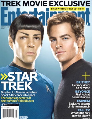
This is the first time I have actually seen the casting. Kirk and Spock look plausible as younger versions of Shatner and Nimoy.
Will the guy playing Kirk adopt some of Shatner’s acting style?
It is a prequel to the original series, though I don’t know by how long. I believe it’s meant to be Kirk’s first adventure immediately after leaving the Academy (I think they even show Kirk taking the Kobayashi Maru test).
“Cardboard and flashing lights, essentially” – Eddie Izzard on Star Trek
I wouldn’t mind the new visual style so much if they hadn’t completely changed the layout.
“Segue: a smooth transition from one topic or selection to the next.”
Even using 23rd century technology, it is not possible to “segue” from that bridge tothe TOS bridge. In fact, that is exactly the definition of what a “segue” is NOT. That bridge design is the antonym of “segue.” Ye canna change the laws of “segue,” Captain!
What. The. Hell?! That’s not a starship bridge, it’s an upscale fragrance boutique! It’s significantly more dissimilar from the TOS bridge than the one in Star Trek: The Motion Picture, and that one was the result of a complete refit that changed the entire appearance of the ship! What is the goddamn point of dressing everyone in almost-but-not-quite versions of TOS uniforms, and then sticking them all on the bridge of the Federation starship Malibu Nail Salon?!
Is the first link not working? I wanna see the bridge!
Spock & Kirk look good, in terms of physical resemblance to Nimoy and Shatner.
Linky 1 no worky.
OK, I see the bridge now.
Ideally they should have something between the ST:Enterprise bridge (dark and submarine-like) and the TOS bridge (bright colors). I’m a little disappointed in the apparent size, too - it’s hard to judge in the photo, though. It should be smaller than the bridge in TOS.
Is that supposed to be Kirk’s first assignment, or his first command? He’s sitting in the captain’s chair. Come to think of it, that may well be him taking the Kobyashi Maru test.
I had a problem with the OP’s first link as well. I guess either the site’s not very reliable, or there’s a zillion Trekkies clicking there right now. Or both. I linked directly to the bridge image in my earlier post-- can anyone see that one?
I don’t see the resemblance to Kirk; his face was never that bony-looking. Apparently he also had his werewolf eyebrows mowed off before TOS. Maybe there was a transporter accident or something.
Spock is better, but he looks strangely unhealthy without the green eyeshadow.
Probably not hte Kobyashi Maru test – that’s Spock, McCoy, and Sulu in the shot.
also: miniskirts!
After seeing the “new” bridge, I dunno about this. I mean, it seems to me that in keeping the TOS characters, they should lead from the prequel to TOS. That doesn’t mean the new actors should impersonate the old ones (heh…Old Ones…heh), but the style should flow.
They (Abrams, and the other actors) keep talking about how faithful this is to the original, but then in seeing the bridge, it’s something completely different.
It’s fine to write stories about different ST crews and ships, but I’d think if you’re going to make something as iconic as the Enterprise and TOS crew, it damned well better be like the original.
Edit: I was going along thinking the bridge in the link was Enterprise. If it is, then I stand by what I said. If not, I apologize.
Enterprise did a great job of making a TOS era bridge look cool, but I can see why they’d go a different way. Still it looks more furturistic than Voyager. I’m not please to see the return of miniskirts. Either have the women in trousers or put a few of the men skants.
Well, I was able to survive the Connery to Moore transistion (as James Bond), so I can accept the new faces on these old characters.
In the photo with an exterior shot of a Federation ship, it looks like they are sticking with “pop up” weapon mounts.
re: bridging the history between Enterprise and TOS:
The general assumption of my fannish friends is that Archer’s Enterprise is on a different timeline, having split off from the official TOS timeline because Zefram Cochrane got to take a look at Picard’s Enterprise, and that changed the way he designed things; this is why they were able to have padds rather than red plastic rectangle readers, and they had actual food rather than cubes. Also, viewscreens and smokin’ hot Vulcans in velour catsuits.
No offense, but why do people who are obviously obsessed with the franchise start threads and claim “I’m going to miss this one.”
No, you’re not.
Wow - Karl Urban (McCoy) looks nothing like he did as the assassin in Bourne Supremacy.