That’s a stupid topic title, but I can’t think of another way to say it. I don’t even know if I can explain it here.
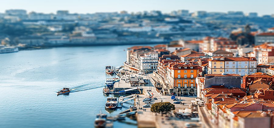
I’ve noticed this on two shows - Dateline & The Lincoln Lawyer. When they show a city from above it looks like a fake city - almost like a city set up for a model train. The trees look artificial and the cars look like toys. The picture also looks brighter and crisper. As they zoom in, then I can see it is real.
I have also seen video effects in monitors and cable boxes that are supposed to enhance viewing of different formats like music, sports, games, and vivid mode that may make some images look odd. I’ve noticed this particularly where the video mode is enhancing edges and colors, and sometimes sports mode looks weird.
I think the tilt-shift effect best matches the OP’s description, but if not that then possibly some video viewing mode is having an effect.
The “tilt-shift” effect is just simulating a very shallow depth of field. When there’s a shallow DOF on a wide angle picture (like a landscape or cityscape), you’re brain interprets it as “this is an image of something small”. You can do it with a tilt-shift lens, or simulate it in software. It’s pretty easy to do in Photoshop.
I think that could be happening when the technique is used. It generally reduces the area of a 2D image. The coloring in that area from real life pictures has to be changed in some manner. Since there is a reduction in the amount of information that can be presented it’s not surprising to see a lack of detail result in producing the flat unvarying colors we readily detect as coming from an artificial image like a cartoon drawing instead of a photograph.
There was a commerical a number of years ago that used this affect. I remember discussion of the technique at that time. It seemed to be used quite a bit for a little while until it lost its appeal as something odd or different.
It seems to be that when something new is discovered and becomes a design trend, it gets overused, pushed to the edge of sanity, is briefly abandoned entirely, then, after a gap, makes a comeback by being used judiciously and appropriately. See also things like the teal and orange colour grade, shaky cam, and HDR photoshop filters.