Oh yeah, I admit I’m biased, but I’ve gotta give a thumbs up to San Francisco’s flag, with the phoenix rising from the ashes. I’ll even provide a link. I may *possibly *feel a bit of hometown pride when I see it.
Mozambique’s flag used to be even better, with the stripes radiating from the top hoist corner, and the gun/book/hoe inside a giant gear.
BTW, the book is a symbol of education and study (not religion), according to the crwflags site. Considering that it started as a banner for a Marxist regime, I wouldn’t expect the flag to pay tribute to the opiate of the people.
…
Based on the NAVA criteria and personal preference I’d concur with the nomination of Australia’s flag as being less than satisfactory.
Personal favourite is Scotland’s Cross of St Andrew
The other on my wish list would be the Eureka Flagthat flew briefly in 1854. If it hadn’t been adopted by the BLF and the CFMEU it’s would likely be the national flag now.
*1. Keep It Simple. The flag should be so simple that a child can draw it from memory…
-
Use Meaningful Symbolism. The flag’s images, colors, or patterns should relate to what it symbolizes…
-
Use 2–3 Basic Colors. Limit the number of colors on the flag to three, which contrast well and come from the standard color set…
-
No Lettering or Seals. Never use writing of any kind or an organization’s seal…
-
Be Distinctive or Be Related. Avoid duplicating other flags, but use similarities to show connections…*
No way to #4. Writing looks cool on flags if it’s done in a calligraphic or other eye catching font! The Shahadah on the Saudi flag doesn’t look cool? Arabic, Cyrillic, or East Asian writing usually has a visual/asthetic component to it that Romanized letters don’t and that can contribute to the overall design of the flag.
Well, that makes sense. I didn’t think it reflected Libya’s lush greenery. ![]()
I have to disagree with you there. Writing on flags is not attractive. I actually think the 5 points are pretty well thought out, and simple to follow as a general guideline.
I know YMMV, but the arabic writing on flags is not appealing to my eye. The simpler the better. That’s why so many of our state flags (US) suck. The standard blue background with a coat of arms, a seal, or some other thing makes them hard to distinguish from any of the others. Pennsylvania’s flag has some logical explanation I’m sure, but two horses? That looks like it should be on Kentucky’s flag. It’s plain ugly. (off to look up PA’s flag history… perhaps the Penn family coat of arms?)
PA’s state flag is indeed a reflection of the Penn family coat of arms. It still sucks.
I also took a look at the provinces of Canada, and Quebec has the only flag that stands out. The rest are uninspiring.
It’s quite distinct, isn’t it?
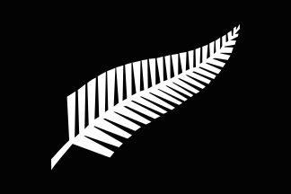
Oh hell yes; I grew up in NZ, and as a kid I always had trouble telling the two apart. There’s a movement that comes around every now and again to scrap it and go with a silver fern, or a kiwi, but much like changing the Aussie anthem to Waltzin’ Matilda, it never seems to happen.
Myself, I’m partial to the Union Jack (okay, okay, “Union flag” if you want to get pedantic about it), and the Rainbow Pride flag’s grown on me, somehow, though I used to hate it. The Texas flag is nice too.
That symbol on the New Mexico flag, what does it mean? It looks familiar.
I’d like Michigan’s flag better if weren’t for the dopey looking pioneer stick figure holding onto his Kentucky style long rifle. The motto in Latin is pretty cool.
If you like that one, you’ll also love the flag of Cusco, Peru: Cusco Region (Peru)
I’m with panache45. OHIO. The only state with a swallowtail burgee!
Thanks for calling attention to that site, Kimmy. How did Fort Worth do so badly? That’s a great flag!
Are you dissing Saskatchewan’s lion, wheat sheaves and tiger lily? 'Cause that’s what I used to see when I looked out my window.
An example to show writing on a flag isn’t necessarily a Bad Thing.
A motto or quotation, such as that on the Saudi Arabian flag, is not so bad. What looks stupid is the name of the country/city/state on the flag, e.g., a lot on this page of city flags (already mentioned). For example, the flags of Sacramento CA, Fort Worth TX, Plano TX and Montpelier VT would be vastly improved by dropping the names (and “Chartered in 1781” in the case of Montpelier).
Sacramento would be a really cool flag without the name on it. Plano will always look like a delivery company, however, and Montpelier looks like something you’d see on a box of wine.