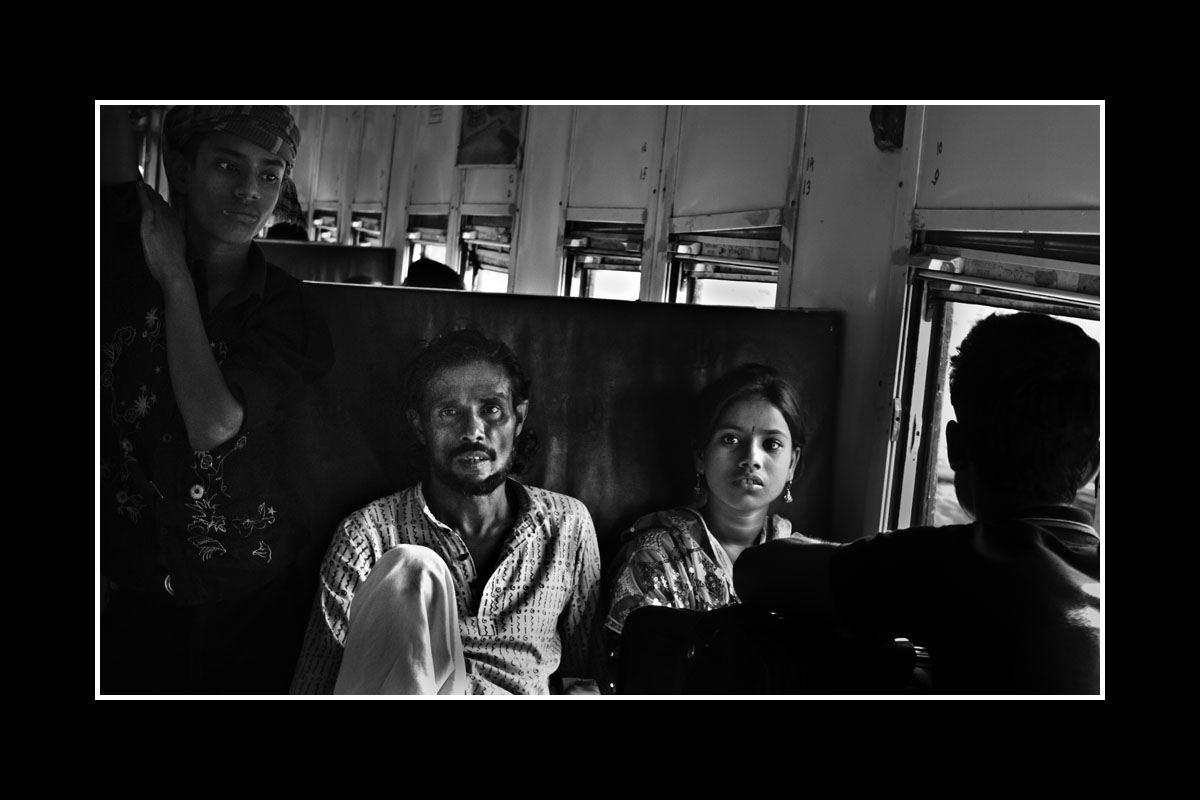
No, that’s fine - it’s been my disappointed feeling since I took it, but I also thought that, since I’m a rank amateur, somebody else might be able to salvage it, or at least improve it more than I could. And indeed pulykamell has already improved it a great deal more than I could with his judicious cropping. But I understand - no competitions will be won with it. ![]()
Here’s my stab at it. I was a bit hesitant to smooth out the guy’s face much at all since it seems like you’re trying capture a bit of a world-worn quality about him.
Thanks B. Serum - you’ve linked to a teensy thumbnail though.
By the way, to all who suggested cloning/touch-up, I am actually not bad at doing that, from a career in marketing and advertising, but don’t really want to it. Plus I think the areas to be cloned out are way too big, and would require way too much artistry to replace, for it not to be noticeable.
???
It’s full size when I click on it.
At first I thought Mean Mr. Mustard was being a little harsh but, after downloading and fooling around with it a little bit, I think he may have a point.
If you crop it to make a portrait, you lose the context that gives the photo character. I think it’s critical to save the figures on the left and right but then you’re stuck with the excessive headroom above the couple that makes the composition feel unbalanced. I find myself wishing you’d either gone for a tighter closeup or wider angle. As it is, it feels like you got the worst of both worlds.
Instead of cropping, you might try using a vignette to de-emphasize the edges and draw attention to the centre without losing the surrounding context altogether. I’m about to go out for the evening but I might try fooling around with it sometime this weekend.
Tried it again: 180 x 102 from here!
Yeah, I don’t think you should clone. To be honest, I don’t like the vignette and blurring ideas–they look really cheesy to me. I think you have a reasonable picture with the crop, and I don’t think the space above the couple is distracting at all. It’s not going to win any prizes, but it’s better than a snapshot, for certain. I had a quick look at the DNG, and there is more information I could eke out of the file, and I’ll give it a shot later tonight or tomorrow.
Ok, first version, changes are white balance change, exposure changes (including fill light and shadows), denoising.
Second version with crop, slight rotation (not enough to make the seat straight, but not quite as askew as original), and minor color channel alterations.
Second version in black and white
Compare to original
I’ve never actually processed a raw file before. I have to say, for the sort of adjustments I do to my pictures, ACR is just flat out better than photoshop. Faster, more effective, and has pretty much all the settings I tweak right there.
Anyway that’s what I could do with 5 minutes. If you like the direction I took those in (I think both crop and uncropped are a big improvement myself), I can send you the DNGs, or if you want, I can spend more time on it tryng to perfect it.
OK, here’s what I was able to eke out:
You have recoverable detail from most, but not all, of your blown highlights. I think that’s about as good as that picture is going to get, although some of the toning can still be tweaked a little.
Nice job recovering (most of) the woman’s overexposed face. How’d you do it? I was just playing around with the DNG in LR (a program I know my way around fairly okay, but I’m no expert) and didn’t do nearly as well. I just cranked ‘Recovery’ to 100%, which is all I thought you could do in this situation to recover blown out highlights. Got any tricks to share?
ETA: (directed at the group) The tiltiness of the picture bugs me. Is it just me? When I was dorking with the photo, I just had to tilt+crop a little.
ETA2: with the black border in pulykamell’s edit, it screams for a Demotivational caption of some sort. ![]()
I normally hate careless angles in photos, but I think the tilting works here in terms of the lines it forms. I personally would not straighten those lines, and I feel the guy staring at the camera gives the image a solid vertical to keep it from feeling like it’s off-kilter and falling over.
I did, too, think with the black border it was begging for a “motivational” caption. ![]()
As for how I recovered details, well, I started in Lightroom, moving the exposure slider down while holding down Option (I think it’s Alt on a PC) to see where my white points were clipping. I moved it down until the clipping in the face and pants were no longer being affected. Once I got to about -1.3 exposure, moving it down farther did not recover any more additional detail, so I made that my starting point. (Almost all of the woman’s face was recoverable–it’s parts of the pants that were the most blown. A smidgen of a blown highlight is not fatal.) The Recovery slider in Lightroom 3 and below is not very good for extreme highlight retrieval. Once you get past about 20 or 30 on that slider, your image starts looking funky, losing contrast, non-blown highlights become gray, etc. Then, I just got to work with my Wacom tablet, and started making localized dodging and burning adjustments, along with some adjustments for clarity, contrast, and brightness (basically, mid point), where necessary. Basically, it’s the type of corrections I learned in a wet darkroom, but with finer control. I then took the photo into Photoshop to tweak the sharpness a little and make a couple finer overall tonal curve adjustments. There are still a couple of places I’d like to clean up tonally–I’d like a slight bit more of tonal separation between the dark tones of the boy on the left’s shirt and the train seat, and I’d like to clean up the burning in the guy’s pants a little bit.
But, in the end, this is just basic darkroom work taken to the electronic age. I come from a photojournalism background, so for a photo like this, I try to limit myself to tonal adjustments, cropping, and not much else. I personally think this is a reasonable frame. Heck, as a quick one-frame grab on a train, I myself would be happy with it. I don’t think this is the unsalvagable frame other posters think it is.
Fair enough. I’ll admit that the tilt/crop’s I did to the original weren’t very compelling. This is a challenging picture to crop and come up with an interesting composition. I like yours very much, but my “augh! the horizon is tilted blargh!” reflex gives me no rest, even when it makes better sense to ignore it.
Thanks, good stuff. I’m going to take what you said and try to take that photo where you took it, just for practice. It sounds like the key is your starting point with the photo’s exposure. I tend not to use dodge/burn and instead use multiple adjustment layers and masks to ‘paint’ in adjustments in key areas. Any criticism of doing it that way vs dodge/burn?
I agree, the guy on the left is an interesting looking fellow, and his lower half is buried, I’d want to pop him out a little in the mix. And the knee from middle-guy is definitely a sticking point to fix or mend.
I agree. It’s definitely a challenging frame, but the subjects are compelling enough to keep trying things.
This:
is awesome. (What’s ACR?)
But this:
just blows me away. Wow. What’s the motivational caption? ![]()
Bugs me too, and I took it. I think if it were me doing it, I’d rotate the train’s verticals to true at least.
I have no standing to comment on photo composition, but this version held my eye.
I’m guessing Adobe Camera Raw, a plug-in for Photoshop. Which doesn’t make much sense to me, given SeniorBeef’s comment that “ACR is just flat out better than photoshop”, since ACR runs in Photoshop. ![]()
BTW, SeniorBeef, I also liked very much your edits of that photo.
Are you talking about Photoshop, then? I’m talking about working within Lightroom, so when I dodge and burn, I am working with the RAW information rather than a JPEG. If you have blown highlights in a JPEG, you’re not going to be able to recover them. In a RAW file, you usually have about a stop to even nearly two of detail in the RAW. Were I doing this purely in Photoshop, I would export a deliberately underexposed file from RAW via ACR using, say, a -1.3 exposure setting, as well as a “correctly” exposed file. I would then use the -1.3 layer with masks as my burn layer to paint in the overexposed highlights. With tricky shadow details, I might even export another file from ACR optimized for the shadows, and use that as my dodge layer. That way, you are maximizing all the information. Once you convert the DNG to a JPG, you’re stuck with whatever pixels the engine has rendered, so you are actually throwing away information.
Or, you could just do it in Lightroom, which parametrically works on your RAW image data, so any local adjustments you’re making using the dodge and burn brushes will be using the RAW data underneath, not the rendered JPEG data (like early versions of Aperture did.)
Yep, looking at the photo hours later, that knee needs to be cleaned up, for sure. But there needs to be detail into those pants. The blown highlights in the other version absolutely kills the frame for me.
Yeah, ACR is the plugin for photoshop that handles raw files. I meant that for the sort of adjustments that ACR covers, it’s quicker and more effective than using photoshop’s adjustment tools to do the same thing.
It seems to cover all the adjustments I typically do - exposure, crop, tilt, saturation, color temp, contrast. I really don’t like to do anything that alters the fundamental nature of the picture like using the clone tool to remove a straw arm or something. It feels dishonest to me.
Thanks. I think mine does the best de-noise job, so if you don’t like the composition you could use it as a starting point anyway. That’s why I posted the cropped and uncropped versions seperately.
I also think concern for the blown highlights on the girl’s face is going too far. The way her pristine skin is lit up by the sun is part of the message of the picture. I think my version preserves a highlight rather than includes a blown highlight - pulykamell’s version largely removes it.
That was my thinking too - even mentioned obliquely in the OP.
So, when we’re talking about dodge/burn, and dodge and burn layers, do we mean a layer that’s been lightened/darkened, and then selected parts of the layers are being “painted” onto the photo? Or is it something else?
Caption suggestion:
ARRANGED MARRIAGE
Helping craggy old dudes get laid since 1321