I’m a photo newbie and have been trying to figure out whats wrong with my pics. I know that the lighting is messed up, can’t figure out what to do though. I took these pictures in my kitchen, which has fluorescent lighting, and during the daytime with the windows open. http://www.flickr.com/photos/65128301@N03/5930097595/
They all seem to be underlit/underexposed maybe? I tried changing the aperture to a lower f stop and I also decreased the shutter speed to 1/10 sec (using a tripod). I’m using a Nikon D5000. Any recommended settings or tips? Also, any Photoshop tips to try to fix them if I just can’t get good lighting in the kitchen?
The exposure looks pretty close to right for me. You could increase the contrast a little, but that’s all I’d do. It may be that the lighting is a bit too even, but that gives you a bit of flexibility to lighten, darken or increase contrast using Photoshop or the like.
Exposure looks fine. White balance looks okay. The composition could use some cleaning up, but the biggest problem is the boring, even lighting. Otherwise, they are perfectly fine snapshots of food.
I can’t give a photo lesson in a single post, but this Google hit I found on food photography lays out the basics pretty well.
I’m trying to post pics onto a website (my sister’s restaurant). I’m trying to get pics that look like the ones you would find on http://WWW.foodgawker.com
The white balance actually looks awful to me. Are you shooting under fluorescent lights or something? I saw that you used auto white balance. Unless you’re shooting RAW (which is probably a good idea in this case anyway), I strongly recommend using manual white balance. Not only are you more likely to get it right, but it’s the only reliable way to get consistent white balance between shots.
The lighting is too flat; you need it coming in from an angle, at least. To get those great food photos, you need to control the light carefully. Often that just means recognizing great window light and arranging your plate in the right place and orientation to take advantage of it, other times it means actually using a lighting set up (NOT on-camera flash) to get what you need.
Many of those foodgawker shots have a shallow depth of field. From the one I looked at, you’re shooting with an 18-55 f/3.5-5.6 lens. At even f/3.5 it’s going to be hard to get that kind of depth of field. You need a faster lens for that.
Great food photography is an art. It’s not just a matter of getting the exposure right and clicking. But the most important thing by far is the light.
ETA: Yes, it’s easier with fake food, but it’s not a requirement. Here are some very nice photos of real food:
One tip that I received recently from a professional photographer looking at some of my work was to leave room around the subject. My problem is that I try to compose exactly in the camera, leaving no room for error. That sometimes works fine, because it gives greater impact, but cropping is easy these days, so you can fix the composition afterwards.
So, for example, in the second picture the picture leaves out a little bit of the bread roll and the plate: you might have been better off trying to get it all in, then cropping to perfect the composition.
In the others, there are bits of distracting background. You can avoid that by making sure that the background is plain (e.g., by using a plain bed sheet or a large uncreased sheet of paper), the background fills the whole picture, and there nothing distracting near the subject.
Two things I noticed about your pictures vs. the foodgawker ones:
(1) Foodgawker tends to have a lot more “stuff” in the composition for interest. You kind of just have the food, and the minimum required to support the food, and are all shot at a high angle to limit the amount of background.
(2) A lot of the foodgawker photos have a conspicuously shallow depth of field (i.e. the food is in focus, but everything behind it is blurry) which I think is a nice effect. It also goes well the the “having more stuff” thing, since the stuff is clearly there, but the food itself is highlighted. Some playing with your lenses (like getting in close with your camera as opposed to standing farther away and using a zoom lens) might give the same effect.
This is not true. A lot of the current food photography trends are towards more natural looking, and completely real food. Look through any issue of Saveur Magazine and see the pictures that accompany the articles. They are not fake at all.
Here’s a nice behind-the-scenes video of a Chicago Tribune food shoot. And that’s a studio shot. A lot of what I see in food magazines today is less fussy and directed than that.
It’s still all basics of photography: light and composition.
The white bowl on a white background, you need to increase the brightness and contrast; plus, yes, the white balance is off - does your camera have manual white balance, where you put a white card in front of the camera?
I guess my idea about the fake food goes back to a story I saw years ago on CBS Sunday Morning or some such show. I seem to remember them using things like glycerin sprayed on the food to give it that nice lustrous, appetizing (?) glow.
I’ve only skimmed the thread, but I agree with what I saw.
[ul][li]The lighting looks a bit flat. You might also try using a ‘cookie’ (or ‘gobo’) to give the light some texture. You can make them yourself, and cut them so that they don’t cast weird shadows on the food.[/li][li]The composition needs work. The first photo has tan/yellow/brown food in a clear bowl on a tan-ish background. The soup in the white bowl is on a white background. You need more contrast, and I would add ‘props’ such as flatware, a glass, a vase, or other things to make the shot more interesting. You need to carefully arrange the scene so as to appear natural and appealing to make the food ‘pop’.[/li]I agree with the depth-of-field comment. Try various depths to see what works best.[/ul]
You need to learn about composition and how to create energy or movement in a visual image. You need to learn to separate yourself from the emotional involvement of your subject (I’m assuming you cooked the dishes, which look rather tasty by the way.) and focus solely on the visual impact of the image you are trying to create.
Some particulars;
The counter top is too busy. Also you might think about creating visual interest by including forks, knives, spoons, flowers, vegetables, the list go on and on.
Some specifics;
In the first one, the peppers and carrots are visual highlights, they are going to draw the eye more so even than the cilantro. Consider their composition. And what the heck is that yellow object at the top intruding into the image? Lose it.
The sandwich shot is boring and is practically a monochrome image. (Which can work if that’s the effect you are going after.) If you care going to crop of one part of the subject consider balancing it by cropping off a similar portion on the other end. There is also a bit of something creeping into the upper left hand corner of the photo.
The third is just an orange circle. Show what the subject really is by including a spoon, stylishly laid out. The attempt to cover the over busy background of the counter top was a good idea, but it failed because of the bit of counter top in the lower left hand corner. There are ways to do this, but in this case it’s a visual distraction.
Interestingly enough, the fourth photo in that grouping,(the one you didn’t link to) comes the closest to being a successful shot. There I would have paid closer attention to the way the green and red portions of the dish were composed and either put it on a less busy background or zoomed in tighter on the dish making the counter top a much more minor player in the photograph. I might also have lowered the image angle some.
Food photography is a highly specialized field and is far more difficult than most people would believe at first glance.
I guess the white balance bothers people more than it does me. I think it’s close enough–perhaps it could use a dab of magenta, but it’s not the white balance that’s the problem here.
OK, I’ll critique the images one by one:
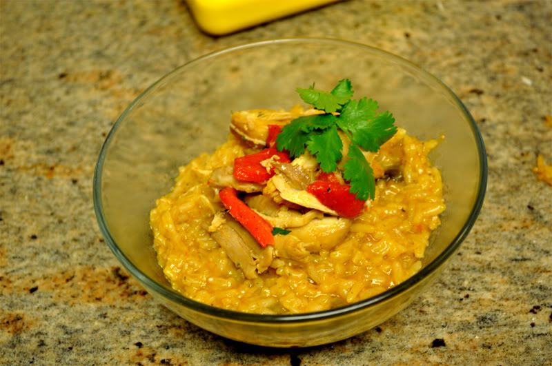
The first is some kind of risotto thing. First, that countertop has got to go. And you have a bit of a yellow board in the background, why? Also, why are you using a clear bowl for this? I think this would stand out much better on a white plate or perhaps a harmonious colored bowl. (Or is this the serving bowl that is used?) You have something visually to work with there: the green cilantro and red pepper are great color accents that you can use to anchor your composition. But it needs to be anchored. Right now, they look sort of haphazardly splatted on the plate.
Compositionally, it can be very simple. Just google “risotto” for inspiration. Nothing wrong with researching ways other photographers have approached the same problem.
You can come at it from above for a geometrical approach (which you should be able to pull off with judicious placement of peppers and cilantro.) I might add a fork in there as an accent. You can come at it from a low angle with relatively low depth of field, like this image. You can get nice and very close and just emphasize the texture of the risotto itself, punctuating it, once again, with the green and red of the cilantro and peppers, something along the lines of this. I would probably also cook the risotto a tad more al dente so it doesn’t turn into a gloopy mess during the shoot.
Now, after you have sketched out or thought out some compositional ideas, we have to deal with light. Your best bet, I think, if you do not have additional lighting, is to find a nice big window, set up your food, backgrounds, etc., relatively close to it, and observe the lighting. It depends on your food, but you’re probably going to want to experiment photograph it perpendicular-ish to the light source, to bring out the texture of the food and the drama. If the non-lit side looks too dark, you will want to set up a make-shift reflector. This can be just a piece of white poster board or any other reflective white object that will bounce light back into your scene to add details to your shadow areas. You don’t want to flatten the picture with the lighting, though. Depending on how your kitchen is and how much light is bouncing around, you might not need the reflector. For less drama, you’re going to want the light to hit the food more from the front, rather than on a perpendicular angle. It all depends on what you’re photographing and what mood you want to create.
I think playing around with the window lighting set-up with the possible addition of a makeshift reflector is going to be your best bet. That’s what I do for many different kinds of subjects if I don’t have the time to deal with setting up lights. Windows are a photographer’s best friend. Yes, the lighting will get boring and predictable after awhile, but it does look nice.
This web page I just found has many wonderful examples of what I’m talking about. Tip #1 shows you window light in action. The picture that accompanies Tip #4 is kind of the geometric angle I had in mind as one compositional possibility for the risotto.
OK, on to the tomato soup: White-on-white is not good. Plus that tablecloth has got to go? It looks ratty, old, there’s a splotch of tomato soup on it, the bottom right of your image shows the tabletop peeking through. There’s no textural elements to it and the lighting is flat. This is a tough one: it needs some texture. Do we have to use that bowl? Is the soup served with anything that we can add to our composition without possibly misleading customers? All the compositional and lighting points from my post on the risotto apply. It doesn’t have to be fancy. Something like this would work fine. (I’d change a couple things about it, but for a website, that general idea and angle would work.) That image looks like it’s just simply lit with a window off to the left side. Here’s a nice, romantic much more skillfully composed and atmospheric tomato soup shot. (Except I don’t like the stray highlight on the olive oil bottle in the background.) That’s shot with studio lights, but you can recreate a very similar idea with using just a window light. Once again, a textural accent would be great if you can do it. It can be a dollop of sour cream, some chives, a piece of toasty bread, whatever, as long as it accurately represents what is being served at the restaurant.
The last image is a bit tougher, what with all the melted cheese. I would start by getting just a tad bit more color on the cheese (use a torch), once again to create contrast and texture. Then I’d really have to think about how this sandwich is served. I’d consider perhaps cutting it in half, and arranging it on a plate with pickles or fries or whatever it’s served with. But that one is going to be a bit tricky to not make look like a pile of glop.