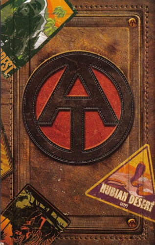
Well, the one with the circle “A” looks almost the same as the GI Joe adventure team logo.
I like the one submitted by Diane531 at the bottom of MsWhatsit’s link. It’s very pleasing aesthetically, and doesn’t look like it represents something else. It’s public domain, and endorsed by Atheist Alliance International (whoever they are).
I don’t like the Darwin Fish or the atom ones, since neither (and especially not the atom ones) not only don’t say atheism to me, they say “evolution” or “science” . If you (especially wierdaaron) really really feel the need to use the atom symbol, use one with the “A” in the center, like the one Arlington National Cemetery uses, to better distinguish it from “science”.
ETA: One like a null or 0 or the universal “no” symbol (red circle with slash) would be OK, if they’re endorsed by some atheist group. Otherwise, I think you’d just be adding to an already confused situation.
Yup. I don’t see the point of a symbol.
- People for whom religion was just never an issue in their lives. I’m an atheist, I was born an atheist. I never evaluated religion or examined anything. It was just not a part of my upbringing.
I think it’s silly to reject the Darwin fish on the grounds that many religious people believe in evolution, but then turn around and suggest the atom as an atheist symbol. Are you saying that religious folks don’t believe in … atoms? Science? Physics?
The Darwin fish says more than “I believe in evolution.” It whimsically puts it in the context where it is common to see the word “Jesus,” as if to explicitly say “I believe in evolution and not that other stuff.” A drawing of an atom simply doesn’t give a clear message like that and could just mean “I’m a chemistry (or physics or science) geek.”
Wesley Clark writes:
> The vast majority of college professors would fit in this group.
For what it’s worth, this isn’t true. Only 23.4% of college professors (in the U.S.) are atheists or agnostics, according to the best poll that’s been done. Even if it’s restricted to the top doctoral institutions, only 36.6% of them are. No, I’m not claiming that this fact proves anything. Nor am I interested in debating whether this proves anything.
How about just a globe of the earth (no heaven or hell)?
I agree, selecting symbols and organizing starts looking too much like a religion to me rather than an absence of religion. Next thing you know we will start having sunday morning meetings.
I think there doesn’t need to be a symbol. But if there WAS going to be a symbol, it would have to be something dignified-looking. For this reason, the Darwin fish is out. The stylized red A is also. The vitruvian man is good but his wang is too small.
I think it should be based on a picture like this.
Slightly more introspective chimps.
It should be something that wouldn’t exist if there were a righteous loving god. Like this.
I hate the idea of creating a symbol for atheism. I understand the compulsion, but really, it’s just stooping down to the level of organized religiosity in the first place.
Anyway, if I were forced to pick a symbol, it would be a symbol. NOT a logo. The difference being it’s made from simple geometry and can be drawn/reproduced by written hand and understood. Stylized logos are more art than glyph. So the Empty Set or just a Circle is better. But really… resist the urge.
Seriously. Why do I need an icon to represent my absence of belief? There’s nothing to represent, so no symbol is needed.
My two cents:
-
The atom logo is a bad one. A tiny fraction of people recognize it and it evokes science and not atheism.
-
My recommendations for logos for atheist, theist, agnostic, all having a unified look: Link
If there’s controversy over the symbols, Polerious’s idea looks interesting.
The “no symbol” idea won’t work because the whole point of the exercise is to determine what icon to use with people. Using no symbol would just look like an icon is missing.
I haven’t clicked all the links in this thread, so I don’t know if this one has been offered up yet or not. I like the reasoning behind this guy’s idea.
Difficult. I’m cool with having some sort of symbolic identifier, but I agree it needs to be a symbol, rather than a logo.
I’m familiar with the a-atom symbol, which will probably be on my grave someday, since that is what they use in veteran’s cemetaries. I’m not crazy about it, though. Not so much because it says ‘science,’ but because it’s the symbol of an organization (American Atheists) rather than a general symbol for all atheists.
Don’t like the Darwin fish as a symbol, either. Too jokey and seems to be a backlash against Christianity rather than it’s own thing.
The empty set symbol works symbolically, but looks too much like those slash symbols on road signs (No Parking; No Pets, etc.) – has a negative vibe to me.
I liked several of the stylised A’s, but they seem a little too logo-ey.
If I had to vote right now, I think I’d vote for the plain circle – which evokes (to me) the circle-of-life, which is nicely naturalist, and also the earth itself, with no heaven or hell.
How about the symbol for infinity - ∞ ? Sort of like the empty set symbol but the other extreme?
I like Polerious’s suggestion, or something along its line. Suggestions of “we don’t need an icon” don’t really work, since the whole premise requires one. However atheists feel about it, the fact is that they’re a minority in the US and so being one (especially a vocal one) is a rarity worthy of noting (should one choose to).
