Let me check in with The Geto Boys’ We Can’t Be Stopped. Gross, but even worse when you realize that’s not special effects - Bushwick shot his eye out with a Derringer and thoughtfully had the foresight (heh, heh) to take a cover photo on the way to the ER. Lovely!
My favorite album cover designer would be Peter Saville. He designed all of the Joy Division and New Order sleeves. I also think that XTC had some amazing sleeves, especially this one by Hipgnosis.
Going with Jethro Tull here, too. “Thick as a Brick” original release LP had the many-paged foldout fake newspaper (loved the continuing rabbit theme through the stories and the ads were a hoot). The pop-up in “Stand Up” was cool. The original LP of “Living in the Past” had a leather-textured cover and a many-paged book inside. The back side of “War Child” featured all of the characters from the songs on the album–very well done… actually I think I like almost all of their album covers.
The one cover permanently burned into my mind is Frank Zappa and the Mother’s Weasels Ripped My Flesh.
And now… I must be blind. I have been a huge Pink Floyd fan, Meddle being one of my favorite albums by them, but I have never attached much significance to the cover. I still cannot see what some of you are talking about! Please help an ignorant old Floyd fan!
Re. Weasels Ripped My Flesh: the radio ad campaign for that LP consisted of a series of spots where they showed the album cover art (apparently without the word balloons) to people on the street and got their reactions. One woman sounded really scared by the image.
Re. Meddle: it’s just a close-up of an ear, with water ripples superimposed.
The Durutti Column released **The Return of the Durutti Column ** on vinyl in a sleeve made of sandpaper designed to destroy the covers of albums placed beside it. Of course, despite the name, it was their debut album and, despite the aggressive sleeve, is comprised of mostly gentle introspective guitar music.
My judgement is clouded by the music inside & how I “experienced” it. But the record has aged well. “Walk on Gilded Splinters” can still raise goosebumps.
I always liked the cover to Delaney and Bonnie and Friends on Tour with Eric Clapton for the story behind it. The feet in the car window belong to Bob Dylan, who had nothing to do with the tour. The photo happened to be laying around when they were designing the album, and they decided to use it. One of the few cases where a musician on the cover had nothing at all to do with the album.
The Mothers “We’re Only in it for the Money” cover was a picture of the group in women’s dresses. It wasn’t until you bought it and opened the gatefold that you realized it was a parody of the “Sgt. Pepper” cover, turned inside out (Zappa actually called Paul for permission). Bonus: Jimi Hendrix was at the cover shoot.
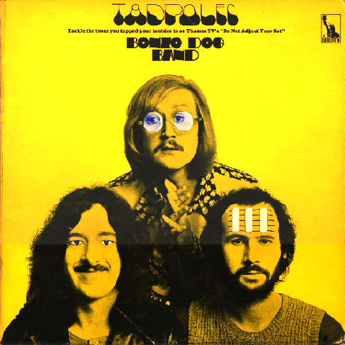
“Tadpoles” by the Bonzo Dog Band had a die cut cover. As you pulled out the inner sleeve, it created an animation: Vivian Stanshall (top) had various images; “Legs” Larry Smith (left) had his eye track back and forth, and Neil Innes (right) has musical notes moving across his forehead.
Though the image is well known today, Mott the Hoople’s colored version of M.C. Escher’s Reptiles was new to record buyers when it came out and did a great job of making the album noticed.
As a teenager whose hormones were just starting to rage, this album cover of Linda Ronstadt’s Hasten Down the Wind will be forever imprinted in my mind. Yet it looks so tame now.
Of the many KISS albums I had, this one creeped me out. It’s hard to tell in this photo, but the look the photographer captured on Gene Simmons face is just . . . eep!
Count me in as another PF Meddle fan who never had a clue what was on the cover. Even after I looked it up and you guys explained it, I still don’t see an ear. A baboon’s anus maybe but. . .
That was, without a doubt, the sexiest album cover – indeed, one of the sexiest images – of that decade, and of most decades since then, too. The model’s expression just invites one to dive in and frolic in the foam. I like the Blind Faith cover because of its innocent/erotic blend, but for pure, heart-quickening sexy, Whipped Cream was the best! Oh, and the music inside was pretty good, too.
Yep. Ronstadt’s expression, the way the shadows accentuate her the lines of her body through the dress – it was a photo that would haunt a lad’s dreams deep into the night. Oh, yeah, and the music was pretty good, too.
Monty Python’s Previous Record is a great one. A long rubbery arm wrapping around the cover multiple times, grasping at a six-breasted butterfly-woman.
That surprises me. It’s not that unusual for records that were originally gatefold to have been reissued later in a cheaper cover–for example, non-gatefold editions of Genesis’s Nursery Cryme and Foxtrot graced the budget bins for a while–but I thought Deram had kept the Moody Blues’ packaging intact pretty much up through the end of the vinyl era. I know I was able to get On the Threshold of a Dream in the early '80s with both the gatefold cover and the lyric booklet still present.
