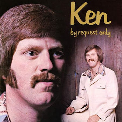
I was looking at one of those “worst album covers ever” and I noticed those sites almost always pick obscure albums like tiny Christian labels or self released projects like this. I wondered why pick on these no-budget artist when there have been a lot of awful major label releases by name artists. For example, take this Three Dog Night cover. Not only is the cover grotesque, but what on earth did a band whose audience was mostly teenagers think this could sell records? Got any candidates of your own?
Wow. Yeah, that’s actively bad. For ugly in a lame, they-weren’t-really-trying sort of way, my pick is the Kinks’ classic album Lola vs. Powerman and the Moneygoround (Part One). Excellent album, cruddy cover.
This one fits the criteria. Big name, excellent album, WTF cover.
I don’t usually notice album covers much, but since I got into browsing through used albums at secondhand shops, the sheer volume of overexposure to certain titles has made several stand out in my personal list of ecch.
This link sums up the degree of overload I have had to the cover to Styx’s "Pieces Of Eight’ album.
I loved some of the music on this Fleetwood Mac album, but the cover sucked SO HARD!
http://turntabling.net/album/wtf/wtf-album-covers-fleetwood-mac-mystery-to-me/
I always thought that Bob Seger and Kenny Loggins deserved to be in the Hall of Fame of bad album cover art. They seemed to think that just showing a photo of their furry face was all that it took to make a cool album cover. WRONG!!!
Of course, one of the greats for bad taste was the (justifiably kiboshed) Beatles “Butcher Cover” from their “Yesterday and Today” album: Click!
Iron Maiden is well known for their fantastic album covers, which makes the bad CGI art for Dance of Death even more perplexing. ![]()
Still, nothing can match the horror of Love Beach!
Won’t put a link (copy & paste yourself if desired) but:
Obligatory mentioning of The Scorpions Virgin Killer cover.
For those too lazy: it features a fully frontally nude 12 or 13 year old girl deliberately posing somewhat provocatively. Some, lots in fact, will never say it’s anything but outright kiddy porn. I think it’s certainly, um, edgy, but given the circumstances of its creation and the fact that, like it or not, the girl is an adult now and still totally proud of it, I think it’s not that big of a deal. Screams many things but ‘bad taste’ just isn’t one of them…
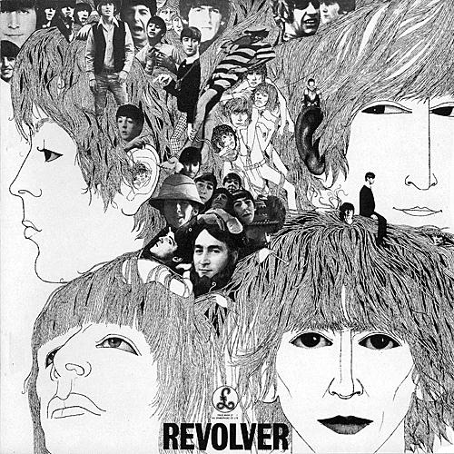
They are certainly uglier covers, but for a really big name and an absolute classic album, the cover of Beatles’ “Revolver” looks like it was done for an art project by a high school student of mediocre talent instead of a professional designer like Klaus Voormann. I suspect that if he hadn’t been friends with the band, he’d never got that job.
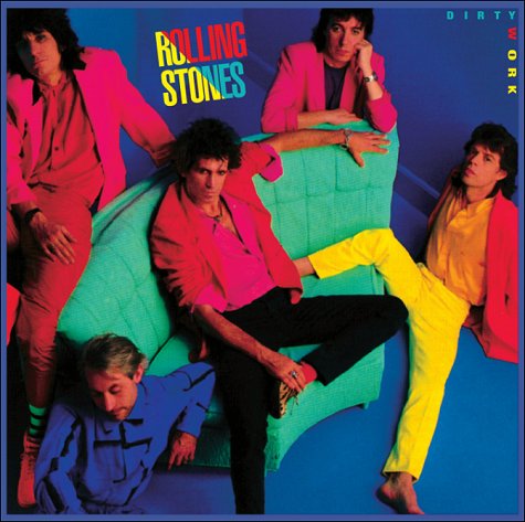
Since I’ve dissed the Beatles above, I shouldn’t forget about the Stones’ fugliest covers which scream of typical eighties lapse of taste: “Undercover” and “Dirty Work”. Fittingly, the music on both albums wasn’t any better than the art work.
While I completely agree with your description, I must admit I like it - probably just the memories spent picking out the details while listening to it.
Along the lines of The Scorpions, have to add Montrose’Jump On It- a close-up of a woman’s crotch with a red leotard on. Whatever. At least the **Black Crowe’s **Amorica was making a, um, political statement, what with the pubes peeking out over the American Flag string bikini, and stuff…![]()
My first thought was the Three Dog Night cover mentioned above (which I still own).
My next thought.
mmm
Likewise Blind Faith’s debut (and only) album (again NSFW if you decide to Google it). For good measure we have a phallic bomber that the model is holding.
I came in to mention David Bowie’s Lodger.
This does not really meet the criteria for this thread but I must share this collection of Swedish dansband publicity photos and covers.
That’s still considered one of the great rock covers. Certainly not ugly (and not, really, all that sexual, unless you’re someone whose automatically turned on by prepubescent girls).
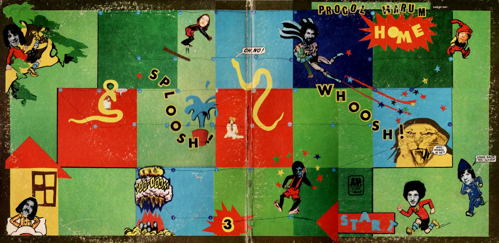
Procol Harum’s Homewas a terrible cover. I suppose they were trying to do a game of Snakes and Ladders, but it looks very amateurish.
I like boobies as much as anyone, but that cover is crap. The girl has a weird, unattractive expression on her face like she’s either stoned, about to sneeze, or both; the superimposition of the model on the background looks cheap; and image of the the underaged girl with airplane-dildo is inescapably, exploitatively sexual. On top of that, the lurid, oversaturated colors are totally inappropriate to the rootsy, post-psychedelic music within, while the slapped-together sepia-toned band shot that was used as an alternate cover suits the music perfectly.
I love Alice in Chains, but their self-title album looked hideous in the green case it came in. And the purple one it came in later.
ABBA–The Album. Cover. The Ugly.
.jpg)
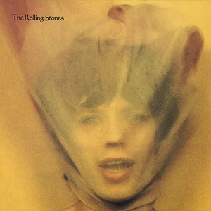
My nomination: Goats Head Soup
Do you like the original art work better?