Your submissions, please, for awful album covers gracing (or, rather, defacing) a great album!
The Kinks have several album covers I’m not crazy about, and overall may have the lowest album-cover-quality-to-album-quality ratio.

I don’t think I would pronounce it “awful”, but the first Alan Parsons album cover wasn’t much to draw people in:
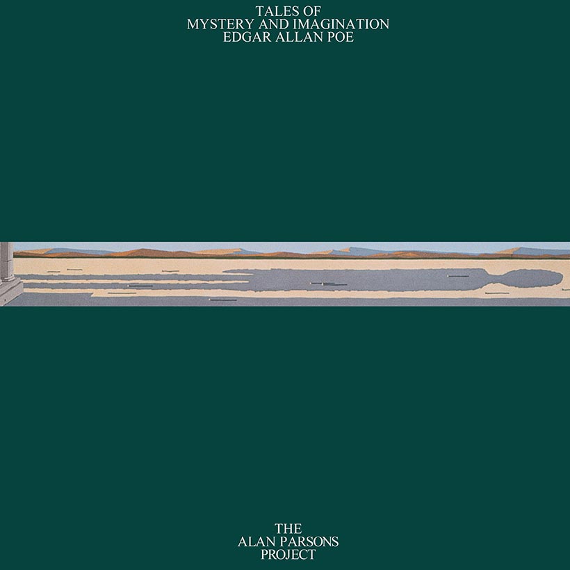
I guess they got feedback about that, and replaced it pretty quickly with this alternate cover:

I love Black Sabbath, but many of their album covers are just awful, IMO. Like Paranoid, Sabotage, and Technical Ecstasy.
And I really really really hate the cover art on King Crimson’s first album.
No contest:

Orleans first album
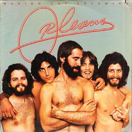
Compare that with their follow-up album
https://cd.calimacil.fr/images/1/6/orleans-ii.jpg
Somehow “Orleans” and “great” don’t quite seem to go together…
Ca. 1990, I dated a man who owned a used record store, and EVERY.SINGLE.TIME someone purchased Prince’s “Lovesexy”, they would cringe and say, “…the cover…”
Great choices so far: Kinks, Pet Sounds…
Zep III is a pretty good album, but Jimmy rightfully lamented the “teeny-bopperish” typeface. He kindly attributed it to a miscommunication, rather than excoriating the designers (Hipgnosis, I think — hey, a candidate for the “clever business name” thread!).
Two words - “Blind Faith”.
Was there any cover art more low effort than The Beatles White Album?
That’s a good one. Every time I used to see that album in someone’s collection, I always assumed they were a heavy smoker; there’s no way an artist would chose that shade of yellow for an album cover!
The line between “low effort” and “high concept” is often nonexistent.
Somebody was high, no doubt about that.

Are you talking about the US version with the band photo? I was actually talking about the original, more controversial album art with the naked tween girl. Although, I suppose both versions fit depending on your definition of “awful”.
I see I was ninja’d by Smell the Glove. “None more white.” ![]()
It’s such a fine line between stupid and clever.
The Who deserve to be in the Bottom Ten.
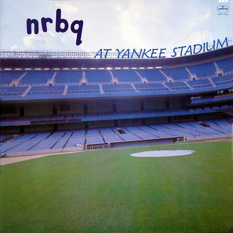
To avoid wallowing in negativity, I’ve always like this NRBQ album cover.
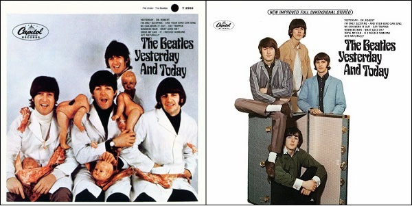
Anyone remember the original album cover for The Beatles’ Yesterday and Today and its quickly replaced substitute?
I had to stare at that for several minutes to “get it”. ![]() At first I thought the marks on the pillar were childrens’ shadows and I thought “well, that’s kind of trippy”. Now I just think it’s kind of gross.
At first I thought the marks on the pillar were childrens’ shadows and I thought “well, that’s kind of trippy”. Now I just think it’s kind of gross.