I can’t decide if the original is ahead of its time or a tasteless misstep. But that replacement cover… it’s baffling how Capitol took the circa-1966 Beatles and made them look so boring.
The original was a brilliant statement on how Capitol butchered EMI’s Rubber Soul and Revolver to create the Frankenstein monster that is Yesterday and Today.
I was never very fond of the cover of Cream’s “Wheels of Fire”.
Oh! Well now I could put this in the “pop culture things you realize after a million times” or whatever. Huh.
The cover of the first Steely Dan album is a collage, the most tasteful element of which is a photo of streetwalkers.
At first I assumed the aesthetics here must have been ironic – a deliberate car crash.
Apparently not! Walter Becker and Donald Fagen themselves said it was possibly the “most hideous album cover of the seventies.”
Heheh, I got it the first time I saw it. Always loved that cover.
We probably don’t want to know what they WANTED to put on a cover, with a title like that!
Considering what they got away with for Sticky Fingers, you’re probably right.
Look at the back cover.
I heard it was supposed to be ironic because it followed Sgt Pepper’s extremely detailed cover. But “Magical Mystery Tour” came between the two. DOH!
When the question is, “If you had to be stranded on a deserted island with just one album to listen to…?” the White Album is my answer.
The same stuff, but messed up and broken. How does explain anything?
That’s the point. The Stones reveled in their bad boy image. The front cover shows sweetness and order; the back cover shows what they thought about the idea. It perfectly encapsulates the group.
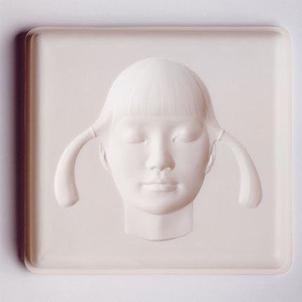
Spirtualized did a couple of amazing albums (shoe-gazey but enough banging tunes to not be irretrievably noodley) that have cover art that was at the same time great and awful.
Ladies and Gentlemen We are Floating in Space came with an awesome authentic looking pill packaging:
Let it come down had a cool optical illusion deal (it’s embossed but it looks raised):

Why were they awful? They wouldn’t fit in any bloody CD rack ever made. You always had to put them on top where they would inevitably fall behind the rack and get lost. Additionally the pill casing has an authentic foil back like a real pill, once its torn off thats it!
I’m not sure I buy it. And even if I did, it’s still ugly!
That Foreigner album cover was very controversial at the time, too. (It wasn’t a very good album, either.)
The “who cares what the music sounds like; did you see the cover?” award probably goes to a one-off act called Mom’s Apple Pie. All I’m going to say is that it’s definitely NSFW.
But it is kind of a pastel black.
For the curious: A bloody vulva in a pie. The vulva probably wasn’t obvious to many buyers of the album — it’s rather small and subtle, but obvious (and clearly intentional) once pointed out.


