I’m going to suggest that you go to fractint.org and ask the folks there. They’re more programmer-types than mathematical-chops-types, but it’s probably a good place to start. If nothing else they can probably point you to another place.
I am not a mathematician but I do work with procedurally generated imagery. I don’t think anyone can say whats going on without seeing your source code and way you do the rounding.
My gut instinct is that the structures you have found while some of them are cool to look at, are not ‘interesting’ in a mathematical sense precisely because they vary so dramatically by number of iterations. That to me seems like an arbitrary artifact of where you stop calculating and not a ‘real’ feature.
Yes. This all started for me, ages ago, when I did something similar to make Mandelbrots plot faster on my Commodore 64.
I think Wikipedia mentions that n =1 in the Mandelbrot set’s central cardioid and increments in successively smaller outer lobes. That is why I use a two-pass algorithm to find attractors, so I don’t have to know the value of n. Indeed, when seeking attractors I reduce precision to make the patterns more visible, so it is possible my algorithm couldn’t find n reliably if it tried.
This is one reason I want to know if this stuff is really novel. If there’s enough interest, I might be persuaded to improve the program, or at least clean it up enough to release sourcecode.
I figured someone would say something like that. I would be even more curious to know how rounding or iteration counts could create these patterns without any mathematical basis. Are you suggesting I could have created these images algorithmically, without involving mathematical characteristics of the underlying set? That would be a neat trick, indeed.
One question I’m trying to answer here is whether it might be worthwhile to rework the program to use supersampling instead of rounding to bring out the patterns, or to analyze the algorithm to work out why changing the increment changes the patterns. I know there’s real math here. I wanted to hear from a real mathematician to help me decide if it’s worth chasing, given my limited math skills.
They look like Quantization noise to me, but yes I would be interested to see what a mathematician says as well.
If the patterns only show up as a result of the rounding, then they’re not really there.
Baahhh…
Any interesting pattern mathmatically generated is interesting…Real? What does “real” have to do with it?
And get off my lawn!
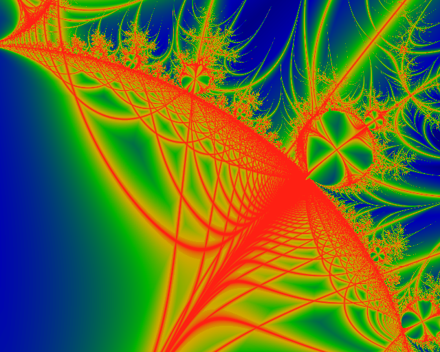
Yes. The “string of diamonds” and other blocky artifacts are clearly quantization (i.e. rounding artifacts). But there is a smooth, vanishingly thin pattern of curves underneath, which the blocky image only approximates. These curves should represent sets of points whose series’ terminate in attractors with the same magnitude. The resulting shapes seem to relate to the set’s overall shape, but I don’t understand why or how.
Chronos is saying that the patterns are a result of the rounding algorithm and not an underlying feature of the mandelbrot set itself. I’m not really seeing an underlying curve. When I go one iteration more or less I get a different set of curves. That’s why I’m thinking its a rounding artifact.
I agree with billfish678, but I also agree that if the patterns are a result of, say, the details of the rounding process, including the arbitrary minutiae of the IEEE floating point standard and so on, then they are quite likely described by rules which are quite convoluted and far from mathematically “natural”; they are still mathematics, the way even the analysis of the historically contrived game of chess is mathematics, but much less compelling to study. On the other hand, if the details of the rounding process responsible for these patterns are quite clean and simple, then the resulting patterns are much more mathematically interesting, although that interest may be for reasons which actually have little to do with the Mandelbrot set, as such.
No, sorry. Each curve’s series’ reaches its first-pass terminal value at the same count in the second pass.
Tip: To see the curves, stick with one iteration value, and use the sensitivity to increase or reduce resolution. Use the lowest sensitivity that reveals distinct curves in the area of interest.
So what if changing iterations doesn’t work the same inside as it does outside the set? That doesn’t mean this stuff isn’t real, it’s just that much stranger. The iteration setting represents the time for taking a snapshot of a complex process. I suspect internal attractor plot is a lot closer to the complex series math than the external plot’s simple divergence test.
The rounding process is dead simple. After the first pass, the second pass makes a truncated copy of each iteration result in the series and compares it to a truncated copy of the first pass end result. Actual results are not rounded. The rounding only makes the comparison more sensitive. The sensitivity sets the number of bits to truncate.
Other people have done visualisations of the interior of the mandelbrot set take a look here:
http://linas.org/art-gallery/mandel/mandel.961113.html
and here:
It looks to me like your program is effectively doing a very sensitive edge detection on the interior convergence value fields shown above. So you’re seeing contours that correspond to the gradient values of the fields shown in images above, but due to rounding errors you are getting the sudden jumps when changing iterations.
Edited: animation of interior here: http://www.youtube.com/user/barneypitt#p/a/u/0/j-Ubbxk9pks
I think you’re effectively seeing a quantized edge detected version of the fields shown in this video in the interior.
I’ll try to revisit my rounding code to make sure it handles those minutiae consistently. I wouldn’t be surprised if my rounding technique can be improved to eliminate some of the blocky artifacts, but I can’t believe rounding accounts for any of the smooth swoops and curves that show up when the settings are “right.”
Have you looked at the interior coloring options in Xaos?
http://wmi.math.u-szeged.hu/xaos/doku.php?id=main
using incoloring mode real/imag reveals interior gradients that change rapidly when incrementing / decrementing the number of iterations.
That looks like it might be related, but there’s no info on what he’s actually plotting. If, as I suspect, he’s animating in the iteration axis, then it makes loads of sense that varying iterations in my applet yields varied results. But my plots don’t look, to me, like a mere edge-detect of his animation. For example, rays and tendrils in my plots radiate from node centers, not edges.
FractInt? Holy shit. I remember running that thing on my old Atari ST when I was about 12! (More than 20 years ago! Geez I feel old!) I can’t believe it’s still out there. ![]()
Yes! That plot includes outlines that clearly match stuff I see in my applet. MY applet’s plot seems more complex; for example, lines cross; but that actually could be a procedural artifact (perhaps my algorithm is displaying multiple iterative states simultaneously that appear as separate states in Xaos).
Thanks very much. That gives me a reference for at least partially understanding my applet’s displays.
Thank you guys!!! I also had no idea I could still get dear old Fractint. I’ve been diverted into other fields for a decade, and just got back into working with gifted kids, and next year I’ll be getting some of them into fractals. I was just going to ask you about fractal generators and someone points to Fractint. Lovely memories.
Meanwhile, to the OP. I agree with the roundoff arguments, but that still makes the forms interesting. I’ll follow this thread with interest.
Also, take a look at Pickover stalks:
from this page:
You seem to be getting internal curves which at least superficially resemble pickover stalks.
OK, I think I understand at least part of this. That Xaos real/imag mode (and moreso the zmag mode) apparently shows the end state of the series for each pixel. Because it’s a chaotic series, the picture is vastly different for each count increment. That explains that.
My applet instead shows how quickly the end state is reached, but only plots a pixel if the end state (or something close to it) is visited at least once before the count completes. So it makes sense that parts of my plots look like some zmag plots. The similarities convince me that my plot is “real.” But it also makes sense that my plot looks much more complex than a simple zmag plot. My applet looks at the journey, not the destination.
I am also convinced that rounding is not responsible for the complex linear network-like features revealed when a black or speckled interior plot in my applet is enhanced by increasing sensitivity without changing the count. The applet detects features by comparing bitwise-rounded double-to-longbit values. This comparison cannot produce a match unless the sign and exponent fields match, so it cannot produce a false match unless the sensitivity is set too high, and that simply blows away details like an overexposed photograph. That sort of false result is easy to see. If you see a linear or curved detail, it corresponds to something real in the underlying math.
I am less sanguine about black bits that interrupt some patterns. I think these gaps might be filled in if I add code to normalize the result exponents before I truncate and search for matches. I also am still thinking about oversampling, algorithm changes, or other techniques that might clarify the plots. And I’d like to try adding a Xaos zmag plot mode to my applet to allow more direct comparison.
In any case, the corroboration from Xaos has given me a lot more confidence that what I’m seeing is not simply a figment of my applet’s imagination. Finally I know the strange, spiny interior Mandelblob that I first saw on my C64 in the 1980s really was something!
Thanks guys!