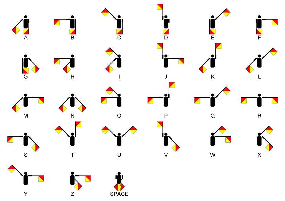
The Peace symbol ![]() is made of the semaphore letters N and D, representing Nuclear Disarmament.
is made of the semaphore letters N and D, representing Nuclear Disarmament.
Toblerone
The Peace symbol ![]() is made of the semaphore letters N and D, representing Nuclear Disarmament.
is made of the semaphore letters N and D, representing Nuclear Disarmament.
Toblerone
The logo of the German steel giant Krupp (today Thyssenkrupp and in big troubles for years like the whole German steel industry) are three steel tires for locomotives, the product the company got big with in the middle of the 19th century.

3 come to mind right away.
Amazon with the arrow going from A to Z because they sell everything from “A to Z”.
Baskin- Robbins with the “31” as part of their logo.
Chrysler and the pentastar representing the 5 divisions, Chrysler, Plymouth, Dodge, Desoto, Imperial.
We’ve been Amazon customers for at least 25 years now and I don’t want to admit how very recently I noticed this for the first time. And I “noticed” it because someone pointed it out to me.
No, they were much better. Saturn made great cars.
Yep, solid cars, very reliable.
We have a full assortment of emoticons to indicate you are kidding, being sarcastic, etc. Since none were used, the poster seems sincere in spreading that myth.
FFS, he called it “their Dark Lord Satan”. That screams satire.
It has always looked like a sperm to me. I can’t help it. Try as I might, I can’t see it as anything else.
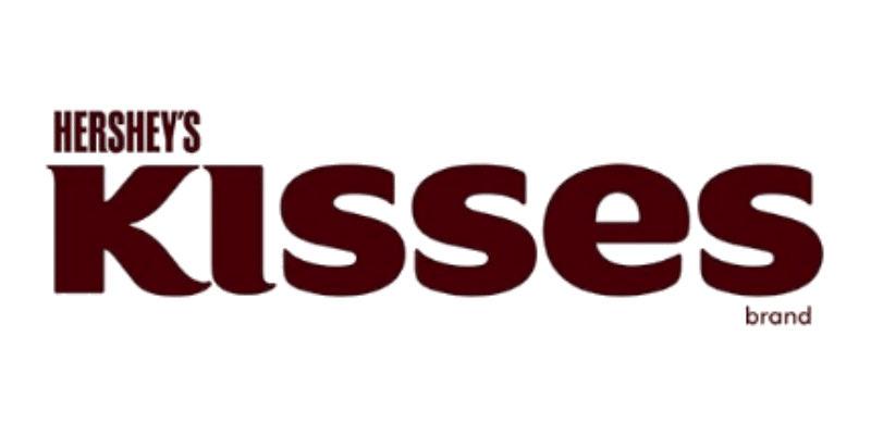
Hershey’s Kisses’ logo looks straightforward until you notice that the space between the K and I looks like a Hershey’s Kiss.
And the physical emblem itself is one of the finest car emblems. Deep transparent red with the rings embedded. Cartier could have made it.
I’m probably the only person not on the design team that spotted this but the logo for Water Tower Square in North Olmsted, Ohio is a stylized version of the square itself. The stores wrap around one corner and the water tower is opposite.
The Goodwill Industries logo is both half a smiley face and also a lowercase letter G.
Took me a moment to see it fully. The whitespace is the character’s ‘fill’.
Cologuard’s is an uppercase C and a backwards G, as well as the obvious.
Thanks a lot!! ![]()
![]()
A lot of cultures have the stars as The Seven [this or that], usually maidens, and some of them have a story about why there are only six now. Astronomers have speculated that long ago, like 100,000 years, Pleione and Atlas were further apart and more splittable.
Railfans refer to that as The Lazy 3 or The Worm.
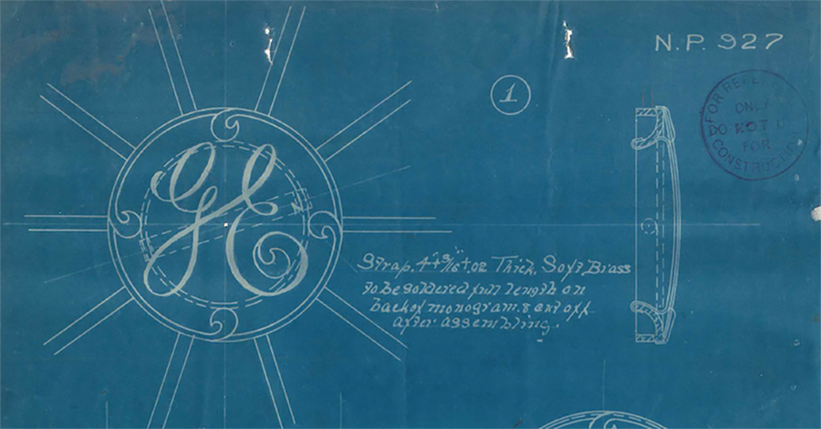
One of my favorites is also one of the most venerable, GE circa 1892. It first appeared on a pendant on their ceiling fans of the time and while the calligraphic GE are obvious the reason/origin of the four intruding ‘dingbats’ as they were called, is lost. A favorite explanation is that they represent the four blades of the fan.
To you. But that was the (bogus) claim. We have had several posters here post things that were UL. Nor has he come back to clarify.
The logo for Ocean Network Express is just their initials, but they lean really heavily into the fact that those initials spell ‘ONE’.

Their slogan is: ‘As ONE, We Can’