The Best of C.L. Moore and Flesh Gordon

When I first picked up The Best of C.L. Moore, back when it was new, it was the paperback edition with a cover by the Brothers Hildebrandt showing a metal-skinned cyborg lady. Last night I found a copy of the hardcover edition, published a year earlier in 1975, with cover by Chet Jezierski. It says so both on the cover itself and at the Internet Speculative Fiction Database. It clearly is meant to illustrate “Shambleau”, arguably her most influential story (and one which I cited in my first book “Medusa”, as an example of modern incorporation of elements of the myth of Medusa).

But… is THAT figure on the right supposed to be Northwest Smith?

He looks like a low-grade image of a 1930’s serial hero. In fact, he looks a lot like…
No, it can’t be.

But then I noticed that weird framing device around the top, and all doubt was removed.
It’s Flesh Gordon. Here, have a look at the original poster:

http://www.emovieposter.com/gallery/inc/large_size.php?lot=0928

“Northwest” has the same blue jumpsuit, the same leopard-skin armlets and gorget, and that winged, eye-balled half-frame is exactly the same.
The film Flesh Gordon came out in 1974. It wasn’t exactly ancient history when the book came out. The book by Catherine L. Moore is a collection of her classic stories from the 1930s and 1940s. Although they have an erotic tinge (and had “spicy” cover illustrations when first published) they have nothing whatever to do with Flesh Gordon. Or even Flash Gordon, for that matter.
The movie poster artist was, according to many sources, George Barr. He and Chet Jezierski were distinct individuals, each with a respectable body of work. It seems weird that such blatant copying of one artist’s work by another would happen. I’ve seen it in cheaper works by lesser publishers, but this seems beneath Doubleday.

I thought at first thast maybe the art department just added the frame, but that would leave Northwest/Flesh still unexplained. I suppose it’s possible they might have just substituted Flesh for Jezierski’s original image of Northwest, but that seems unliklely – the image of Shambleau and he are in the same style.

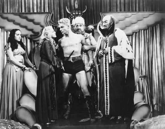
(The image of Flesh, by the way, looks as if it’s copied directly from one of the film stills, although I haven’t been able to find the corresponding still. At any rate, it looks a lot more like the actor Jason Williams than the guy in the poster does.)

They look different - the face is longer, the eyebrows different, the ears higher and elongated, and the hair lighter in the Flesh Gordon ad.

the pictures look more like Flash than Flesh Gordon. Actually it looks like Buster Crabbe playing Flash

Flesh is also wearing blue leggings that appear to be of a piece with the body portion of his costume, while the fellow on the book cover is wearing black tights or hose that goes underneath his briefs.

The frame is a pretty obvious copy, but I’d expect something like that to be part of a standard library used by graphic designers.

And, of course, you know the most famous single influence from it… :smiley:

I’ve never seen that “frame” anywhere else. You can see in the Flesh Gordon poster that the "frame has a single eye in the top and bottom, which is, I suspect, a reference to the “Penisaurus” in the film. The same single eye is there in the top of the C./L. Moore book cover, but it’s darker and harder to see. If you realize that it’s an eye, it’s actually kinda creepy. I seriously doubt that it’s any sort of standard device.

As for the costume, as I say, the image on the Moore cover actually looks more like what the costume actually was in the film than on the poster. Take va look here at about 00:32 in:

http://video.search.yahoo.com/video/play;_ylt=A2KLqIXif5pSPA0A0Hf7w8QF;_ylu=X3oDMTEwNm5jNWI1BHNlYwNzcgRzbGsDdmlkBHZ0aWQDVjE0NgRncG9zAzI1?p=Flesh+Gordon+youtube&vid=d425426797a75a31ec4818a204850bc3&l=1%3A51&turl=http%3A%2F%2Fts3.mm.bing.net%2Fth%3Fid%3DV.4620943651701410%26pid%3D15.1&rurl=http%3A%2F%2Fwww.youtube.com%2Fwatch%3Fv%3D5tBZymDhwMQ&tit=Flesh+Gordon+Trailer&c=24&sigr=11a9le5bl&sigt=10kbtd31p&age=0&&tt=b

Besides., the blue costume, belt, and animal-print conical gorget and armlets alone are enough to identify the image with Fleshj Gordon. The idea that the costume and “frame” come from somrewhere else, orf are “generic” is ludicrous.

Nope. Don’t leave us in suspense…

I’m not seeing much similarity either. Flesh Gordon is standard superhero skin-tights; The C. L. Moore cover is definitely Flash Gordon, with the old-fashioned but standard comic strip acrobat costume. The framing borders with eyes are much closer copies and that’s a nice catch. But ti wouldn’t surprise me much if those were both taken from some iconic image that we’ve forgotten today. I can’t even guess how to search for it, though.

Flash Gordon didn’t wear a cape or wrist pieces. And look at those wrist pieces–they’re totally identical on the poster and the book cover. And did you watch the trailer that CalMeacham linked to, with Flesh Gordon in the black leggings? I can’t see why everyone seems so eager to pooh-pooh Cal’s find. Looks pretty solid to me.

Fine, I’ll give you the cape and the wrist pieces. But the book cover looks like detop’s link to Flash Gordon. Here’s a better image. The neckpiece (there’s undoubtedly a technical name for the front part that hold up a cape) and the belt are dead ringers for one another. I find that far more of an homage. The costume in the movie trailer also looks like a reference to Buster Crabbe.

And what about this Flash Gordon image? That wing isn’t all that far off from the frame border.

If two pieces are paying homage to the same earlier image, it’s not a surprise that they have similarities. Cover art gets wiped all the time. In that era Doubleday was not a big name; IIRC they put out fairly cheap editions aimed mainly at libraries. But this wasn’t even one of them. It was an original published by the Doubleday owned Science Fiction Book Club. (Which is where I bought mine.) Putting cheap, swiped art on covers wasn’t “beneath Doubleday”; it was the norm.

It’s a simple disagreement of opinion, nothing more. He sees it, I and others don’t. Disagreeing is what we do around here. It’s SOP.

Yer reachin’. The costume on that photo of Buster Crabbe is nowhere near as close to the cover of the Moore book as the Flesh Gordon costume. Where’s the animal-print conical armlets? The unitard – or whatever it is – is even the same color.

As for “the wing isn’t all that far from the frame border” – You’re dreamin’. The frame on the cover is an EXACT match for the one on the poster. No “isn’t that far” about it.
Thanks, Biffy, for the show of support.
You can always disagree on the Dope Board, but I really do have a hard time understanding this show of skepticism in the face of near identity.

The hero on the CL Moore book cover is the spitting image of Flesh Gordon. It much more distantly resembles Buster Crabbe’s Flash Gordon. It’s not even close. Ludicrous, as Cal says.