The Mexican flag isn’t great, either. But in practice, it’s a red-white-green tricolor with a splotch in the middle of it, and you can learn that that’s Mexico. There’s at least something. Illinois is just a splotch on a white background.
I don’t think there’s any “instead” about it. The big problems they’d be solving without changing the flag, they’ll solve with changing the flag, too, and the big problems they’re currently ignoring, they’d ignore without changing the flag. It’s not like choosing a flag uses up so much time and energy that they don’t have any left over to deal with global warming, or whatever.
Some so called ‘flag experts’ think any flag with a State seal is a bad one.
I have a flag question. The five colors of the Olympic flag rings were selected as at that point- 1913 iirc- at least one of those five colors was in every nations flag.
IMO, as a resident of Illinois for the past 35 years: it’s ugly. The artwork has always struck me as extremely amateurish, as though it had been created by a 14-year-old using Microsoft Paint.
And if you look at Latvia’s flag, it has a red-white-red horizontal tricolor. But the shade of red is very dark, almost brown. Very close to the same shade as Qatar’s. Not the same as the Olympic red.
If an Illinois is to include some sort of device or devices, at least one of them should be a narrow yellow triangle, curved on the hoistward edge, with two or three red circles embedded, to evoke the pizza Chicago is famous for.
The center of the Mexican flag is its most striking feature and what has now become the Mexico coat of arms. It’s a powerful-looking Golden Eagle, perched atop a prickly pear cactus, with a snake in its beak and talons. What’s the meaning behind this imagery? It goes back to an Aztec legend that foretold the founding of Tenochtitlan, the capital of the Aztec Empire. In ancient times, the gods told the Aztecs that they would find the perfect place to build their city when they saw an eagle on a cactus, eating a serpent. They spotted such an eagle – right in the spot that is now the main plaza in Mexico City.
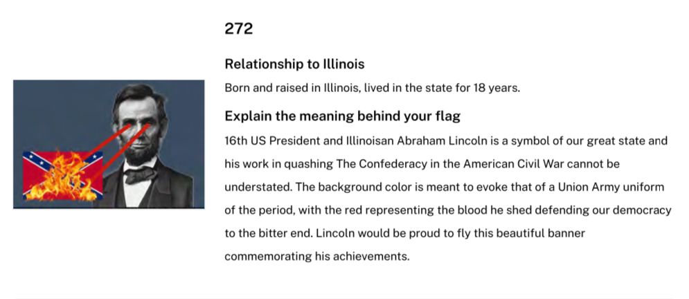
No; I don’t think Illinois has official colors, but if we did, it would be navy blue and orange, the colors of both the State University and the Bears. I would be inclined to go with the butterfly design, just because it was the only one that got that right. But honestly, the current flag is so bad I’d pick any of the ten contenders over it. None of them are anywhere near as awesome as Laser-Eyes Abe Lincoln, though.
Supposedly there’s going to be a vote this month on these flags. I assume this will be an online vote, but I can’t find any info on where it is. Anyone know?
One of those contenders is not that different from the current flag. It got rid of the state’s name at the bottom and then added some blue and red stripes on the edges. The text claims it eliminates the seal-on-a-bedsheet look. Well, that’s true, but it substitutes a seal-on-a-beach-towel look. Not a great improvement.
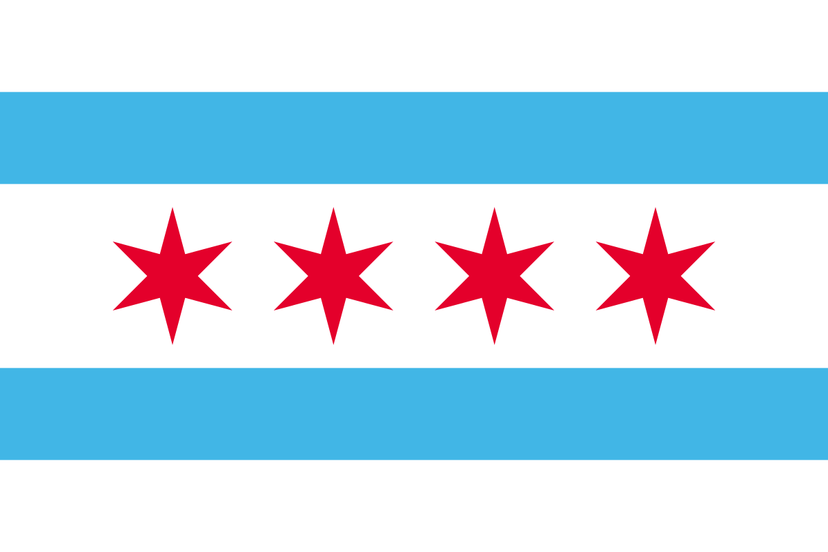
Well, it’s not something that comes up in conversation with me, but it’s ugly as shit. Meanwhile, the Chicago flag is absolutely gorgeous and what a flag should strive to be. There are very few state flags that are not pieces of poorly designed trash. Not that I’ve ever thought about it or have strong feelings or anything.
Nah. It’s pretty. Does everything a flag should do: be distinctive, be simple enough for a fourth grader to draw, be recognizable from a distance, have meaning. And I like the abstraction of the two branches of the Chicago river, and the four stars signifying historical events in Chicago history (they were thinking of adding a fifth star not too long ago for some reason … and that’s yet another cool feature, the ability to update the design when something of great enough significance happens here.) It’s absolutely perfect. (And I have to wonder how you didn’t see Lincoln’s profile immediately in that one flag design. It’s not cleverly hidden like the FedEx logo you mentioned. It’s right there! Then again, we Illinoisans are used to seeing Lincoln’s visage pretty regularly, so I suppose we’re conditioned to see it. Not a fan of that flag at all, though. The white negative space is so distracting and pointless.)
When it comes to state flags, I think New Mexico wins; Texas is absolutely solid; Arizona is cool; Colorado is cool. And I love Ohio for its wacky shape with sound graphic design.
Yeah, it’s a solid flag design. There are a few states that are better, but there’s definitely nothing wrong with it. And that’s especially impressive, for a city flag: Usually by the time you get to city flags, you have to accept something pretty messy to keep it distinctive.
I’ll agree that New Mexico is top-tier, but I think I’d put Alaska in that category, too. Both of them, if you showed them to someone who didn’t know state flags and asked them to guess what they’re the flag of, they’d probably be able to get it right.