The “Old but Stripes” flag was some cranky old man saying we should just add stripes so we can re-use all the old flags and something something wasteful government spending. I assume it attracted votes based on that demographic versus “Our old flag really needs a couple of stripes”.
While some of the options were serviceable and I would have been okay with, none really made me say “That one!” despite thinking the current flag is… not great. So, sure, change the current flag but none of those options made me want to rally around it or vote daily for it.
Yeah - Chicago flag is classic. Stupid me, I still think of myself as a Chicagoan, despite only my 1st 2 decades in Chicago followed by 4 in the burbs.
Curious, I looked up to see if my burb had a flag. It apparently does, but damned if I’ve ever seen it. Gonna have to keep my eye out… Instead, the “seal” is pretty ubiquitous. I had assumed that image would be on any flag.
And to your second point, more voters chose a new flag over the old one. It would be interesting to see how it compares to the top 3 ‘others’ throwing out the one that is the current one with “Illinois” removed. Ore they could have had the vote to pick the best new flag then have it go head to head with the current flag.
Just out of curiosity, I found this site listing flags for several municipalities/townships in my count. Take a gander if you wanna see some truly horrendous flags!
Wow, my mind hurts looking at some of those. Too many graphic artists and not enough Vexillologists.
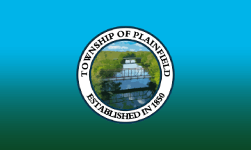
Oh, wow. Plainfield has a flag that looks awful but was “never used”. The flag for Plainfield Township, where I’m at, looks like someone played with a digital camera for ten minutes in 2004 and called it done.
That’s not a real flag!
Yeah - some of the look like they were designed as banners for a “Taste of” celebration or something rather than actual flags. Likely not reliable at all. For my city, the description of the seal does not match the image. Also, like I said, I’ve never seen the one purportedly for the city I’ve lived in some 12 years or so.
Same here. I don’t have an issue with what’s depicted on the Illinois flag; my issue with it is that the art style is, IMO, really ugly, and to my eyes, looks as though it was created in MS-Paint in 1995. (Yes, I know, it actually dates from the 1860s.)
Cleveland, Ohio now has a “people’s flag” which organizers are hoping will eventually replace the current flag (which looks like France’s, but with the city seal on it): https://www.cleflag.org/
Interesting colour choices. I wonder if @Kropotkin will approve. 
They are also (quite possibly not coincidentally) the uniform colors of the Cleveland Guardians (formerly the Indians) baseball team.

Intended more, I think, to evoke and compliment the U.S. and Ohio flags.
Very nice. IMO, better than all those Illinois proposals.
To this outsider it looks like s mashup of anarchist and various Middle Eastern flags.
That was my reaction as well. I would not have picked it out as an American flag.
Yes, it’s a step in the right direction.
Yeah, I’d probably agree with this sentiment. My only issue with the Clevelend flag is that, at least on my monitors, it’s a little bit muddy with the red against the dark blue. My eyes want a little more contrast or separation (like in the uniforms you have the outline of white). Not sure I like outlines in flags, though, so I don’t know.
As another Clevelander, I have to say that I don’t really care much at all about the Cleveland flag, one way or another.
And in reading about this, I learned that the suburb where I actually reside currently, Lakewood, also has a city flag, but the articles mentioning that fact are the only places where it can be seen, at all: It doesn’t even fly at City Hall.