I can’t seem to find a picture of the original cover for CJ Cherryh’s The Pride of Chanur - it’s hilarious to me that she’s been mentioned elsewhere in this thread. Now, it does technically portray a scene in the book - so there’s a naked human dude with a bunch of cat people. But god, it’s humiliating to be caught reading.
I saw that cover a few weeks ago when I was looking at Duane’s work on Amazon. I assumed I didn’t want to read it.
YES, I judge books by their covers! I ADMIT IT! ![]()
There’s actually occasional sex in the book. But it isn’t at all explicit and certainly doesn’t involve naked women kneeling in front of a guy with a sword.
I can handle explicit sex, but yeah. That cover is more Gor-ean than sexy. ![]()
Urras and Anarres comprise a binary planet system, orbiting each other (though Anarres is smaller). Each appears as the “moon” to the other. Residents of both can see “dystopia” in the sky. All this goes with the deliberate paralleling and interleaving of perspectives throughout the book.
Well, yes, that’s wrong. Urras is the mother planet of the Cetians, and Shevek is from Anarres. But given the unfamiliarity of binary planets, the mirrored perpsectives, the nonlinear structure of the narrative–I can see how somebody could get mixed up. It’s still unacceptable, of course.
I can certainly understand that; I’m just saying that, in that particular case, it might plausibly be a case of ignorance rather than active racism.
Then again, though, even if the race of a character isn’t mentioned at all (and in many books, it isn’t), then one could just as plausibly depict the character as black, and I suppose that happens much less often than it statistically ought to. It sort of reminds me of a time I once saw someone complaining about the Lord of the Rings, that there weren’t any minority characters in it.
I meant what I said about that particular book literally, that I did not see the cover until I had the finished book in hand. (Admittedly, the entire history of that project, from the first contact with the publisher to that ending, was one of those horror stories that authors tell when they want to play “can you top this?”)
All publishers have different policies, and all genres have different customs. But authors almost always get covers crammed down their throats. I’ve never been involved in or consulted about a cover. I’ve never seen one even as a separate piece of finished artwork - obviously long after any comments could be made - until right before the book’s release.
“8-9 months ahead of the release” astounds me. Can I ask what type of book this is?
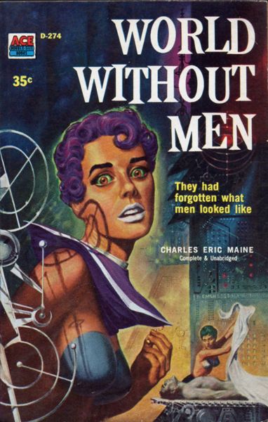
Back on subject, it’s always fun when the art department tries to use sex to sell sf. It goes back forever too. Charles Eric Maine’s World Without Men from Ace is a hoot. Love the lipstick. And if anyone can figure out how the bra on the background woman stays up without an anti-gravity device…
Same way it does on the foreground woman, I expect.
Maybe they are anti-gravity devices.
Novels for children, publisher is Random House. They have advanced copies about that time anyway, so the cover’s not a secret anymore. They do ask me what I think, but I know that the answer is always “I love it!” (For the record, I do like all my covers, especially the new one).
Incidentally, I get a kick out of your username. Love Harpo.
Bra? I thought that was paint!
Children’s books seem to be a different world. I’m still surprised they have that much of a lead time.
Like your name, Exapno works because I don’t have to be the one that spells it for a quote. ![]()
Cherryh must have pissed off a cover artist or cover editor or something. My copy of Fires of Azeroth is the one my link rips into.
The arms of the girl in the second one are…confusing. I can only assume Helen Parr was the model.
I think your timetable is off. Science Fiction covers (especially paperback ones) back in the 1950s and 1960s frequently had little or nothing to do with the contents, but by the 1970s the reverse was the case – the covers were usually relevant, and were commissioned specifically for the work in question. Compare Larry Niven book covers from the 1960s, for instance, with those from the 1970s.
Not that they don’t frequently just slap a science fiction-y cover on, especially in the case of anthologies. I have a UK edition of Jules Verne stories that uses as its cover a drawing obviously intended for Arthur C. Clarke’s Rendezvous with Rama.The book came out in 2000.
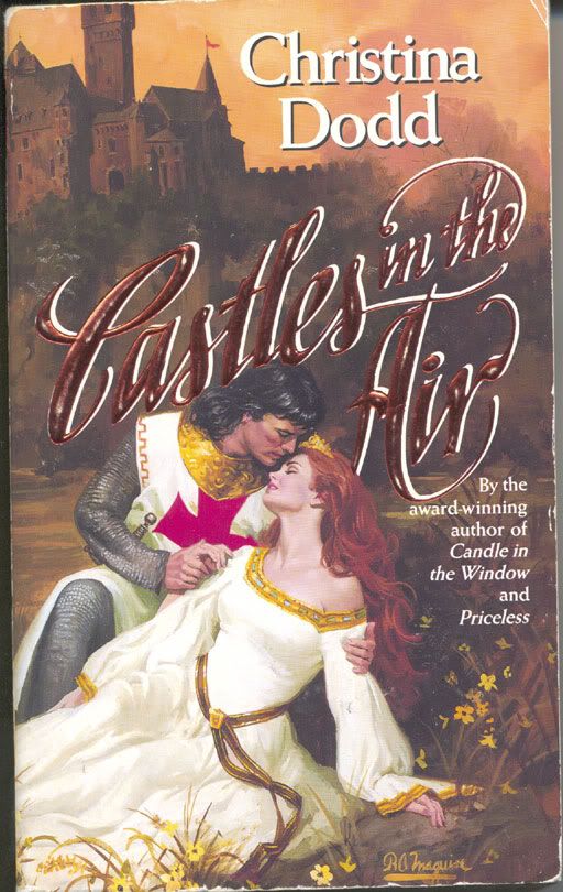
Wrong skin color, blur, sexism … all bad, but not surprising errors. How about the wrong number of appendages? And not for some alien or fantasy creature, but for a regular human?
Witness the horror of Castles in the Air, by Christina Dodd.
(I know romance novel covers are usually quite awful, but this is in a category all by itself! Poor Ms. Dodd. But she good-naturedly embraced her publisher’s embarrassing error and successfully sold all copies of that original run, so she’s the one laughing all the way to the bank.)
I have a paperback version of Star Trek stories (it’s one of a dozen novelizations). The cover depicts the TOS Enterprise whisking around the planet propelled by its three rocket engines - you know, the fire streaking out of the two nacelles and the fire blazing out of the engineering hull (where the shuttle bay is). Another one shows the Enterprise landed on the surface of a planet.
I laugh every time I see them!
That’s one of them 3-D eye thingies. Stare at it long enough and a rabbit pops out at you. ![]()
Actually, Podkayne is specifically described as being a pale blond, looking Nordic, and it strong contrast to her Maori uncle who is dark as night. Characters in the story even comment on it.
Some snooty women on the space liner are snarking when she isn’t around, commenting about the old black man and his white “neice” wink wink.
That’s the first collection of James Blish’s rendering scripts as short stories, which came out while the series was running, and called simply Star Trek.(The later ones had numbers appended to them)
As I’ve pointed out before on this Board, the cover is simply the promotional art that NBC came up with for the series. They ran it on TV to promote the show, and in places like TV Guide. It’s not the fault of some cover painter – it’s the decision of NBC execs, who thought people would be confused if a space ship didn’t have jets spurting out the back – even if they were coming out of space-warping nacelles and the shuttlecraft bay.
This page claims the artist was James Bama, and reproduces the poster:
http://drexfiles.wordpress.com/2009/06/24/james-bama-american-realist-first-trek-publicity-artist/
Quoth CalMeacham:
Not actually inconsistent with what I said, though I hadn’t realized that the trend towards relevant covers started so long ago. I just knew that old books I read often had irrelevant covers, and new books often had relevant ones. When I get home, though, I’ll check the dates on some specific examples.
Quoth Irishman:
Either it’s been way too long since I’ve read that book, or the copy I got had that edited out, because I have no memory of that whatsoever.
I reread it a couple months ago.