Yes, nothing sexy about naked women kneeling in front of men! Heaven forfend anyone should think such a thing!
One mistake on that site: The Get Smart cover is by Jack Davis. I can even spot an illegible signature in the lower right-hand corner.
This cover for Michael Flynn’s Falling Stars is pretty ridiculous. Those space suits are hilarious. The novel takes place in 2017. It’s realistic, near-future hard science fiction, which does feature astronauts working in low-earth orbit - but not wearing spandex bodysuits with glass domes for helmets.
Not a mistake – you didn’t read carefully enough. To quote from that very page:
No offense, but I don’t see how that’s “not actually inconsistent”. Relevant paperback covers became pretty prevalent in the 1970s. I can cite plenty of examples – the whole Ballantine/Del Rey The Best of… series had custom covers, always illustrating one or more of the stories. The Ace covers for the Heinlein juveniles, all by Steele Savage, werre relevant. All of the Larry Niven covers after about 1970 were relevant – Protector, Ringworld, etc. In fact, they made a very determined effort at Del Rey to not only put relevant covers, but also illustrations inside the covers.
Presented without comment (because everything I want to say is incoherent or obscene): Children's Atheneum: Covers That Appeal to a Twilight Generation
“Bella and Edward’s Favorite Book” is rather absurd, but what’s wrong with putting a rose on the cover of a love story? Roses have been a symbol of love since pretty much forever.
I nominate the first edition of Stephen King’s Carrie, which depicts a foxy-looking, heavily eyelinered chick who cannot possibly be the lumpy, awkward outcast Carrie White.
I’m also not keen on the original cover art for King’s The Stand, which seems to imply that the book is about a battle between Luke Skywalker and some medieval guy wearing a commedia dell’arte mask.
OK, on looking over my book collection, I see that there doesn’t actually seem to be any correlation between age of the book and how relevant the cover is: Some old books have bad covers and some new books have good ones, but there are also some that go the other way around. My 1983 edition of The Stars, like Dust, for instance, has some sort of weird… spaceship? that appears to be mostly keel and that looks like it’s falling apart (clearly just a random sci-fi-ish illustration that the publisher attached to the book), while my 1991 edition of The Caves of Steel clearly depicts Lije and Daneel in the corridors of New New York. On the other hand, though, my 1975 edition of Space Cadet shows a group of folks in pressure suits and magnetic boots holding a tether on the outside of a ship (a scene I’m pretty sure was in the book), and my 1991 edition of Speaker for the Dead shows some sort of futuristic cityscape, despite the story taking place almost entirely in a small colony town. And then there are some where the cover art was clearly based on the story, but not very well: For instance, Flatlander shows Gil and his “imaginary arm”, except that the imaginary arm is coming out of a real sleeve, and he doesn’t have his real arm on that side.
In my collection, as I say, older books often don’t have covers with much connection. A 1960s edition of Niven’s World of Ptaavs has a shadowy silhouette – with two glowing eyes, so it can’t be a thrint. A somewhat later copy has a “symbolic” cover with lots of identical figures – which could’ve been used for just about anything. But in the early 1970s the cover shows two dolphins with artrificial “hands” discovering the Sea Statue, which is clearly illustrating the book.
Most of my 1960s paperbacks (and rare 1950s ones) have abstract covers (like Powers’ “Blobs”), but not all that many of the ones from Bantam or Ballantine or Pocket Books or Signet actually portray anything from the story. (Ace, on the other hand, was ahead of the others. Their Edgar Rice Burroughs series has covers by Frazetta or Roy G. Krenkel that definitely illustrated the story. Their editions of “classic” texts often copied hardcover illustrations, like The King in Yellow, or were original illustrations to Metropolis, l"Atlantide, Off on a Comet, Almuric, Duneand others.)
But after about 1970 the covers seemed to be making a real effort to be relevant to the text. By the late seventies you had people like Darrel K. Sweeyt and The Brother Hildebrand and Michael Whelan and others very clearly drawing covers to match the guts of the books. There were occasional lapses, as I note above, especially with anthologies. But even anthologies tried to have artwork that matched the contents.
See also this edition of Jane Austen’s Persuasion. My reaction when I stumbled across this on Amazon was basically ![]() :mad:
:mad: ![]()
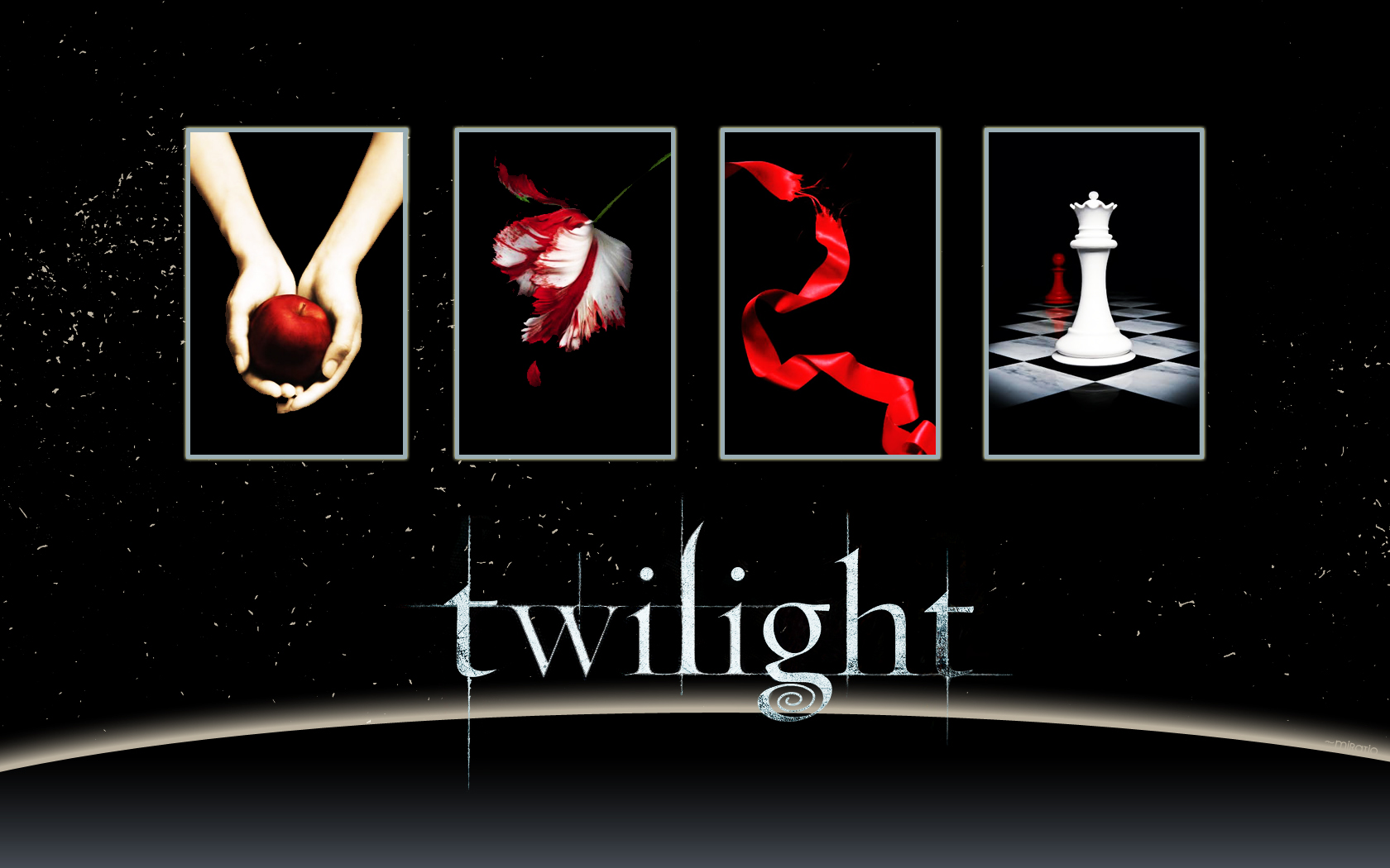
That blogger is way off…there is no rose on any of the Twilight Saga covers that I can see. I just did a search on Google Images…Twilight has an apple, New Moon has a parrot tulip, Eclipse has some sort of red ribbon, and Breaking Dawn has chess pieces.
A Twilight wallpaper with all four of the covers, minus title and author text.
Lamia’s link is actually much closer. It’s pretty obvious that it was modeled after the Twilight cover, with a rose in place of the apple.
Don’t concentrate on the fact that a rose was used for all of them, concentrate on the actual formatting of the covers - a bright red or red/white object on a stark black background.
I love this cookbook cover so very, very much.
So … pictures of roses … not exactly COMPELLING art … the first rose in the series looks kinda vagina-ish … but so do a lot of things. Have you seen the honey-baked ham art?
And? What’s the problem? I don’t think there’s anything wrong with the Twilight series covers–in fact, I think that the Breaking Dawn cover is quite striking and a powerful image.
The problem is that they’re putting out books with covers that “look Twilightty” whether it’s appropriate for the books or not. Possibly thinking that teenage girls are stupid enough to be snowed by it.
You can judge a book by its cover. Almost all genre titles give off huge and instantly perceptible clues about what the book is about. Space. Romance. Crime. Fantasy. Western. A large percentage of the reading audience needs no more than that. If you have to break it down, you can have less clothed or more clothed chicks to denote the level of spiciness in your romance, or have the chick carry either a sword or a huge gun to denote whether it’s fantasy or sf. [Those half-naked creatures on book covers are chicks, no matter how many postgraduate degrees they have inside the book.] Realism doesn’t get a publisher a sufficient extra return to make it worth anybody’s time.
[spoiler]Then there’s You Can’t Judge a Book By Its Cover. The image is too blurry to make it obvious, but that is a real nude with visible nipples. Marvin Kitman was a tv critic and humorist about popular culture. There was a moment around 1970 when real books intended for ordinary bookstores could experiment with putting real nudes on the covers, something that few porn books did at the time. The nude - which is repeated on the back cover as well - has nothing to do with the book. I doubt the cover sold many extra copies because that’s one of Kitman’s least known titles. Too bad, because that’s one of the funniest joke covers ever in publishing.
OTOH, Mickey Spillane’s The Erection Set, featuring a much more visible nude - Spillane’s current wife - undoubtedly sold a boatload just for the cover in 1972.[/spoiler]
Nudes? How about the first paperback cover of “Regiment of Women”?
I couldn’t find a better imageIt certainly made the book easy to find, though the book had nothing particularly to do with eroticism (and the cover is oddly unerotic). But the cover is relevant to the story, which is about a society where sex roles are reversed.
Book covers are marketing. They announce what the book is like, so people can tell immediately. You can tell immediately if a book is science fiction, fantasy, literary fiction, best selling fiction, chick lit, or whatever. It’s like decaf coffee always using green on the box.
Pics or there’s no such thing.
Who was the last person who went broke by underestimating the intelligence of teenage girls?