The irony, it burns.
Heh, now all they need is to add a symbol for a spanner…
I don’t get it.
Look at the tagline…
Then mentally make the gears turn. The irony hits you then.
[QUOTE=Lobsang]
I don’t get it.
[/QUOTE]
If you imagine gear 1 rotating clockwise it makes gear 2 rotate counterclockwise making gear 3 rotate clockwise which makes gear 1 rotate counterclockwise and then problems begin.
That is hilarious. I wonder if it is deliberate.
I’m wondering if it was disconnected in the original draft and someone, perhaps someone not on the design team, forced a change because it wasn’t all interconnected.
Or maybe we’re simply not seeing the third dimension, where two of the cogs aren’t touching at all. i.e. they are al different distances from the viewer.
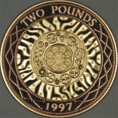
It gets more publically embarrassing than that. The obverse design on the back of the British 1997/1998 £2 coin, represents the then nineteen EU member states, as cogs, interlocking in a ring. Some said it was a subtle anti-EU message.
[QUOTE=jjimm]
It gets more publically embarrassing than that. The obverse design on the back of the British 1997/1998 £2 coin, represents the then nineteen EU member states, as cogs, interlocking in a ring. Some said it was a subtle anti-EU message.
[/QUOTE]
I think you’ll find that the obverse of that coin depicts Her Majesty the Queen, as does most every other British coin. The design you mention is the reverse.
Silly numismatist! ![]()
Bugger. Explains why it took so long for me to find it while doing an image search on “£2 coin obverse”.
Oh man, that’s hilarious. Do their trains actually move, or do they sit there and heat up until they explode?