Today in a handful of change I received, for the first time, one of the new U.S. nickels with the redesigned Jefferson obverse (I hesitate to call it a face). I am therefore inspired to congratulate the United States Mint on its ongoing and highly successful currency uglification program.
I had been somewhat disappointed with the updated paper bill designs, which until recently seemed largely content with their Monopoly-evocative detailing and off-center, slightly more bloated depictions of the Founding Fathers. The higher denominations have since begun to show more promise with the addition of sickly translucent color washes and other comically intrusive anticounterfeiting measures.
The program has obviously been accumulating valuable data through their experimental State Quarter program, which allows them to introduce various combinations and permutations of ugliness and bad taste, and systematically track the effects thereof. The 2005 nickel is the first clear beneficiary of the fruits of this approach.
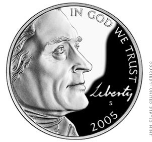
I have lost count of the times that I’ve looked at American currency and thought to myself, “Why this obsession with profile and three-quarter views? Wouldn’t these depictions appear much more interesting and dignified when viewed at a ridiculously close-up nine-sixteenths angle?” At last we have a coin that answers this question. Jefferson’s left eyelash seems to beckon playfully at the viewer, inviting them to ask, “What the hell is that? Is there a bug sitting on the bridge of his nose?”
The 2005 nickel eschews tiresome classical standards of portrature in favor of a more refreshingly populist approach, the “partially decapitated” depiction so familiar to amateur photographers everywhere. This coin suggests that Jefferson is as much a part of the American family as anyone who has ever had the top of their head accidentally cropped out of a wedding picture. It’s gratifying to note that the Treasury is sensitive to the needs of Americans who might find the sight of Jefferson’s large brain offensive.
I note also that, whereas the motto “In God We Trust” and the word “Liberty” were given comparable positioning and identical type in the earlier Jefferson nickels, in the 2005 coin the God motto retains the bold Roman lettering and is right up at the top, while “Liberty” is rendered in barely legible script* near the bottom. I’m sure that’s just a coincidence, however.
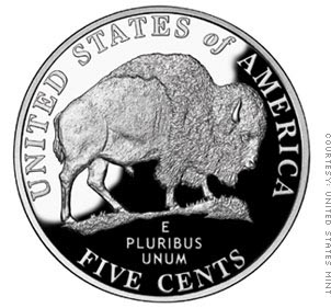
The reverse of the nickel has a bison on it. The bison is male. I have no strong opinion on this matter one way or the other.
In summary, the 2005 nickel is a bright beacon of hope that United States currency will continue to become even uglier and less dignified as the new century matures. But we must not allow ourselves to become complacent. Other nations will not sit idly by and cede the title of Ugliest Currency to America without a struggle. No doubt other countries are even now designing money that depicts their heads of state even less favorably, and featuring animals with even bigger wangs.
The Treasury Department has done a fine job so far, but they need our continued support in this arena of endeavor. There are whole color schemes from the 1970’s that have never been considered for use on paper money! The new one-dollar bill could have a full-face portrait of George Washington lit from beneath like Nosferatu. The penny could have a hyperrealistic closeup of Lincoln that only depicts one wart and a few beard hairs. I would encourage all Americans to consider how they can help to make our nation’s currency uglier.
*Supposedly it’s Jefferson’s own handwriting. I somehow doubt he routinely wrote in millimeter-high script though.


