Is this a trend we should be worried about?
Is this a trend we should be worried about?
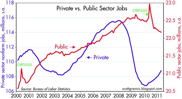
There are about 21 million public sector jobs vs. 109 million private sector, so that’s not what we should worry about.
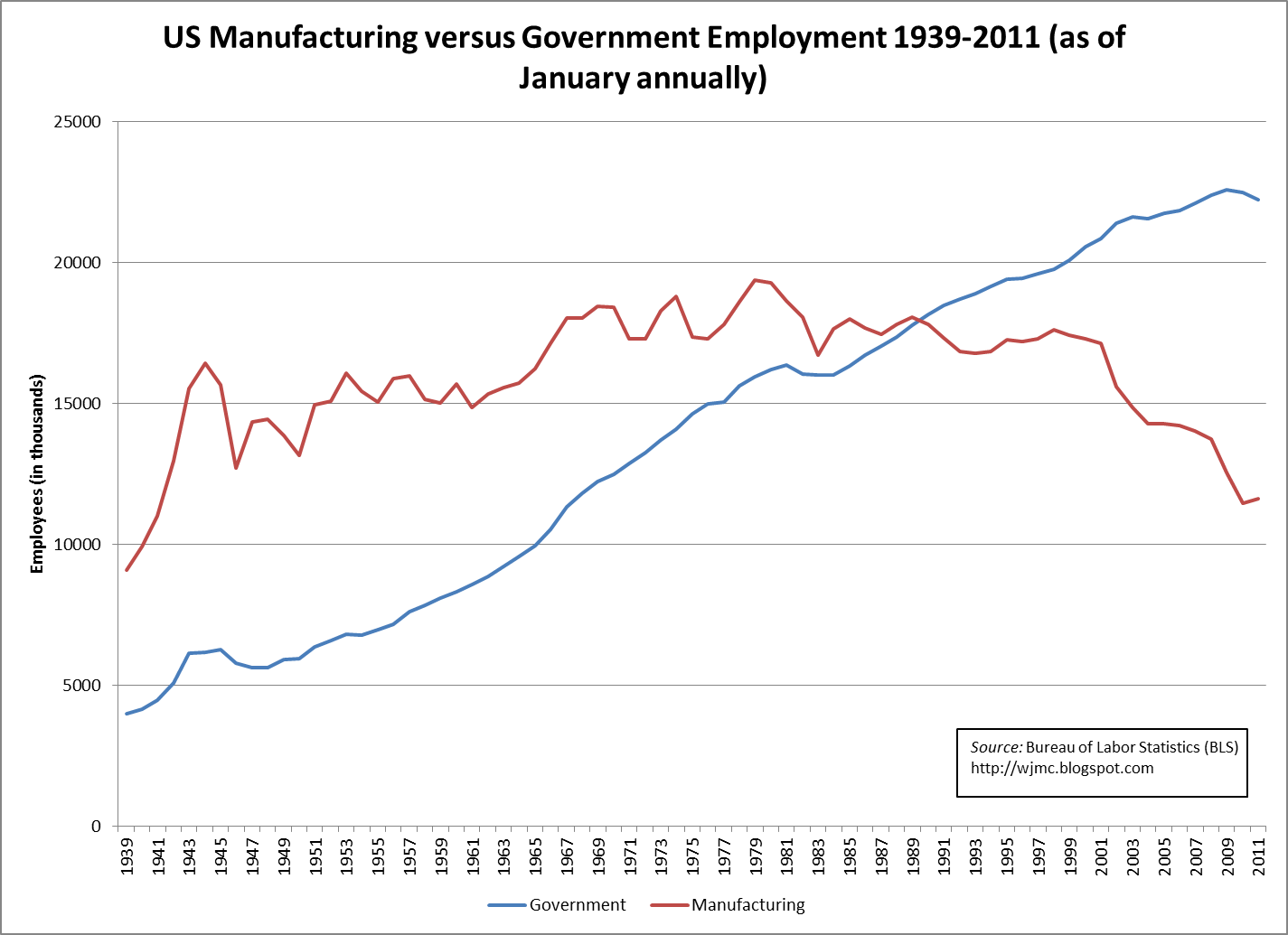
The fact that U.S. manufacturing jobs peaked in 1979 is definitely something to worry about.
I don’t even quite understand what they are comparing, if there are so much more private sector jobs than public sector jobs. One job means one employee, right?
That chart is hard to interpret.
Far more meaningful would be to compare the total number of private sector jobs to public sector jobs. As shown, it cherry-picks a single category, manufacturing, to compare to all public sector jobs (excluding as far as I can see uniformed military). I have no idea what that means.
Frankly it looks like propaganda. People who don’t take the time to read the chart might get the idea that the number of public sector jobs is larger than private sector jobs.So the chart is in that sense misleading.
So the chart says that fewer people are employed in manufacturing than in earlier decades. Partly, of course, that’s because of outsourcing to China, Japan and other countries. But it’s also because of increased productivity. A hundred years ago, agriculture was a big employer but it’s not anymore. Does anyone worry about that?
There is a school of thought that only manufacturing is “real work”, and everything else is basically massage therapists and birthday clowns.
Funny how they don’t plot software developers over the same time frame.