Crocs and Birkenstocks.
Thank you for saying it. I think they look sloppy as hell. I also hate the scrubs I have to wear at work because they are not ironed (I have to change into them once I’m at work). We look rumpled and unprofessional, IMO. I loved the look of the sailors in their (well, I call them sailor suits or Cracker Jacks, I dunno the right name), with their white hats etc. I also liked the Army green (I suppose I am thinking of the dress uniforms) and the AF blues. I don’t like camo scrubs, un-tucked and un-ironed. They’re great for battle and yes, use them there. But I do wish there was something a bit more formal and military looking for civvies…
Cracker Jacks was a completely understandable nickname for the enlisted dress blue uniform. And no one ever doubted that they looked good. It was just certain pragmatic factors that no one I knew liked about them.
From what I understand, the new Navy camos are supposed to replace about 80 different work uniforms they have, making things generally easier (I mean, just imagine how much less weight the ships will have to haul around without the sailors having to pack so many uniforms!), and the reason I heard for them being camo is that various smudges and stains (coffee, machine lubricant, whatever) not showing up as easily and marring the appearance of the uniform.
Yet another reason for me to be bitterly jealous of Aircrew. Do you guys really get issued bomber jackets? 
We really need to take a page from the Nazis’ playbook when it comes to military uniforms.
Capes, death heads, jack boots, that sort of thing?

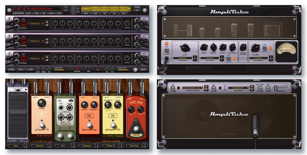
The absolutely worst thing about these awful plug-in interfaces are the knobs. They’re almost always impossible to move precisely. Using these plug-ins properly is all about fine-tuning. Let me just type in the fucking gain value, please. Here’s some more plug-in GUI nonsense:

I don’t know about capes, but everything else looks pretty sharp.
The Rhode Island State Police uniforms (image) look alarmingly similar to the Nazi SS ones. Which is a good thing, because the Nazis may have been evil bastards but they really knew how to design a uniform.
Wow…how did Rhode Island get their Asian AND their African-American resident to join the State Police?
That is the Family Truckster with some after-market mods. It is good for taking the family cross-country but it sucks at off-road stuff.
My contribution is ranch houses. My sperm count drops just a little more every time I see a concentration of them. The only thing worse is the split-level ranch which, unfortunately, some of my wife’s family live in and we have to attend holiday events in some of them. I just ask that people leave the bathroom door or exterior doors free so that I can barf periodically as I take the ambiance in and my stomach starts to churn and I get all dizzy from the implications of it all. To be fair, I have visited some of Frank Lloyd Wright’s houses and I didn’t know if I could even survive let alone make it back to the car. I haven’t been the same since and certainly not in a good way.
No. In his book Culture of Complaint, art critic Robert Hughes spent a couple pages discussing the mascot’s unfortunate resemblance.
Incidentally, is it true that Izzy was so unpopular that he stopped appearing at non-Olympic sporting events in Atlanta after only a short time because he was mercilessly razzed by the fans?
According to this 1996 article :
[nitpick]Correct me if I’m wrong, but shouldn’t that be children**'s**?
[/nitpick]
I liked the design (but the 360 design is better). It made use of the X logo. As far as the weight, it was the only console at the time to come with a hard drive. And you’re supposed to add it to your entertainment center, not play volleyball with it. So, I only noticed the weight for about ten seconds. Then it stayed put until it became outdated.
The only problem I have with the Zune’s appearance is it’s color: brown. Brown as mud. Brown as feces. We can’t totally blame Microsoft for that, however. I’ve been out shopping with my fiancé, and apparently someone decided that chocolate brown is the hot, trendy color these days. You see it in clothes, bed sheets, upholstered furniture, everywhere. And not a single one of those items looks good.
Obviously, the fashion guru who made this decision is of unsound mind, and needs to be locked up immediately, for the chromatic safety of the American public.
Oh, I don’t know. Chocolate brown satin sheets look pretty nice. Not that I’d actually use satin sheets, but they look pretty. I was actually considering painting a couple of walls in my dining room chocolate brown. It seems to go nicely with either pale blue or a soft lime green. I have placemats with those colors and I like.
I think he compared it to a fetus. A sperm on its way up in the world!
Yes. Good eye.
What?!?!
I don’t think there’s anything ugly about that whatsoever. It looks downright classy. Simple, basic, and yet accented by the little wood panel. I love designs like that. I really wish they made more stuff like that nowadays instead of everything being all curved, swooped, and x-treemed out.
What about the logo for the Olympics in London in 2012? (Although I did like the bit that Graham Norton did on the logo on his chat show. I tried unsuccessfully to find a YouTube video of it.)