Jesus H. Christ on the cross, that’s fucking ugly.
I think design should be stuck in 1979. Despite everyone making fun of that time period I think it was a great time for aesthetics. Things were straight-lined, simple, basic, and with bold earth-tone colors.
[QUOTE=Raguleader]
if only it would actually work with the media buttons on my laptop instead of pointedly ignoring them. VLC is great, except for just minor interface things that made me dislike it and stick with MPC for videos (although I use WinAmp for audio stuff because the interface really doesn’t bug me too much, but to each his own).
Actually, you COULD probably find a more user friendly winamp skin, but then, that’d be one more extra thing you’d have to do to make the program the way you want it to be, and it might just be easier to find another program that does that without the fuss.
[/QUOTE]
did you turn on the media buttons option in winamp
[QUOTE=Ranchoth]
I mean, they’re probably very effective at comfort, camouflage, and overall utility…but goddamn, those are the ugliest things I’ve seen in my life.
[/QUOTE]
My God, you’re right!
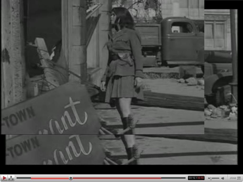
My all-time favorite military uniform is this.
(Elizabeth Montgomery in “Two”, on The Twilight Zone.)
The CW11 logo spells out a not-so-nice word.
I wonder if that was deliberate
[QUOTE=Annie-Xmas]
The CW11 logo spells out a not-so-nice word.
I wonder if that was deliberate
[/QUOTE]
:dubious: Girl, if you see the word “c*nt” in there, you’ve got a heck of an imagination.
[QUOTE=Peak Banana]
:dubious: Girl, if you see the word “c*nt” in there, you’ve got a heck of an imagination.
[/QUOTE]
I don’t, but I’ve always seen CUM. Just put your cursor at the bottom of the second loop in the W.
I said “not-so-nice” not “downright vulgar, nasty, disgusting word that even I never use.”
[QUOTE=Annie-Xmas]
I don’t, but I’ve always seen CUM. Just put your cursor at the bottom of the second loop in the W.
I said “not-so-nice” not “downright vulgar, nasty, disgusting word that even I never use.”
[/QUOTE]
Oh. :smack: I suppose this means that I have one heck of an imagination.
“Cum”, eh? … squints… Nah, your imagination is still pretty good. 