Here are some of mine:
Text:
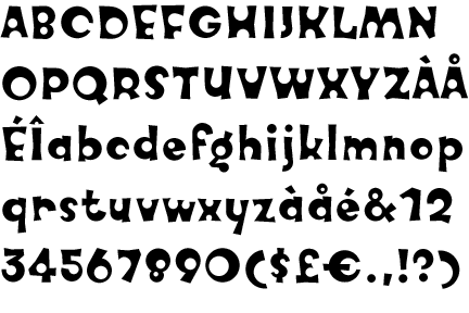
Deutsch Gothic
Fitzgerald
Harrington
Samarkan Oblique
Handwriting:
Angelica
Bud Hand
Maidstone
Psycho Poetry
Dingbats:
Celtic Borders & Celtic Frames
Fleurons
Orient Patterns
Orna1,2,3 and 4
Here are some of mine:
Text:
Deutsch Gothic
Fitzgerald
Harrington
Samarkan Oblique
Handwriting:
Angelica
Bud Hand
Maidstone
Psycho Poetry
Dingbats:
Celtic Borders & Celtic Frames
Fleurons
Orient Patterns
Orna1,2,3 and 4
It sounds weird, but I really like the Arial/Helvetica font family.
Sans-serif:
Verdana, Tahoma, Arial, Trebuchet MS, Adobe Barmeno, Interface DaMa, Lucida Grande
Serif:
Calisto MT
Monospaced:
Letter Gothic, OCR A Extended
Courier, always courier.
I like it when everythings squared away. Yes sir, squared away.
I’m an Arial man - 11 (cpi?), 1.5 spaced, full justification. Not very flashy, but what do you expect from a civil servant.
We used Camelot or some such on our wedding invitations.
Courier, Monofonto, Franklin Gothic Book, Glass Gauge, Westminster, and Eurostile.
Comic sans 11pt Bold Dark Green for everything but “official type stuff”. For “official type stuff”, I use whatever Word defaults to which seems to be Times New Roman 10pt (at least my work’s copy of Word 97 does). Thank God I dont do much “official type stuff”.
dead0man
Matisse & EwieD
Georgia
Verdana (which is what the SDMB uses, I believe)
Garamond Narrow (Apple’s corporate font  )
)
Err… I didn’t mean what you use for, say, viewing web pages. I meant what fonts do you like best. Like… think they are cool or whatever.
I made a buncha thumbnails of my various fonts…
Note: the thumbnails on the page are pretty much the full size of the images, so just go through page by page if you want to see them, you don’t actually need to click on any actual thumbnail.
Mmmm, it’s still Arial/Helvetica all the way for me, I’m afraid; I like the clean uncomplicated look - less is more.
I meant what I said. I dislike all other fonts. Courier appeals to me greatly. Especially when I type a lot and everything is in neat little columns. It’s so neat and organized.
Microgramma Bold. It makes a statement.
I had to laugh when I heard about a font called KnobCheese (was that here or on another board?)- it’s interesting, but not my cup of tea though.
Well I do a lot of graphics… I don’t use those fonts for text applications, I use them for things like this:
tree hugger which you have to admit would just not be the same in Arial or Courier.
Here is something I did using a dingbat font… for the stuff on the silver part: mirror (the starting image was this)
Fonts are handy! Fonts are fun! I wouldn’t ever use anything really weird in a text document though… that would be annoying.
Classic serif: Garamond, Century Schoolbook
Sans serif: Tahoma, Futura (Tahoma’s great in small point sizes. Futura looks good in bold in large sizes)
Fancy: Bard, Viner Hand.
Garamond, Georgia, and Morpheus.
I like my fonts to look clean and not be wholly standard and bland like Times Roman.
I am an Arial guy all the way. Serifs make my eyes twitch.
