I recall some of the old books that the Jehovah Witness press used to put out, and I also recall that you could tell that it was JW just by looking at the font. Does anybody here recall that can tell me what kind of font it was? It was really cool, IMHO.
I don’t have a copy of any of their literature here, or else I would scan it and post it. I am specifically thinking of the stuff printed from, give or take, 1960 to 1980 (perhaps later).
Those old books had a distinctive look and feel, didn’t they? Very plain covers, thin paper, and a distinctive odor when you fanned the pages. I figured that it was because they printed everything in house on their own equipment.
I admit that I haven’t though much about the font. I’ll have to dig around and see if I can find an old JW book. I know I have one or two.
It appears to be very similar to New Century Schoolbook. Part of the distinctive look is that it sets a little wider than we’re used to seeing in magazines and newspapers. However, special faces have often been created and sold for newspaper use. I started to note that this was particularly the case in the era of the Linotype and Monotype, but in fact it’s still common today. So chances are good that the Watchtower folks used one of those, which won’t match exactly a modern typeface commonly found on computers or any of the faces graphic designers know from advertising and job printing.
I’m sorry to disagree with Hengist. It has been more than 20 years since I was familiar with the names of typefaces and then it was mostly from the Monotype series. I would agree that the body text is Century Schoolbook but the headers look to me like the old Gill Sans, (as used most famously by London Transport on their ‘tube’ maps or as you say in the USA, ‘subway’.) Futura became popular in the 1970’s as a slightly more up to date bastardisation of Mr. Eric Gill’s superb original.
P.S. I hope this comment doesn’t brand me as an ‘anorak’.
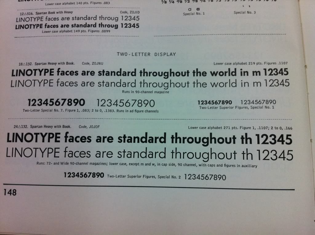
The headings are most definitely not Gill Sans. They are either Futura or Monotype’s equivalent, which was called 20th Century. It’s conceivable that they even came from Ludlow or another foundry, but chances are good that Watchtower was using a Linotype or Monotype machine for such work.
Incidentally, the London Underground does not use Gill Sans, but uses its own (somewhat similar) proprietary font, often called Johnston Sans.
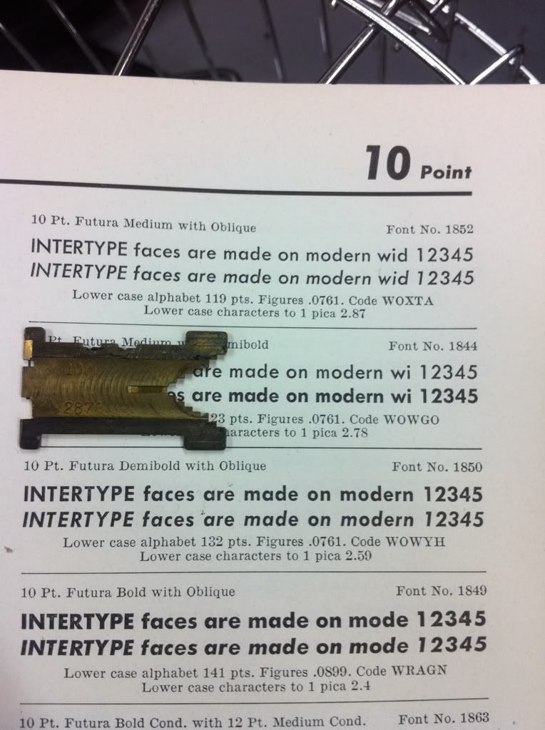
Come to think of it, Linotype didn’t actually have Futura, which was a Bauer font. Linotype’s imitation was called Spartan.
Before the desktop publishing era and Adobe-Monotype-Agfa pooling arrangement, typefaces were proprietary. US law never provided much in the way of patent or copyright protection, but names could be protected under trademark law. So the designer had to know various names (Helvetica/Helios/Triumvirate/Megaron) used by different manufacturers.
Gill Sans is really close, but I’m still pretty sure the headings are Futura or a close Futura-knockoff. The real giveaway is the shape of the vertices, especially on M, N, and W. Other giveaways are the fully rounded G, with no flat before the bar, the M that descends all the way to the baseline and the W that ascends all the way to the ascent, and sloping verticals on the M and W. You can see those pretty well on the sample posted above, and those are features that are very rare on any typeface other than Futura, save modern Futura-inspired faces.
And of course, Century Schoolbook for the body text.
You are correct that Linotype’s version of Futura was called Spartan, but Intertype did sell Futura under that name. I have several magazines of it. The Intertype specimen books I have make no mention of how they licensed it, but they must have managed somehow.