I want to make a fake historical document as a joke, using the font that things were printed in in early modern England. Example: The cover of the King James Bible, and a page from the Bible.
What font is this? Can it be downloaded somewhere? What about the special characters like the long “s”?
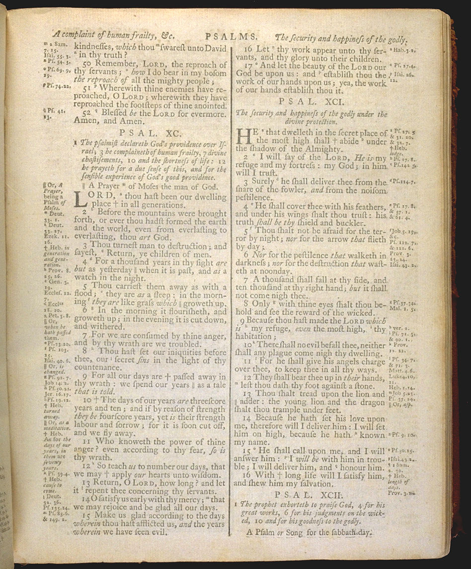
It’s not terribly different from your average Roman face. You can make a jpeg out of a section of that image and upload it to whatthefont.com for a more detailed analysis, but they tend to only find non-free fonts.
Caslon seems to have a lot of variants, but I don’t know the history of typography that well to say whether the two typefaces are variants of each other or completely different fonts. At any rate, you’re right, the two capital letter fonts are slightly different. The capital "N"s look different, too (one is narrower.) At any rate, Caslon would be the right time period (looks like it dates to 1725) and should do well for making a fake historic document.
I haven’t looked really closely on the inside pages, though, although those also look Caslon-esque to me.
These probably don’t include that exact font, but the IM Fell types are good analogues, IMO. They’re based on the typefaces designed by John Fell in the 1700s. You can download them here.
Thanks for all the help. Caslon is a pretty good choice. I missed the opportunity to do what I wanted to do, though (it was going to be an invoice for my boss.) Whenever I send my boss invoices, I make them fake historical-looking letters with antiquated English and “by commission of his excellency” some random European ruler of the 17th century, and a portrait of said personage. (Except for one time when I used Shaddam IV from Dune.) Apparently our accounting department finds these invoices endlessly amusing. I wanted to really make the font look accurate this time, but I had to complete the invoice before I even got any responses so it’ll have to wait until next time.