As seen here.
I just now realized that my prior assumption, that it’s a strange, stylized, negative-space-only depiction of some sort of ribbon is probably not correct. I realized that because I began to wonder why the hell an airline would have such a depiction of a ribbon as their logo.
But what is it? I can’t really see anything in it.
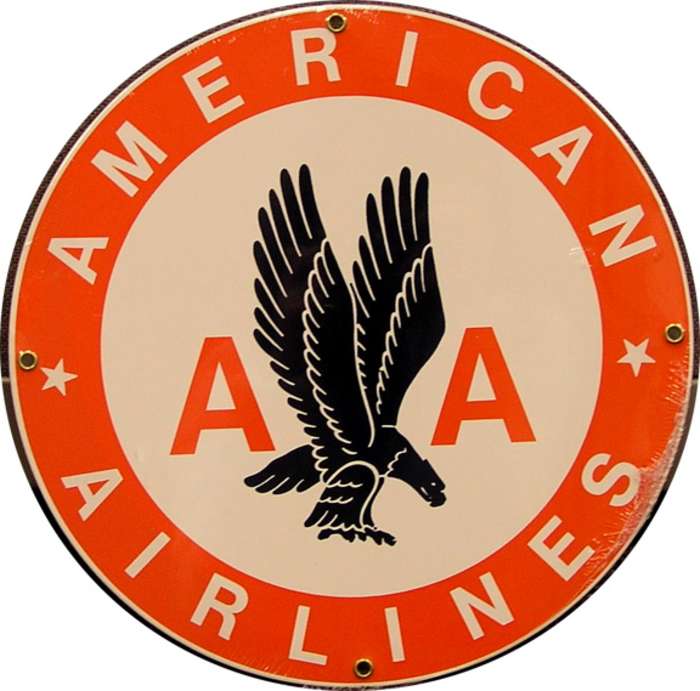
It’s an eagle, between the two As.
It’s a strange, stylized depiction of a bird, probably an eagle. You can see the talons, the head, and the tail, as well as the control feathers at the trailing edges of the wings.
And two big As, but I figured you got that part. 
A bald eagle, to be specific, a popular icon of American culture.
[QUOTE=KneadToKnow]
It’s a strange, stylized depiction of a bird, probably an eagle. You can see the talons, the head, and the tail, as well as the control feathers at the trailing edges of the wings.
[/quote]
Okay, I’m an idiot, but…where? Is the head supposed to be the white bit at the bottom? I just don’t see it.
Indeed, my finely-honed senses did pick up on that.
The white space is the space between the head/nose and the leg foot.
Left of the white space is the head, pointing down with nose, and a slight white eye.
[QUOTE=NinjaChick]
Okay, I’m an idiot, but…where? Is the head supposed to be the white bit at the bottom? I just don’t see it.
[/QUOTE]
Look for the white dot inside the blue part at the bottom left. That’s the eagle’s eye, with the beak below and the talons to the right of that. I think the idea is that the eagle is supposed to be in mid-dive, which has always struck me as rather an odd pose for an airline to use for its logo.
And again, the key word here is stylized.

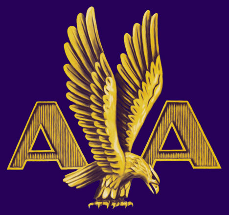
That’s a larger picture, actually from an American Eagle plain, but that airline is a regional subsidiary of American Airlines, and it is essentially the same logo. The different colours on this one might help you see the bird there.
[QUOTE=mnemosyne]
That’s a larger picture, actually from an American Eagle plain, but that airline is a regional subsidiary of American Airlines, and it is essentially the same logo. The different colours on this one might help you see the bird there.
[/QUOTE]
Oh, my gosh, thank you. I see it in that one.
Well, that little bit of the world makes a hell of a lot more sense now.
This one should make it perfectly clear, if no other did.
Clearly an eagle