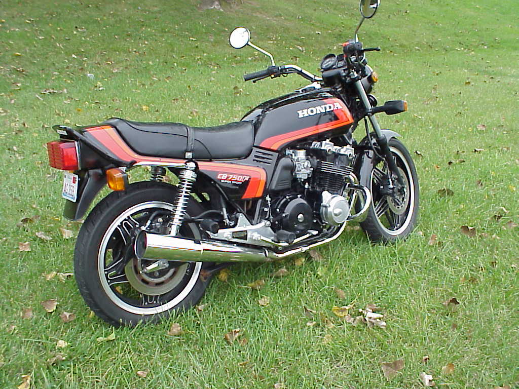
There’s this certain very specific style of stripes - multicolored stripes where the stripes are right next to each other and usually similar colors, or colors that fit together in the same color palette or that are different shades of the same color. Yellow, orange and tan seem to be really popular for this style. Also, the stripes always seem to be bending off to a curve rather than an acute angle, and often culminate in a beveled, round-edged end (like the left side of the red stripe on that truck in the first link.)
When did this style originate? In my mind it’s sort of inextricably tied to the 70s. It seems to be kind of making a comeback in indie rock/“vintage”-themed things like shirts, album covers, etc. Is there a name for this?
my guess is it’s a just a graphic design trend that is closely associated with the time period due to its popularirty then and its kind of campy, ulgy-yet-oddly-appealing character so similar to all that was the seventies (e.g. disco, afros/perms, fly colars, &c.). accent stripes, is what I would call them.
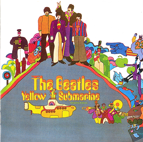
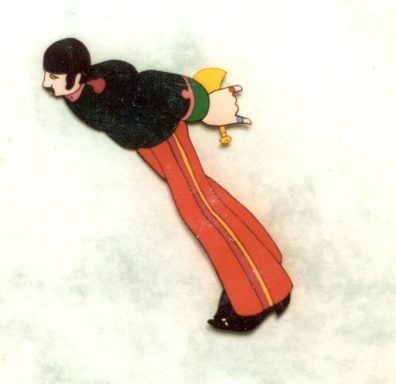
Actually, I believe the parallel stripes thing started in the sixties with artwork by Peter Max, and then the Beatle’s Yellow Submarine (feature-length cartoon).
When an aesthetic filters through to the baseball diamond, you know it’s at the end of its run, whether that aesthetic be parallel-striped baseball jerseys, or goatees.
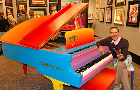
Of course, every played-out aesthetic gets a revival. You can see it in this Peter-Max/Yellow-Submarine-influenced music video from Of Montreal which came out last year.
Reading the thread title I was reminded of the background to the famous Farrah poster.
I have to say that after not seeing this poster for so many years there is something creepy about her smile that I hadn’t noticed before. Of course it’s possible I wasn’t looking at her smile back then.
It’s interesting, because I see elements (or at least echoes) of this style and aesthetic in some modern designs I keep seeing - as discussed in this thread.

