It is not, by all appearances, CBS’ “Didot” typeface. However, my usual fallback, the whatthefont automatic font identification app, is of no use to me, as the best images I can manage are screencaps of compressed Youtube videos taken from 30 year old VHS recordings, and weren’t “clean” enough for the software to process. And sharpening and enhancing the contrast of the images in my paint program didn’t help.
It seems familiar, but I’ve tentatively ruled out any fonts in my own collection. Also Korinna, a number of National Geographic typefaces, and the one used for Diet Cherry Coke in the 80s. But I’d rather not spend any more time driving myself crazy hunting for the answer if someone better in the know might already have the answer at hand.
I’d load it into a vector editor like *Coreldraw *or *Illustrator *(if I absolutely am forced to - bleagh!) and make a clean version of a few of the letters.
Video titlers were just a hair more sophisticated than the lower end of type composition in that era. I used one that would do a range of type modifications from a base font ca. 1985.
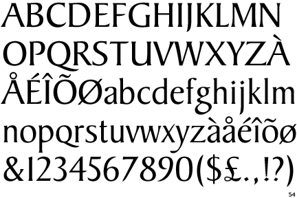
You wouldn’t have had Baker Signet on a Chyron—and certainly not in several weights, plus a dotless i as an alt character, set so tightly that some characters touch.
No, this would have been a “title card,” assembled by hand from Letraset or phototype, that was shot by a camera and then superimposed in the switcher.
As for several different weights, my 1982 RyderType specimen book shows five weights. I’m sure the equivalent shop in New York City had the same number or more.
Kinda famous while not knowing it, The artist that created the simple Coke logo that appears on many cans did base that logo on the Baker Signet font.
I did notice that font and type sites report that Baker Signet was used (implying that it was used as it is was), but when one looks at the “e” in modern cans it is clear that the font was slighttly changed.
It is now mostly seen on the diet version cans and plastic bottles while the company still uses the old cursive classic font, the old “Coca-Cola” logo in regular bottles and cans.