I can’t say every Californian recognizes it as their state flag, but every Californian is certainly familiar with it. Besides flying under Old Glory in front of every government building and post office, the flag is emblazoned on much of our tourist and airport giftshop clothing and tchotchkes. As much as Texas and the Old South likes to express their sovereignty, no other state has had the balls to put the word “Republic” on their flag.
I have never heard the term “Southern Cross” to refer to the confederate battle flag.
The flag of Miss had one version a of the Confederate battle flag in it’s canton and the same arrangement of stripes as the stars & bars, but yes one stripe a different color. The Flag of Miss was basically the stars & bars combined with the later Stainless banner" CSA flag.
Whatever you say it was clearly harkening to the CSA.
And every public school. I can’t imagine not recognizing your own state flag, but then California’s bear is easy to recognize.
Ah - my favorite.
I stand corrected. But the name “Costa Rica” is discreet. One does not get the sense that it is there to help the inhabitants spell the state name. 
If I ever get a coat of arms, maybe it will have a dragon shaking paws with a woman holding a bong and showing a puppy, a maple leaf, and the word: S-M-R-T. That might make a good flag.
A small town near me has recently been making a big deal about their new logo/flag. It is a gear overlaid with an acorn doing jazz hands.
![]()
That was one of the minor problems with the 1956 Georgia flag.
Not the major problem, of course. The major problem was that the legislature added the Confederate Battle Flag emblem to spit in the face of the Supreme Court, and to remind black Georgians that they were second-class citizens. But even aside from the blatant racism of the flag, it didn’t work as a design; the round state seal, wide stripe, and saltire don’t harmonize well. It was an ugly flag in conception and an ugly flag in aesthetics.
My home town unveiled a new flag a few years ago, for the city’s 150th anniversary. It’s probably not one of the vexillologists’ favorites, and is pretty busy in the center.
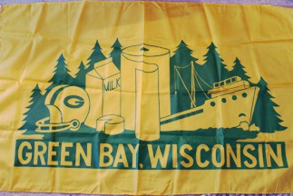
But, it’s better than the flag it replaced (which, as far as I know, is the only civic flag which features a roll of paper towels):
Whatever it was, it was the Confederate Army’s battle flag, and is pretty much THE emblematic Confederate flag.
The actual Confederate “stars and bars” flag was more like if the US Betsy Ross flag (stars in a circle) and the Texas flag had a child. Most people might not recognize it as Confederate unless they already knew what it was.
There’s no rule in that list against it, but my understanding is that vexillologists think it’s bad idea anyway. And yes it is uncommon, but there’s a few others. Some versions of the Argentinan flag are double-sided. Also some country in Central America, but I can’t remember which one. Those just have the seal of either the President or the Treasury Dept on one side and nothing on the other.
As far as the non-rectangular Ohio flag, I can’t recall vexillologists deprecating that. It’s also rare among national and 1st level subdivision flags. I once did a search for them and found only Ohio and Nepal. However, among lower level units (municipalities and whatnot), it’s not as rare. There is one eastern European country where all the municipal flags are swallow-tailed. They probably have a law requiring it.
I’ve seen Oregon’s flag made in one of two ways and both make for a heavier flag. So it doesn’t fly in the wind as easily as other flags. One is simply a double flag, two pieces of cloth sewn together. The other is a single piece of plain blue cloth, with the seal and beaver on thicker and stiffer bits of cloth that are sewn to the single cloth. You can’t see the seal from the back, but you can see the outline of it.
Isn’t the US flag technically two-sided?
Not in the sense we mean here. On the US flag (or almost any other flag without left-right symmetry), if you stick a pin through it at any spot, the pin will be poking through the same color on both sides.
As someone interested in vexillogogy (the study of flags), a lot of American state flag designs are familiar to me. As a Canadian, I am familiar with the flags of all 13 of our provinces and territories and could describe most of these flags exactly (in the case of only 3 or 4 I might miss some small detail).
I happen to think that most Canadian provincial/territorial flags are esthetically very pleasing and that it’s a beautiful sight to see all of them, together with the national flag, flapping in the wind on a sunny day. The reason why I think there are more esthetically pleasing flags among the Canadian provincial ones than among the American state ones is because the former tend to be derived from provincial coats of arms, either having the design of the shield of said arms reproduced as a rectangular flag or incorporating the shield / coat of arms in the design. These heraldic designs follow centuries-old rules that are conducive to harmony and symmetry; not a single one has any writing on it to clutter the design. My favorite is British Columbia’s, with its Union Jack in a chief bar on top, a small antique crown in the middle, and a glorious demi-sun in splendor in the bottom compartment casting its rays as it sets on the blue wavy lines symbolizing the Pacific Ocean. I also love New Brunswick’s flag, with its distinctive lymphad (a kind of medieval galley), or Nunavut’s vibrant flag incorporating Inuit culture but in a way that respects heraldic rules. The provincial flag I’m most “meh” about is Alberta’s, which simply has the shield of the provincial coat of arms on a blue field; it’s perhaps the Canadian flag perhaps most similar to a typical American state flag.
American state flags that I like are mostly those of Southern states: Texas, Tennessee, Florida, Alabama, Georgia, the old Mississippi flag. Or Maryland’s - that one follows the same principles as some of the Canadian flags mentioned above - it’s just a rectangular representation of the shield design of the state’s coat of arms. Alaska’s is also a good sensible design - gold stars depicting the Big Dipper on a blue field. California’s bear isn’t bad either. Am not a fan of flags that have as the dominant symbol the state seal or that are different on one side than on the other. Sorry Ohioans, but your pendant-shaped flag is about my least favorite state flag. I always imagine a bunch of those flying in a row on a cord, facing downwards, with a politician in a boater hat standing below them on a podium and, well, electioneering, to a crowd assembled all around.
I suspect that’s not at all true. While I might not have any idea what’s on Delaware’s flag, I bet most Delawareans won’t have any problem recognizing it. About the only flags I recognize by sight are the south western states, Texas, California, and Arkansas but only because I’ve spent a lot of time in those states. Well, not Texas. I think almost everyone knows what the Texas state flag looks like.
I would be very happy if Congress would pass a law that no state flag could be blue.
BTW the latest iteration of the Georgia State Flag , literally IS the Stars and Bars (11/28/1861 – 5/1/1863 version) with the canton further charged with the Georgia State Seal’s device and “In God We Trust” . Apparently the people in Georgia decided to just quit while they were only slightly behind, after the abomination that was their first attempt at “fixing” their flag in 2001-2003 (even though their pre-1950s flag would have been a perfectly cromulent alternative).
Boys, It’s big enough to sink a Trawler stern first! Damn, that is hilarious!
Normally, I agree with you on most things, but this time you can … be unhappy.
Ironic, since the unofficial state motto is “Alis volat propriis,” “She flies with her own wings.”
Yeah, that’s what I think about Ohio’s flag. It looks like generic bunting. Like for a 4th of July picnic.
And I say that as a descendant of Ohioans.
This is generally true, but I think it’s not strictly speaking true for the Union Jack. That flag has a subtle but notable assymetry in it which, even if you’ve never noticed it before, is a bit unsettling once you consciously see it: The red saltire (representing Ireland) is not centered within the white saltire (representing Scotland).

To my knowledge, this is the same on both sides (“same” when seen from the perspective of an observer looking at the respective side of the flag), so there are points on the cloth that are red on one side and white on the other. By extension, the same is true (on an even subtler level) for the many other flags that incorporate the Union Jack.
That flag has a subtle but notable assymetry in it which, even if you’ve never noticed it before, is a bit unsettling once you consciously see it
Which is, presumably, why came to be a signal of distress at sea if flown upside down: but (also presumably) that may not have been a conscious decision when it was designed and adopted.
Apparently only about half of adults surveyed could recognise when it was upside down.