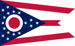
I recall an incident where the Ohio state flag fed into an episode of Obama Derangement Syndrome:
A friend recently sent me a link to a Web site about Bob Grant, a New York City talk show radio host known for his controversial statements. The Web site, www.mediamatters.org, hosts a portion of Grant’s talk show in which he expressed tremendous apprehension that Barack Obama could become president of this country. His reasoning? Obama has taken over the American flag and put an “O” on it to make it his own.
The flag in question was in the background during an Obama appearance in Toledo. Bob Grant, while on air, asked his listening audience to help him understand this “strange-looking” flag. A caller informed him that she was under the impression that this was the United States’ new flag, and because Obama claimed everything was going to change because of him, the flag would be changing as well.
The circle in question was actually the “O” of the Ohio state flag, but was misinterpreted by Grant and his listeners…
I also disagree with “easy to draw” principle, because that eliminates a lot of distinctive flags. Wales and Bhutan have already been mentioned, but what about the US and UK flags?
At best, someone trying to draw those flags will only get a representation of the flag. There won’t be 50 five pointed stars in the proper framework.
The red and white saltires of the union flag can’t be easily drawn either, especially since the flag isn’t symmetrical. Tricolours are boring and not distinctive, but terribly simple to draw.
See, I would characterize both of those as examples of good flags. I don’t like the American flag because of any inherent patriotism (I don’t like our national anthem, for instance), but I think it’s a well-designed flag, with good symbology, graphically pleasing design, distinctiveness from a distance, and pleasing, simple colors.
ETA: Note also that in the “Good Flag, Bad Flag” PDF linked to above, while the US flag is not specifically discussed, every page has a panel of the same flags on it that I presume are all examples of “good flags” of which one is the US flag (heck, our Chicago flag is on it, so it must be good flags. And it seems to go along with all their “good flag” examples.)
The top five are: New Mexico, Texas, Quebec, Maryland, Alaska, Arizona, which actually hits almost all the flags that I like that I mentioned. My other mentioned favorites Ohio was #15, and Colorado #16 (which I said could use some refinement.)
And that’s what takes Maryland over the top. If you read the whole PDF, it basically says at the end rules are made to be broken and points out Maryland’s flag for its distinctive design. Like any type of artistic endeavor, there’s only general guidelines you can glean. Maryland’s indeed, to me, is a mess – I label it as cacophonous upthread, but it “kinda works.” I can’t quite pinpoint what it is about it that works – it’s quirky in all the right ways.
Me, too! I’d save the Berkshire flag for commentary and fly one of the “County Divisions” during February, just as a private, out-dated joke. Staffordshire could be the new “beer flag.”
I don’t think I’d ever heard of the term “Southern Cross” used to describe a Confederate Flag, but apparently the term does go back to the Civil War. I found a 1961 newspaper article that mentions that even then, a lot of people weren’t familiar with the term.
Anyway, a. . .eh. . . ‘popular’ song of the Civil War, “The Southern Cross” was written to be sung to the tune of “The Star Spangle Banner.” Lyrics supplied in this snip. Read at your own peril.
I agree that the Washington State flag isn’t traditionally good design, essentially being a difficult to draw state seal. But I do like it despite that. I think the green and yellow make it fairly distinctive. I too would be surprised by locals who don’t recognize it, I feel it’s fairly prominent.
Slightly related, the thing I find weird is the state route markers, essentially stamping the number on Washington’s face. It feels disrespectful in some way. Example: Washington State Route 522 - Wikipedia. The state’s geographical profile is perfect for a route marker (rectangular, wider than it is tall, distinctive west coast so it’s not confused with one of the perfectly rectangular states). Seems like a missed opportunity.

 And it seems to go along with all their “good flag” examples.)