On a similar note, I was most annoyed when the Washington Bullets got changed to the Washington Wizards. I can’t think of anything more appropriate to the DC area at that time than “The Bullets” other than perhaps “The Stray Bullets.”
Sometimes there are reasons other than marketing or changing to keep a logo from looking dated.
When the Ravens debuted in 1996, their logo was this, a “B” with bird wings. It was later determined to be plagiarized, and it had to be changed to the current profile logo after two seasons. Personally, I like the seldom-seen front-facing logo.
I’m usually opposed to logo changes, knowing it’s mostly just marketing bullshit. I came into this thread expecting to hate the new Sharks logo. But I have to admit, I think it’s actually a good revision. The new look is more dynamic, utilizes the team’s “pacific blue” color better, and gets rid of that distracting outline around the shark.
And now I’ve reviewed the full slate of logo changes; they’ve actually put together a whole suite of logos–full logo, crest only, shield, name type, etc. (You can see all of them at their official site.) Mostly they’re OK. The “primary crest” logo–the one in the OP link–is fine; some of the other versions are trying a little too hard. I can live with them.
I think the key to a good logo revises is, don’t change it too much. That aforementioned 49ers logo change was an utter disaster–totally clueless, had no resemblance whatsoever to the traditional look. You have to keep some tie to the look that generations of fans have grown up with; otherwise there’s no identification.
The general trend for logos these days seems to involve making characters sharper and mechanical-looking. I think that removes some personality, but that’s not the case with the Sharks logo. (Although it does, like garygnu says, sort of have the anime thing going on.) I liked the black in the original, and I don’t really love the yellow eyes in the new one, but it conveys some movement and has shading, which is cool.
Yeah, but how many pirates actually attached their flag to their sword? I’m fine with the flag, and I’m fine with the pirate sword. I just don’t think they function well together. But they look cool together, which is the whole point.
Addendum to the above: the Sharks color–they’ve trademarked it, if I’m not mistaken–is “pacific teal,” not pacific blue. Just so I’m not sued or nothing.
By the way, I read a survey a few years ago in which NFL fans were asked to name their favorite team logo. The Miami Dolphins’ logo got the most votes for “favorite,” AND the most votes for “least favorite.”
Personally, I like the Dolphins’ logo and hope they never change it; I get annoyed by logos that try too hard to look all tough and intimidating. It’s like the guy in the bar who talks too loud about how tough he is; you just know that the guy who sits over in the corner saying nothing is the real tough-guy. (Me, I’m the dude who keeps asking the bartender to turn the music down.)
It’s always bugged me a little that the logo on the dolphin’s helmet is different than the logo on the Dolphins’ helmets. Recursion would be a great little geek joke.
They also scooped out the middle of their name and put a god damned hyphen in its place. These new unis are just horrible. The purple stuff was distinctive, and (IMO) muted enough so as not to look goofy. Now it’s just another red team but with just half a word on the jersey.
The dolphin is wearing a helmet with an “M” on it. Since there was a thread about infinity covers and the like recently, I couldn’t help but flash back to that. I think it would be improved if the dolphin were wearing a helmet with a dolphin wearing a helmet with a dolphin wearing a helmet with a dolphin wearing a helmet…
As has already been pointed out, new logos are usually merchandising efforts.
My team, the Blue Jays, have had four logos. The first - which they wore from 1977 and through their World Series victories - I like because it’s familiar, but it was dated and busier than a baseball logo should be. The next two were abominations. The current one (actually, there’s two now) is better.
Sports fans tend to complain about changes, but to be honest, a lot of logo changes are improvements. The Patriots’ old logo was just hideous; the new one is sleek and cool. The old Mariners logo was cartoonish; the new compass rose logo is very nice.
Actually the Patriots’ new logo reminds me just a bit too strongly of the U.S. Postal Service logo. “The New England Disgruntled Postal Workers” might just the thing to strike fear into the hearts of their opponents, though.
As a rule I hate the new, X-Treme, With-Attitude, Mr. Badass sports logos. But if we didn’t have them, then the vintage stuff wouldn’t be as cool. I think the new Bucs flag logo looks like shit, with a stupid font and stupid slashes and rips in the flag. It looks like it was designed by a high school student with Photoshop.
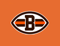
My team (the Browns) don’t have a logo. If they ever tried to add one, there would be an uprising resulting in at least 200 million dollars in property damage. We’re rather proud that we don’t need silly marketing gimmicks like logos, cheerleaders, and winning seasons (ok, so that’s a recent thing) to get us interested in football. They’ve worn almost the exact same uniforms for around 60 years, and I’m pretty biased, but I think they’re the best damn uniforms in pro sports.
They do have semi-official logos (12) that aren’t put on the uniform or any equipment, but do sell on hats, get painted on the end zone, etc. It’s a marketing gimmick to sell non-jersey team related stuff and they’re not very well liked. Usually if they need a symbol to represent the team, they use a side image of the helmet.
Now that I think about it… does any other professional sports team not have a logo?
Looking at the history of my favorite team, Michigan State, my personal favorite is the old fashioned Sparty used in the middle 60s and again for last years ND game. I was surprised at how all the schools used to have numbers on the helmets. The only one I can think of offhand that still does that is Alabama.
Seeing how my favorite baseball team is the Yankees, logo changes haven’t been much of an issue.
How’s that possible, or even legal?
There are 16581375 RGB values, so that would mean that given sufficient resources one could trademark every color thus making it actionable to use a color from nature?
If so, screw the legal system, it has finally gone over the edge.