The San Jose Sharks just unveiled their new logo this morning. (Mercury News coverage, more at sjsharks.com if you’re interested.) It’s a slight tweak on the old one, designed by the same artist.
I kinda like it, but my wife doesn’t. Polls I’ve seen range from 30-50% against the new version.
The 49ers tried to change their logo back in the 90s with near-violent fan disapproval that forced them to scrap the idea.
The Portland Trailblazers were able to simply rotate their logo to make it look better without much problem.
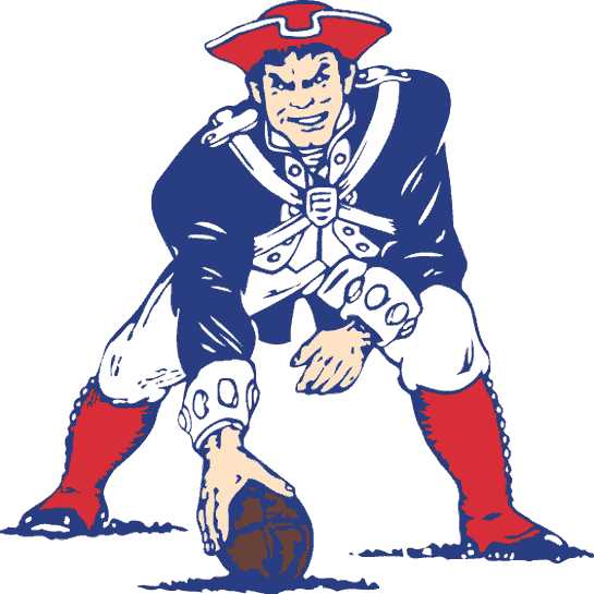
Both the Patriots and Buccaneers drastically improved their logos in my lifetime.
What do you think when a team, particularly your team, changes their logo?
Sometimes, a new logo brings luck to a team- or at least it seems that way. I did this thread about teams whose luck changed after introducing new logos in 2002, the same year the Anaheim Angels introduced a new logo- and won their first World Series. (Now that I think about it, the Mighty Ducks of Anaheim were renamed the Anaheim Ducks this most recent season after Disney sold them and they ended up winning the Stanley Cup.)
It is often about merchandising, but there have been some good examples of logo changes as well. Sometimes, a team is getting rid of a logo which is very dated looking. The Arizona Diamondbacks went from that bizarre purple combination to a more classic looking red. ThePhoenix Coyotes also dropped their odd jerseys to a better coyote design.
One of the best changes ever was the Cincinnati Bengals change from the helments which just said “B E N G A L S” to the striped ones.
It’s all just merchandising. In my lifetime the Cleveland Cavaliers have had at least four logos and have changed the team colors almost as often. The only one that mattered was the change they made in the nineties when they apparently tried in vain to make black, blue and orange look good:
I hated it when my teams changed their logos … but it also created a reverse chic sort of thing where you could be the envy of all the fans in your section when you show up with an actual vintage item with the original logo. Even my mom knows she’s supposed to keep an eye out at garage and estate sales for the standing buffalo and the crossed sabres medallion. Not as good, but acceptable, are the new throwback items featuring the original logos. I will buy things with the new logos, but the threshold is much higher and the item has to be exceptionally desirable and unusual.
I’m less tweaked about the Bills … that change happened when I was a kid, so I’ve had plenty of time to get used to it. But the Sabres, man alive! I managed to pretty much block out the red and black billy goat years, and I (for real) got choked up when the team took the ice rocking the blue and gold for the last game of the season to announce the planned return to the old school. THEN, the “updated” blue and gold design was released … I’m not even kidding (I sort of wish I was because now the SDMB knows what a freak I am) my best friend and I had probably 10 conversations, each over an hour in length, about all the things wrong with the new logo, however ultimately concluding it was better than the red and black and grudgingly acknowledged a few elements that we did like (and of course the third jersey, very close to the original, was quite welcomed).
In closing, yes, I’m fully aware that I’m the leagues’ dream consumer, because I will purchase all this crap.
Change is not always good. In the mid 90’s both the Seattle Mariners and Seahawks updated their logos and saw a marked increase in the sales of merchandise. The Seattle Sonics followed by adding a dark red to their green and yellow colors. The change flopped. They slowly dropped the dark red and are back to the original colors. The Storm WNBA team does used the dark red in their colors, I guess odd color schemes look better on gals than guys.
If you had this as a logo, wouldn’t you change it?
But some teams go with tradition (NY Yankees, NY Rangers, LA Dodgers, Boston Red Sox) while others make changes often (you can see how baseball teams have changes over the years at the Dressed to the Nines uniform database.
For my teams, the Mets have changed their colors a lot (originally blue and orange – interestingly enough, the colors of the Dutch East India Company when they founded New Amsterdam – with black added in the 90s), but their logo has remained the same since they were founded.
The Mets got rid of a tiny “NY” in their primary logo a few years back, but other than that, their primary logo, script logo, and cap logo have remained the same.
I hated it when the Falcons changed their logo in 2003 (new one at top-left of that page; old logo in the photos). I wrote the team an e-mail about it, and the response I got sounds like it came out of a marketing textbook written by someone who’s never heard of Jessie Tuggle:
Translation: “We’re changing it and you can shut up.”
Sigh. I guess they know that people like me don’t need convincing; I’m a Falcons fan and always will be. It’s people who don’t care one way or the other who need to be pandered to.
On the other hand, delphica is right in pointing out that a logo change gives a chance to show oneself Old School by wearing the old one. Bonus points if the jersey is so frayed that you have to wear something under it, and/or bears the name of a once-great player most casual fans have never heard of.
It worked for the Denver Broncos. They changed their logo to the “RoboHorse” logo and changed their uniforms from the Orange Crush style to predominantly blue with an orange stripe before the start of the 1997 season. They won the AFC championship and beat the Packers in Super Bowl XXXII, then went on a 13 straight win tear the following season, once again winning the AFC title and Super Bowl XXXIII.
ETA - And I see you mentioned that in your thread. I’m just gonna go stand outta the way.
A guy I know, a Redskins fan, claims to have the answer to the furor surrounding the team’s logo and name controversy.
Change the logo to a potato. Problem solved.
I’m not a sports fan, but I lived in Tampa when the Bucs changed their logo from Bruce to the Pirate Flag. From a design standpoint, I think it was a great move, Bruce was wayyyyy dated. (winking?!)
From a marketing standpoint, man, I wish I’d been one of their official licensees, because there was a metric crapload of stuff with the new logo/colors all over town almost immediately. It was everywhere: shirts, caps, bumper stickers, car-window flags, everywhere.
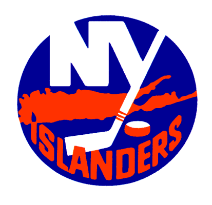
Well, I see that others have covered the not-short-lived enough “Capt. Fishsticks” period that all Islander fans had to live through, among other indignities.

