Yes, a lot of Canadian provincial flags trip up on trying to integrate the Union Jack, heraldry or clunky symbols of the province’s past Oh, and an uncommon amount of yellow which is almost never good.
Quebec, on the other hand, was, shall we say, not burdened with a desire to integrate the Union Jack.
As a native of Indiana, I must give the Indiana state flag its due: The torch, the rays, and the stars, with the largest beneath the arced word “Indiana.”
Flag of the Basque country (Euskadi), not Basque flag. It’s like the difference between “flag of Spain” and “Hispanic flag”. And reported the post behind, which is a spammer.
New Mexico has, hands down, the most beautiful US State flag. It qualifies for most beautiful flag overall, even.
I like Israel, Japan and, yes, Canada. Somalia and Vietnam are good. Switzerland is OK but loses points for being a non-standard shape. Some other ones I like - Bahrain, Quatar and Jamaica.
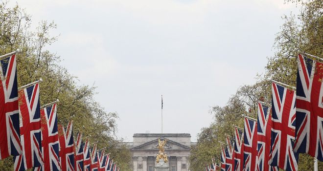
I’d have to agree the Union Jack is a remarkable piece of graphic design, one arrived at almost accidentally. It is remarkably striking.
I’d say all the best flags really come down to two things:
They are in some way distinctive
Without being hideously ugly or complicated
The Union Jack, Canada, Israel, Japan, Jamaica, South Korea and Qatar are all great.
Good, but a bit too complicated, include Brazil, Argentina, Spain, and the USA.
I’m not sure where I stand on South Africa’s new flag. Is is extremely striking and immediately recognizable, but uses six colours, which is symbolically appropriate but really busy. I am fascinated to discover that the man who designed the South AFrican flag, Fred Brownell was also commissioned to design the Namibian flag, which is also a pretty good flag. How many people can say they design TWO countries’ flags?
The design of the South African flag is a hell of s story; knowing a new flag was needed, public submissions were accepted by the thousands and apparently they were almost all terrible. So committees were set up to design a new flag, and of course they worked exactly as well as committees usually do. So they turned to Brownell, who came up with the flag just in time.
It’s weirdly assymetrical and suffers from “flag-on-flag-itis”. I don’t like it.
I think you’re confusing correlation with causation - Britain/UK is considered cool/quaint/popular, so their flag is recognizeable. See the way the US flag, though considered in this thread as a pretty poor design, is also still recognizeable, even when reduced to, say, Captain America’s shield or Wonder woman’s pants.
Hello? Alaska’s flag? New Mexico and Alaska have the only state flags that don’t make we want to throw up. New Mexico has a great flag though, they can hang with Alaska.
But most US state flags are simply gawd-awful, the state seal plastered on a flag. Washington state flag is the absolute worst. In Alaska the Alaska flag is plastered on everything, it really is a symbol of the state. Here you only see the Washington state flag at courthouses and official government buildings and that’s because they are legally required to display it.
I’m looking through the state flags and most of them suffer from being too literal, too detailed, or just plain bizarre (WTF Maryland?) Texas’s flag is cool, and satisfies all my graphic requirements for a state flag. Alaska and New Mexico work for me, too. But I have an oddball love for Ohio’s uniquley shaped state flag, as well. Arizona might make it through to my top five, as well, thuogh I wish the central star was a different color or something. The colors are bugging me out, but I like the general idea. The rest are all terrible.
Lacks symmetry. Also, not visually very striking to me. Some Haida art would have been much cooler. Look at theirlovely flag (I’d only use the centre bit, though, the outside ring is too busy IMO).