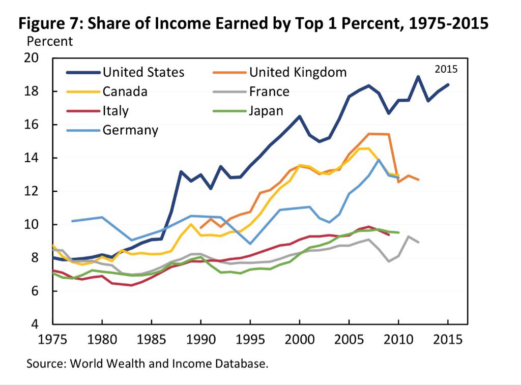
I just saw this graph on twitter. It is take from page 24 of this this Whitehouse report on the effect on the effect of AI on inequality.
My first reaction has nothing to with AI. It is the sudden cliff in the orange line that represents the UK. The top 1% suddenly owned a significantly smaller percentage of the UK economy in 2008 to 2010. What happened to the UK in 2009? I am guessing it is something to with the economic crisis, and the UK governments reaction to it (nationalization of RBS, maybe?) But whatever it was it was something that did not happen in other major economies (the US economy became more unequal in that time), and I have never heard of it.
Is this just a typo on some Whitehouse policy wonk’s spreadsheet, or is this did this actually happen.
Note that this graph is about income, not about ownership of assets. So I would assume it’s simply that bonuses paid in the financial industry (which constitutes a huge factor in the British economy) were cut severely as a result of the financial crisis.
This page on the Equality Trust’s website has a more thorough treatment of the subject, and I think the main takeaways are that (1) the drop is a mere blip in the historical inequality trend; (2) the drop came after an unprecedented rise in income inequality; (3) yes, there was a loss of income at the top, and apparently a rise in social security income at the bottom.
It suggests to me a lot of the 1% in Britain either work in the financial industry (“The City”) or have mainly investment income - all hurt by the big crash. By contrast, the USA not so much, as it has a lot of people more isolated from the financial shenanigans; the people like Bill Gates and other silicon valley billionaires, heavy industry and manufacturing CEO’s, oil industry, etc. This wider base, while affected, were not hit in such a big way.