Film was no where near as good as today’s films. The films with the best colors where slide films. Print films didn’t have the color saturation and contrast we now expect. Print films became decent in the late 80’s and very good in the early 90’s.
Also, this was years before Photoshop – all tweaking had to be done manually during the printing process. This is much harder and time consuming. Some publishers did invest the time and effort to make photos look good (think National Geographic), but most didn’t have the time, money, and/or equipment.
Finally, the best slide films were not every sensitive to light. ASA 25 or 50 was typical then. This was not a problem in bright sunlight, but getting good looking photos under low light conditions we difficult.
Most such “good” movies have been preserved in climate-controlled vaults and probably digitally enhanced today. The fading of dyes, especially magenta IIRC, is a common problem. Photos and movies look washed out and reddish-orange.
Comercial photoprocessing was also often crappy. I recall for example taking a bunch of photos of Niagara Falls to be developed. Viewing the falls, the water was a bright light blue-green - the photos came back a muddy brownish green. The colour averaging of the unit basically made a guess and guessed wrong. Our wedding photographer send a few major prints back to the custom studio several times to reprint with slight corrections to the colour balance. Things are so much simpler with photoshop.
There were and are special movie films. Most films were shot on negative film stock and then a positive print made for viewing. Often, color saturation and exposure was adjusted during the printing, much like what publishers would have done for photos.
Have you every looked at a single frame of a movie? It looks awful. The eye averages many frames greatly improving the perceived quality.
In the 70’s and 80’s there were companies who bought the unused ends of movie film reels and packaged them in 35mm cassettes for photographers. You sent the exposed film back for development and they sent you negatives, slides, and prints. I used a few roles of these films. The negative/print quality was poor with low color saturation and poor resolution. I still have the negatives and slides I took then and just scanned a few. The negatives don’t clean up well and the slides are fair.
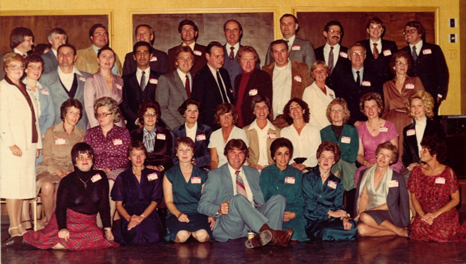
Wow, the patina of those photos really brings out the flesh tones of all those shirtless Brooklynites.
Wired has a recent articleon photos from the 1960’s Gemini program:
*There’s something about old photographs. The perfect combination of faded light, outdated coloring, and nostalgia seems to make them more beautiful with age.
Perhaps that’s why this collection of images from NASA’s Gemini Program is so great. The Project Gemini Online Digital Archive, released this weekend by NASA and Arizona State University, features high-resolution digital scans from the original Gemini flight films.*
The second to last one of Buzz Aldrin is my favorite. Great color and a clean, sharp image - not bad for a 50 year old photo.
Interesting, I found the exact opposite. I’ve been scanning my negatives and I’ve found the Seattle Filmworks (movie stock) pictures held up much better than my Fuji and Kodak (non-movie stock) negatives. Ditto the slides. Agfafilm negatives seemed to have aged as well as the movie stock.
Yes I know that Kodak made the Seattle film, but it wasn’t Kodachrome, and I believe it didn’t use the C-41 process either.
What scanner are you using? I have the Canon Canoscan 9000f and I tend to use the Scan Gear (Scanner driver) over the simplified Navigator EX.
Thank you so much for this link. Truly astonishing, and thoroughly beautiful. Am I being a perfume ponce by thinking they look a bit more ‘analog’ and warm for being on HD film?
I’m also picturing the technology of a 50-year-old camera. The kind you’d buy in an antique shop. And people were floating around in space with that kind of thing.
The 1980s, when those pictures come from, was hardly the dark ages of photography, but it did predate digital cameras, which means that those web pics are all scans. Most likely, a good deal of contrast and sharpness has been lost in the scanning process, and nobody thought it worthwhile to goose things up again with photoshop.
There may have been changes in what is considered fashionable stylistically too, but as far as the technology goes, I thing you are seeing the deficiencies of cheapish 21st century scanning technology rather than of 1980s film technology.
Actual physical prints, if well kept, would probably look a lot better, and, of course, those prints were designed to be looked at on paper, and not on a glowing screen with a glowing background.
Old Technicolor movies can look like new relatively easily because they were made with separate black-and-white films running concurrently through the movie cameras using colour filters. Since Technicolor movies are black and white, all that’s required to restore the colour are new, or even undamaged old filters, to make new prints. The brilliant Wizard of Oz and Gone With the Wind were made in 1939 Technicolor. There’s nothing like black and white to preserve colour.
The use of negative-film dyes killed the relatively expensive Technicolor, and those dyes, like those used to make prints, change and fade. So a colour movie using cheap dyes in the '70s and '80s was anything but state-of-the-art. Because these movie negatives, not just the prints, are color-shifted, expensive digital manipulation for each frame would be required if such a movie was to be reissued to look like new.
This site, The American Widescreen Museum, discusses colour movies through the decades, among much else. Scroll down for the “Development of Color Cinematography” heading on the right. The site’s Technicolor history is here.
In addition, a printed photograph may be damaged by acidity and/or lignin in the photo paper itself, or in the backing and matting material in its frame. Acid burns are yellowish brown.
Kodak has a big problem with faded prints for a long while back when. I think it started in the 1960s and lasted well into the 80s. There was a lawsuit and everything. I think they had a slogan like Kodak pictures last a lifetime or some such and that hurt them.
I’ve tried Googling for more info but Google no longer is useful for a search like this. Way too many hits that don’t even come close.
I think it depended on the quality of the film. The snapshots that look yellowish was taken with cheap cameras with cheap film. I’ve seen Kodachrome photos that look like they were taken yesterday.
NASA used 6x6 Hasselblad cameras shooting 120 (medium format) film. That’s why the space photos look so good. That equipment is still used by pros today and will still provide a higher-resolution image than any digital camera.
I think it’s prints, primarily. Not that I’ve seen a lot of 1960’s era negatives reprinted on modern paper, but I have seen 1960’s and 1970’s color prints in the 1970’s, 80’s and 1990’s in my grandparents’ photo albums, and there was a marked loss of quality over time; the colors got strange and they tended to lose contrast.
I did some side by side comparisons of pictures taken from the early eighties and the prints I scanned looked very bad compared to the scanned negatives. The colors had a strong shift to the brown.
They’ve faded a bit, but they still have reasonably bright colours, especially the two taken at night time. However, I have other slides from that period that now are pretty worthless because the colours have faded badly and unevenly.