Am I alone in feeling that 1960s-1970s photographs have a very rich look to them in terms of the colors? What I mean is, take a look at the following photographs; notice how vivid and vibrant the greens are; how each color bounces off the other in certain ways; there is a very distinct artfulness to it that is missing in today’s photography, which comes off more “processed” or lifeless in some ways due to the digital color timing. The colors may not be as accurate as what one would get out of today’s camera, but there’s a certain rich livelyness to it.
Like I said, look at the greens, the blues, etc in the following photographs (taken different years in the late 1960s and early 1970s and processed in different labs at different times). There is a certain look to them, a certain color palette (I don’t mean the clothes) that you don’t really see in modern digital photography. The fact that pictures aren’t as vivid/full of fine detail as modern photographs adds to the artfulness of it.
All your examples look faded to me. They may have been OK when taken, but weren’t digitized until long after. Dyes fade and change with time; I recall Kodak warning about this on film packages.
If you really want to see vibrant colors look at slides taken in the 60’s. My grandma loved everything about photography and was always taking pictures or movies when I was a kid. The slides she took are amazing. Even the pictures we had transferred from the slides are vibrant and sharp. I’m not sure why these pictures/slides are so much better.
Those don’t look like Kodachrome colors to me. They look like absolute crap. If you want to do that to your photos, there’s plenty of nostalgia type “filters” that will give you that desaturated, faded, color shifted look. I’d guess they’re Ektachrome and scans from prints made with C41 negative film. And the color balance is just awful, especially that last one. I suspect that last one may be in the scanning and the skin tones don’t look like the Simpsons on the actual slide. (That one actually does look like it might be Kodachrome, but just badly scanned.)
I should also add Kodachrome is especially resistant to color shifts and fading. The chemical process used to develop it (K-12 and K-14) is much more complex than tradiotional slide chemistry (E-6) and, without getting into details, it’s much, much more stable.
We were also a slide-taking family and people are often astonished when I show them our slides from 40+ years ago because they look like they were taken yesterday, even the Ektachrome ones. The colors still look absolutely true to life.
It certainly will depend on storage conditions, what specific Ektachrome emulsion was being used, and how it well it was processed. A lot of my dad’s old Ektachromes have faded and blued a good bit. The Kodachromes don’t seem to have any issues. Looking online, it seems to vary wildly, with people reporting Ejtachromes from the 60s and 70s having faded and color shifted toward blue and/or magenta, and others reporting no color change whatsoever.
I know less about photo preservation than magnetic tape preservation, but based on that experience, the differences can be from not only the original chemical balance in the batch of film and the chemicals used to develop it, but storage conditions – heat, light and air exposure.
Yes, which is why I mentioned it first. (The interesting thing is that even though Kodachrome is far more stable and archival than Ektachrome in normal storage conditions [like put away in a dark shoebox], it actually is more sensitive to bright light, such as if you left it in a projector, it will show signs of fading in a hour, whereas an E-6 emulsion doesn’t show fading until two-ish hours.)
Here’s the research on page 176 in terms of Kodachrome’s dye stability. It is by far the best of all the films in dark storage, but the worst of all the films in projector stability.
So don’t leave those Kodachromes in the projector, folks!
They’re all just (bad) scans of photographs. I sadly do not have a single pre 1990 negative (and even after that, very very few negatives at all). My family never understood the value of negatives. I have one single silver nitrate negative of my grandfather in 1945. That’s it.
I get the photos scanned and touched up by a professional nowadays:
Irrespective of any examples, it depends on the photographer and somewhat on the film/other media used. A skilled photographer could have used whatever stock they were using to get the desired effect. A digital photographer can get very close to the color balance of an old film if they want to, and it’s much easier to control saturation in the digital era.
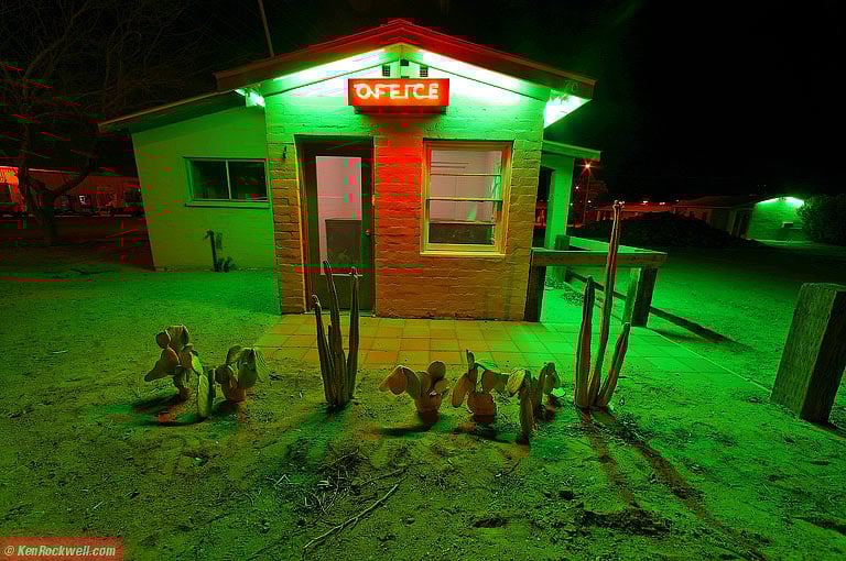
As an easy example, here’s a night shot of Ken Rockwell’s that shows what you can do with just a digital camera. Here it is before he did anything in Photoshop (and even then, he just corrected the perspective, the color was fine).
If you want low-res, then grab a low quality camera. The low-res quality of some older photographs isn’t because they used film, but because they used tiny pieces of film, and shot at high ASA/ISO (high light sensitivity). The images in the OP mostly look like they were taken with an instamatic camera of some type, that had a really small image area, that usually got loaded with 200ASA and above, often 400ASA. That’s grainy even loaded in a 35mm with a nice glass lens, and instamatics often came with not-so nice plastic ones. By the time you blew them up to 5x7, they were getting kind of blurry. You can get the same sort of effect if you a none too great modern camera, such as the one on my phone (it’s a good phone, but not a great camera). For example, this image I took of shadows during the eclipse. It’s extra low-res, because I made the camera do that, but there’s no reason digital photography should always mean super-sharp with perfectly balanced color.
-Scabpicker, who’s still just 6 hours short of a BFA in old-style photography.


