Date in the filename, but you’d never guess by the photo! I think I have run across another in this series on wikipedia somewhere that also made me go WHA?!
Date in the filename, but you’d never guess by the photo! I think I have run across another in this series on wikipedia somewhere that also made me go WHA?!
Looks like Kodachrome. Reminds me of this series of Kodachrome photos from WWII.
The world changed incredibly between 1913 and 1963. But 1963 was thoroughly modern. Many styles have stayed in constant use, like blue jeans. A basic hat, no facial hair, and a khaki shirt are timeless. And you’re also looking at that picture with a western eye. Somebody from that culture might understand more subtle cues of difference that would scream 60s!
There’s a biplane in that picture. Doesn’t look modern to me at all.
If by “modern” you’re asking why the picture doesn’t look aged or faded, it’s almost certainly because it was developed from a well-preserved negative with some digital enhancement. I’ve seen older photos, even ones from the 19th century, that looked so sharp you’d assume they were taken with a digital camera with a B&W filter. My father’s current wife has a photo of her grandmother from the 20’s which looks exactly like her, right down to the modern-style sweater and pants – yes, her grandma was a rebel.
Old pictures look old because they are black and white, grainy, low resolution, or, if they are color, the color is somewhat faded and unrealistic. That picture has none of that.
They had good, high quality cameras and film by WWII, but the film and the cameras were both big, clunky, and expensive, by modern standards. There are plenty of really good pics from back then, though, such as the Kodachromes that Machine Elf linked to.
I don’t see any obvious reason it couldn’t have been taken in 1918. (There may well be details of the uniform, plane, or color process that indicate it is later, but detecting them would require some specific knowledge.)
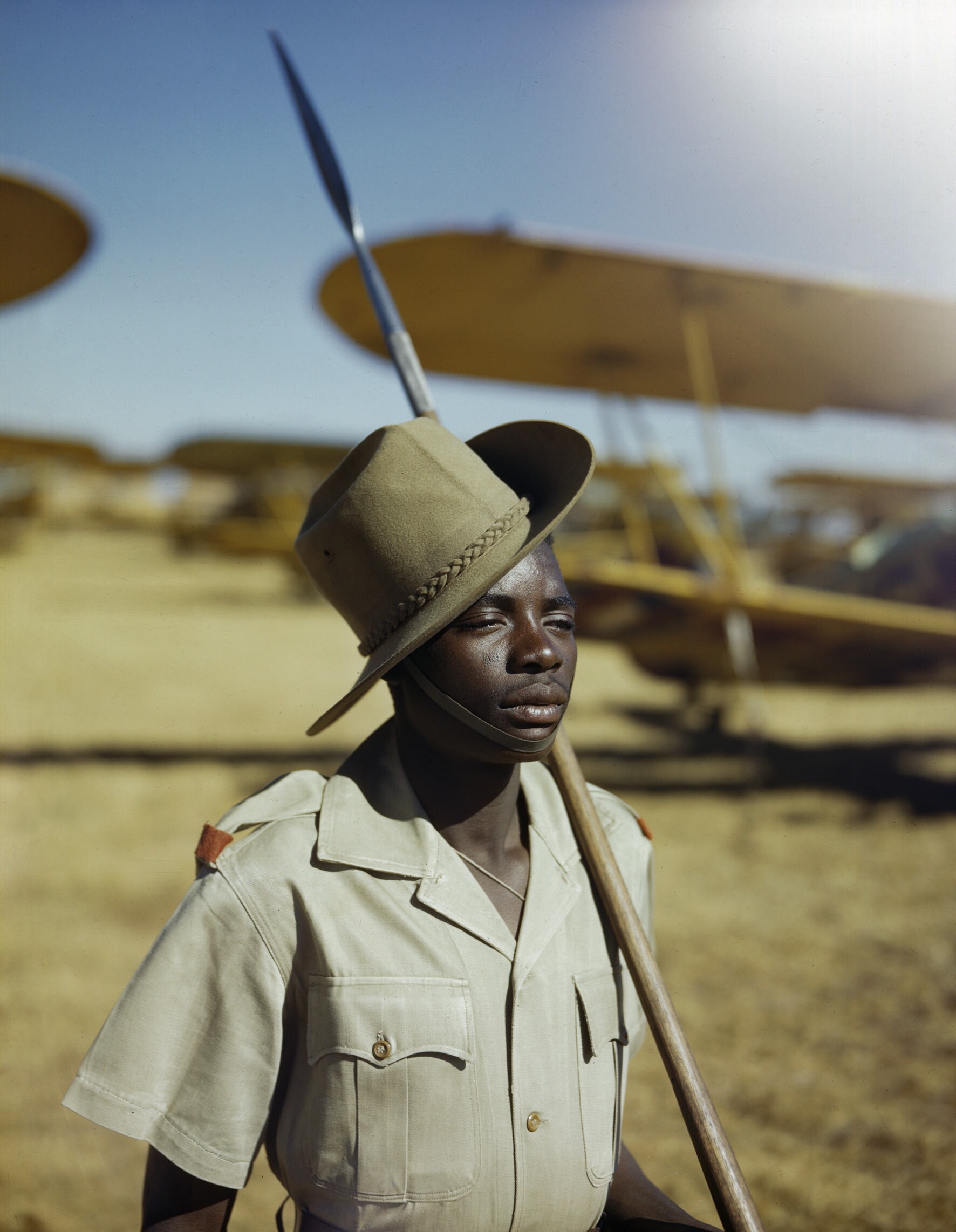
It’s a 1943 photo. But, yeah, the biplane gives it away. Those Kodakchrome prints from WWII really show how good and stable that emulsion was already in those days. Kodachromes are known for their archival longevity and use a different, much more complicated chemical process than standard transparency/slide film. With Kodachrome, the color dyes themselves are not in the film itself (as with the typical slide films), but rather in the chemicals used to process the film. I don’t know that much about the science of film emulsions, processing, and archiving, so I can’t tell you exactly why this produces more archival transparencies.
I’ve never looked at Kodachromes that old, so I couldn’t say how much color and density correction was involved in scanning the original, but I can definitely tell when looking through my father’s slides in the 60s and 70s which were taken on Kodachrome, and which were taken on Ektachrome, as the Kodachromes showed little color deterioration, while the Ektachromes would fade and shift colors.
A soldier armed with a spear, guarding biplanes, so modern? :dubious:
I imagine the color and contrast might have been goosed up a but electronically after scanning, but it may not have been necessary.
The photo has a very shallow depth of field (i.e. the background is very out of focus). This is a standard technique in portrait photography, to isolate the subject and blur the background. But it’s unusual for news & press photography. This may be one reason this photo looks more like a modern portrait than a historical photo.
Ok that is some mind blowing stuff there, wow. I have seen family photos and portraits from WW2 era and none look like they could have been taken last weekend, like this:
Oh and to clear up, the subject of the photo and his weapons and fashions and what he is guarding are not what I was speaking about. It is the whole look of the photo itself not the subject, the color and definition and detail just scream modern to me.
Hell as Machine Elf has shown I was just ignorant on what good era photography could accomplish, I’ll admit it.
I’m sure you’ve seen many photos by famous photographers like Ansel Adams from that time or earlier.
For example: Church, Taos Pueblo, 1942
Sure but I can’t find any that really look modern, here is one of a person I found quickly.

Beyond the black and white it doesn’t compare.
I saw the 6/63 in the URL and assumed that was the date. Should have scrolled all the way.
The rest of my comments still work. No matter how great the color is in those 1940s Pavel Kosenko photos, we instinctively think WRONG as soon as the hairstyles and clothes and makeup register. Without those cues - and anyone could stage a biplane shot today - we’re more likely to make the assumption that an undated photograph is contemporary. We’re incredibly reliant on known cues to help us make sense of the world and we seldom realize it.
Yes, I was going to suggest that very reason.
But, as others have said, it doesn’t look very “modern” to me. It reminds me of the kind of photos that were in a 1950s encyclopaedia that belonged to my father which I used to read as a kid, called something like the “Wide World of Wonder Colour Encyclopaedia” or something equally hokey. It was full of pictures of natives in far off parts posing for the camera.
Yeah, Kodachrome transparency film coupled with large format (4"x5" in most of these cases linked to), along with good lenses will reproduce remarkable detail, possibly moreso than any digital camera today (even medium-format backs.) At any rate, it’s far, far, far, far more detail than you’d pick out in a web-sized photo. If you’re used to 80s-era point and shoot camera shots taken on 35mm negative film, printed by some guy at the local drug store or whatnot, who may or may not have taken great care in color correcting the print to begin with then, yes, you’ll be really surprised at how crisp and colorful those photos from even the WWII era could be.
Heck, check out some of these from a century ago, pre-Kodachrome. Most do have somewhat of a dated look to them, but the one of the woman in the forest especially looks to me like it could pass for modern.
Well, shallow depth-of-field is pretty common in editorial, too. See: sports photography. And it’s not at all uncommon in the news section, either. Lots of telephoto shots with soft backgrounds in news, too, but wide angles do tend to be favored for that “in the moment/action” look to news.
(However, that photo does seem to have a shallower depth-of-field than you would expect from a modern 35mm camera with an equivalent focal length and framing.)
It looks over-processed to me. Her top is a vivid blue but the edges inside her elbows look like someone got a little wild with the Saturation or contrast controls. Some of the others look over-adjusted, particularly for sharpness. Some of this may account for the impression that they look modern.
That’s the keu. A lot of what we think of as “old photos” were probably family portraits taken with a brownie camera. Even if not b&w, they lack sharpness. I had a moderately good point-and-shoot 35mm; the first time I had prints made from my first digital camera (the Fuji 4900z which had 2.4Mp sensor but produced 4Mp pictures) I got sensory overload. 4x6 pictures, especially, were what I described as “painfully sharp”. The level of detail from the “auto” setting was what you’d expect from a really really good 35mm. (It had better be! I’d never paid $1200 for a camera before) I suspect the pictures were taken with either a high quality 4x5 (negative size in inches) or an incredibly expensive 35mm, or maybe a 120-format (2.25-inch-square). The bigger the negative, the sharper the picture.
I think that’s the difference. Ignoring the styles and black and white, hair and clothes, etc… While there are plenty of very good very sharp properly coloured pictures from 60 or 80 years ago, we typically do not see them. News photos more than anything tend to have motion blur from being opportunistic rather than posed shots. Because of second-hand reproduction, copying issues, etc - the majority of old pictures, and a lot of new ones, are not the quality they could be.
The other most important indicator is colour. We associate b&w with old, sepia with incredibly old. Even not-to-old colour pictures (60’s or earlier) the colour has shifted significantly due to pigment dye fading. There’s a brownish, faded look to old photos and old film. When we see clear, sharp, properly coloured photos, it screams “brand new”.
This, the last sentence in particular. We are not conditioned to think of a clear, sharp, naturally-colored photo as being from earlier than perhaps the 1960s. But they do exist, all the way back to at least the 1920s.