I work at a Montessori kindergarten and we’re expected to use it for anything the children will read. This is because the lower case a looks like the a they are being taught to write, not like the hooked a of most fonts. Personally I prefer Century Gothic, which also has the round lower case a and which I believe looks more like the letters they’re meant to be learning, but I was outvoted.
When I get a mail in Comic Sans, its usually some chain letter or some “fun” events which I hate.
I don’t dislike the font by itself, but the contexts in which it is used frequently rub me the wrong way.
Exactly. I answer e-mails from geneaologists all day. We have three or four who write exclusively in Comic Sans. Two of them have e-mail backgrounds. One does it in purple.
Comic Sans makes people think you are stupid or writing for seven year olds.
Yes, I do know it was designed by a kid, if that’s what you’re trying to say. Although I’m sure they could find a better-looking “cartoony” font than Comic Sans. I like the design, but the Comic Sans sticks out like a sore thumb.
While looking online about Comic Sans, I found this brief documentary that was done as a student project, loosely inspired by the documentary Helvetica. The most interesting part to me is where they take well-known corporate logos and change them to Comic Sans, and get people’s reactions. I agree that Facebook looks good, but I don’t agree with Starbucks. I do agree that every other one is horrible, though.
i j p q
They look crooked to me. ‘j’ tilts to the left, as well as ‘p’. ‘i’ is more straight up and down and then there’s ‘q’ having to be different and lean over to the right.
The smaller the font is, the harder it is to see the issues. They’re still there, though, dammit.
Yeah, I admit that the awkwardness diminishes a bit as the text size decreases, but once I’ve noticed it in glorious close-up via chain e-mails, store signs, or classmates’ Powerpoints, I can’t un-notice it.
And some of those letterforms are ugly no matter how small you shrink them.
I’ve called Brush Script “the Comic Sans of the Rust Belt”. It’s everywhere, and used in contexts where one normally wouldn’t expect to see it. I think its appeal there is the retro character. In other parts of the country, Brush Script is used in an period or ironic retro context. In places like Cleveland and Detroit, there’s no irony; it’s seen as a “classy” font appropriate for everyday use, even in an all-uppercase form.
It’s overused and looks stupid. Typing up an invitation for a ninth birthday party? Fine, though there are more fun and ‘whimsical’ fonts out there. Using it for anything else? It’s going to look like an invitation for a ninth birthday party.
If you want a nice font, go with Georgia. It’s almost-but-not-quite Times New Roman - slightly more stylized - and has a delightful transitional serif. Sans serif typefaces are irksome.
I grew up in Fredonia, and we had a Your Host there that used that font on its business name, or something very like it. I thought for awhile that it was some super-classy restaurant because of it (although by the time I was 10 I had figured it out.)
Comic Sans is the font equivalent of dotting your i’s with open circles or, even worse, little hearts. I don’t hate it, per se, but I would never use it, just like I would never dot my i’s with circles. It’s not reflective of my personality. It’s also annoying as hell to read paragraphs written in Comic Sans, as the jiggly nature of the font slows down my reading and gets tiring after awhile.
Interesting. I happen to find seriffed fonts annoying to read on a computer screen - gimme arial or verdana over TNR & Georgia any day. On printed paper though, seriffed fonts read way better than sans-serif. Go figure.
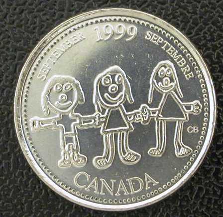
I guess so, because I have never seen this design, on a coin or otherwise. According to mobo85 it was a child’s design, but unlike other kid drawings which made their way to circulation Canadian coins, this one was unknown to me.
I can’t think of anything for which I’d willingly use Comic Sans, and I think it’s a pretty ugly typeface, overall. But I don’t have any particular seething rage for it, either.
I’ll agree with you that Arial is a terrible typeface, but for a different reason. Helvetica is functional, though fairly dull and I’d rather use just about anything but Helvetica if I can help it…and Arial is just a cut-rate knockoff of Helvetica. If I’m going to use a dull typeface, I’d rather use the original than the knockoff.