It might happen in other Bibles too, but this is the one Iread all the way through. Most passages had italics in odd places, like ‘and’ or ‘he’ where, reading aloud, stressing those words would throw off your rhythm and make your listeners lose track.
From my copy of the New American Standard Bible: “Italics are used in the text to indicate words that are not found in the original Hebrew, Aramaic or Greek but are implied by it.”
This is essentially what I was told they meant, as well. In American English if someone said “Feed the dog,” the reply might be “I have.” KJV would translate that “I have done” or “I have fed the dog.”
So why is an italic typeface used? Wouldn’t brackets be more in line with the editorial practice of the last century or so? I have [fed the dog]. Biblical languages [are] fond of dropping verbs [and] conjunctions.
That would be pretty disruptive to the flow, for this kind of a document.
You do realize the KJV was written four centuries ago, right? Typography wasn’t as advanced and codified as it is today.
Well, that was answered quickly! Thanks. I could probably have answered it by Googling, couldn’t I? For once it didn’t occur to me to do that, since I thought the answer would be more complicated.
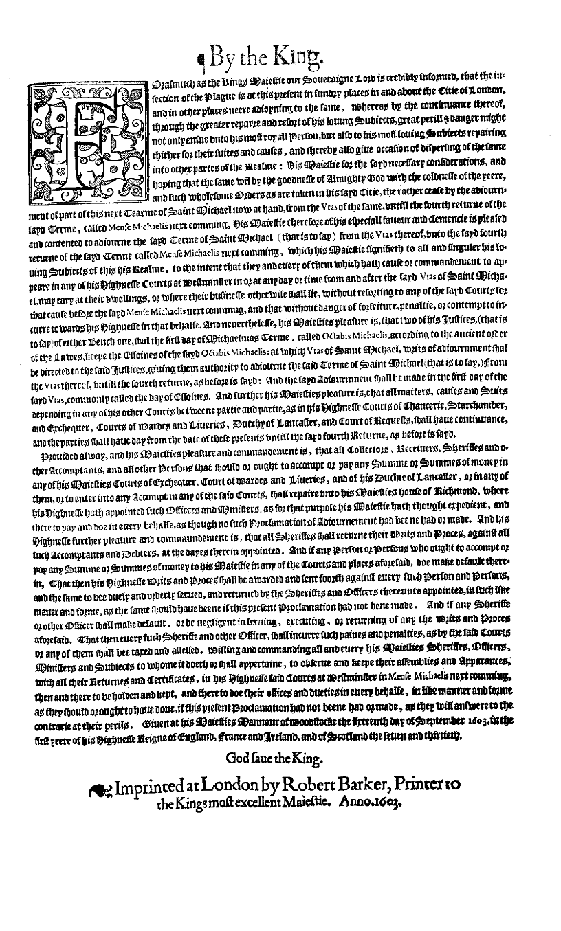
Yes, thank you. Modern KJV Bibles do not, however, typically retain seventeenth-century punctuation and spelling conventions, so I was curious as to why this feature was retained when others were dropped or silently amended. Example pictured here (you can zoom in): http://www.bl.uk/onlinegallery/sacredtexts/kingjames.html. Features dropped since the 17th century include the typeface, use of long s, spellings such as “to beare witnesse” (John 1:7) and “hee came unto his owne” (John 1:11), and “euen” (John 1:12). No italics, but the “euen” is in smaller type, and I think that would be rendered by italics in a modern edition.
I can’t speak for others but [putting] things in random {brackets} disrupts [my] flow a bit or [makes] me {overlook} the words in them occasionally or [give] them undue {emphasis}, I don’t think it’s a “standards and practices” thing so much as a “readability” thing. Even in modern non-news (and often fictional or entertaining) works you’ll often see italics, bold, and recently, different colors (or some other non-intrusive but noticeable marker) denote added content.
In 1611 there was no standard consensus mode of indicating supplied words a modern brackets do. It’s my understanding that the use of italics was considered an unobtrusive way of signifying to the reader that those words were supplied by the translators to help the result make sense.
It becomes interesting to note when the supply produces implications not in the original. In debates on the inspiration of Scripture on other boards, some advocates of plenary inspiration have cited II Timothy 3:16 as internal validating evidence – not realizing that the first time that that verse stood as an independent sentence was in the hands of King James’s men, Paul having written it as a phrase and a long clause modifying the reference in verse 15 to the Tanakh which Timothy had learned from his Jewish mother amd grandmother, pointing him to a cite both he and his listeners would hold in respect as support for his preaching.
Not to mention that putting extra characters like brackets or braces around implied words would substantially increase the overall page count of an already large book that is often printed on specially thin paper in order to be kept to a managable bulk. Italics are an elegant solution that works better than the modern convention, which is truthfully only used for short quotations. If there was need for a book-length treatment, the author, editor, or printer would undoubtedly use a similar convention to the KJB even now.
Actually, early seventeenth English printing did have its own typographical conventions and those had an important bearing on how the original editions of the KJV were set out.
[QUOTE=Dr. Drake]
Example pictured here (you can zoom in): http://www.bl.uk/onlinegallery/sacre...kingjames.html. Features dropped since the 17th century include the typeface, use of long s, spellings such as “to beare witnesse” (John 1:7) and “hee came unto his owne” (John 1:11), and “euen” (John 1:12). No italics, but the “euen” is in smaller type, and I think that would be rendered by italics in a modern edition.
[/QUOTE]
The typeface is ‘black letter’, which itself is significant, as that was what was conventionally used for the most formal public publications, such as statutes or proclamations. Moreover, the conventional way of distinguishing individual words or phrases within black letter texts was not italics but Roman type. So the printer has used Roman type as the simplest way to denote the supplied words. The original readers would have found it very odd had he used any other method.
This changed in later editions, when Roman type began to be used for the main text. Unsurprisingly, the printers then began using italics for the supplied words, for italics was - and had been in the early seventeenth century - the conventional way of distinguishing individual words and phrases within texts set in Roman type.
There is the complication that from the eighteenth century, editions began showing more words as having been supplied. But that’s a separate issue from the typographical one.