Or perhaps by using fishing nets, like this?
Right, only higher in the sky, and lighter, so the kites can lift the nets. Thus silk, of very light polymers. No need to stop them mid air in their tracks, just entangle them, make them lose stability, and crash.
“During the most recent glacial maximum, it’s believed that land bridges extended from the surfaces and connected several of the spheres together.”
The strength of line necessary to fly a large kite train to high altitude might very well not be harmless to a plane.
The world record train mentioned above used “heavy piano wire” as line. That’s high tensile strength steel wire.
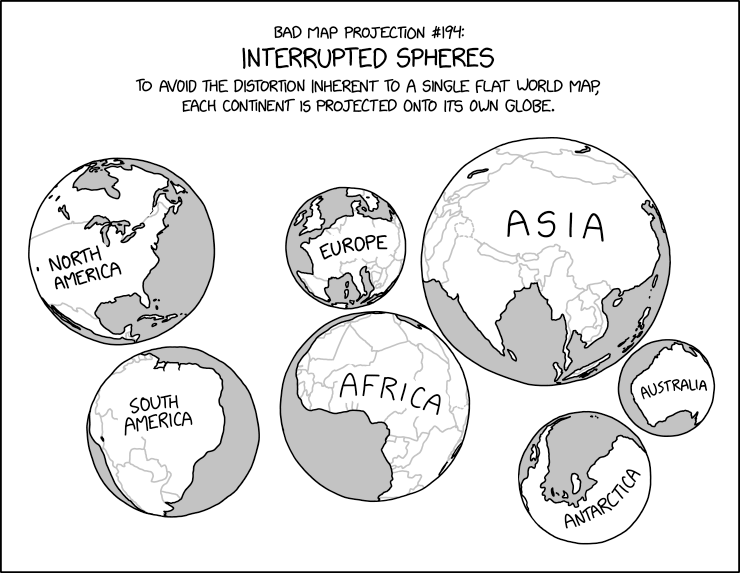
Of course those globes distort the continents as much as a flat map.
I think that’s the joke.
It would be funny to have a globe that’s just North America. Or even just America, but I think it’s worth keeping Canada and Central America to have some useless wasteland for the poles. Cram that in your pie-hole, Gall-Peters advocates.
Thanks (and to @Chronos,too)
I read about a guy who had a globe that compressed the whole world into one hemisphere - and duplicated that in the other hemisphere, too.
That’s why it’s labeled a “Bad map projection”.
Still better than Gall-Peters
What does gall peters do and how is it different from hobo dyer?
Gall-Peters is a map projection that’s rectangular, so latitude and longitude are straight horizontal and vertical lines, but where areas on the map are proportional to areas on the globe. With those constraints, there’s really only one way to do it, to within deciding what aspect ratio you want. The primary inherent drawback is that it distorts shapes on most of the map. By picking your aspect ratio, you can choose a pair of latitude lines (one north, one south, or a single line at the equator) where the shapes aren’t distorted. One way to make such a projection (with the equator undistorted and an aspect ratio of pi:1) is to wrap a cylinder around the globe, and then draw horizontal lines from the axis of the globe, through the surface, to the cylinder. In the 80s and 90s, it was promoted as a more politically-correct alternative to the Mercator projection, which horribly distorts areas and makes European and US areas look much bigger than corresponding African and South American areas. But proponents overlooked that, with the aspect ratio that Peters preferred, it’s Europe and the US that are relatively undistorted in shape, while equatorial regions are significantly distorted.
Hobo-Dyer, meanwhile, has the significant problem that it distorts the hair colors of the itinerant homeless.
According to Wikipedia the difference is in the pair of latitude lines where shape isn’t distorted. Gall Peters is at ± 45 degrees and Hobo-Dyer is ± 37.5. The result is HD is more squished at the poles and less elongated at the equator.
If I read Chronos right it depends on the chosen aspect ratio of the map.
BTW: I am not sure the word shape is the correct one, when it is only a line (or two, if that line is not the equator) that is not distorted. Is it a two dimensional straight line a shape?
Is that the map projection that showed up on one West Wing episode?
A line is one-dimensional, but shapes on that line are undistorted. Or, to put it more precisely: All shapes of finite size are distorted on the map, but if you take a shape confined to a region near the reference latitude, as that region shrinks, the amount of distortion will approach 0.
Urgh!
Mr Chronos, your agonizer please.
Achilles was a mighty warrior, but his Achilles' heel was his heel.