Yeah, it’s almost quaint now, but in 1970, in the midst of Vietnam, war was still a pretty touchy subject and the record company refused to let them call it that.
The song’s original title was “Walpurgis.”
Yeah, it’s almost quaint now, but in 1970, in the midst of Vietnam, war was still a pretty touchy subject and the record company refused to let them call it that.
The song’s original title was “Walpurgis.”
Black Sabbath 4 came out on September 25, 1972. According to his web page, Ryan Corey designed VolumeFour in 2018 “a heavy, geometric art deco sans-serif display typeface inspired by the custom lettering of Black Sabbath’s Vol 4 album”.
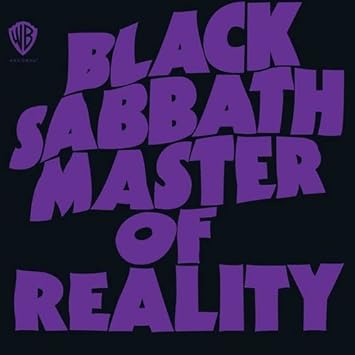
Another cool font they used was for the Masters of Reality cover art:

Designed by Bloomsbury Group and art directed by Mike Stanford, the design is based on distorted and emboldened lettering using the font Kabel Ultra. The “T” gives it away.
I don’t care what anybody says, I hate the In the Court of the Crimson King album cover.
Pat Boone in metal drag?
Sorta kinda reminds me of Camel’s “I Can See Your House From Here” (sorry, can’t figure out how to link to just the album cover image)
By now at least one of them causes so much flagging (both manual and algorithm) on sight that people have stopped bothering.