Artists show your work!

See, these are the kind of answers I’m very glad I’m getting. Now I’m realizing that everyone around me, all my friends and people in my classes and my family and everyone, have always just been kissing my ass about my drawings because none of them know dogshit about art, and my pictures look good to them because they’re just amazed that any “normal” person can create anything that looks like any semblance of a detailed drawing. I’ve really never had any feedback from anyone who actually knows the first thing about artistic technique in any kind of focused way. So of course at first, when I got that, I got a little defensive because I’m so used to everyone else telling me I’m “you’re best drawer I’ve ever seen, dude!” (I want to hit someone every time they fucking say “drawer.” A drawer goes into a dresser. An artist creates drawings.

This should give you an idea of the kind of idiots that are all around me. Anyway now that I’ve been hearing from people who actually know what the hell they’re talking about, I really appreciate the comments and I look forward to getting better.

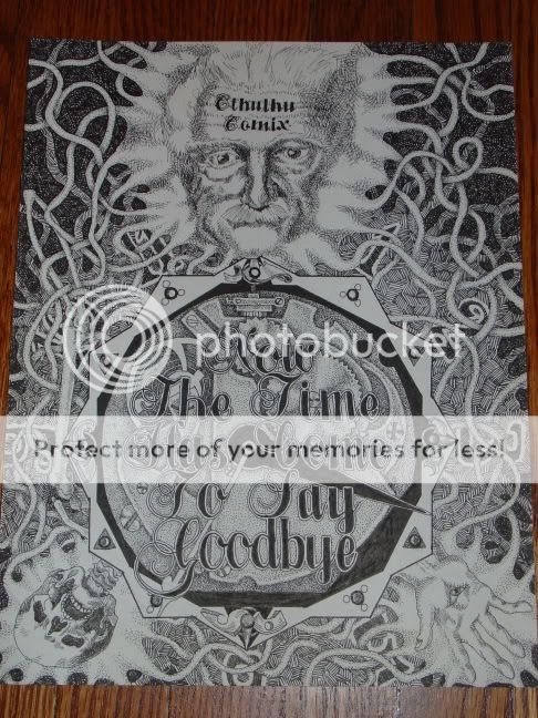
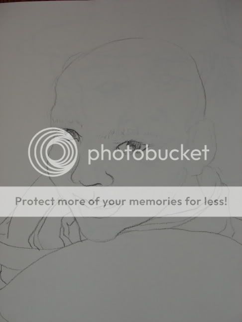
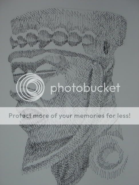
The only comment I can ever think of getting, that was somewhat negative, was when I was told (by several different people) that all the “realistic” looking characters that I try to draw are basically just slightly modified and simplified versions of myself, including my body shape and my face and hair. Now that I think about it, it’s true, goddammit. I never try drawing faces other than the same one over and over again, unless I’m trying to do really stylized and ridiculous looking ones like the ones on the “Workmen.” Another flaw of not “drawing from life,” I guess. I’ve tried drawing other people but I’ve never finished because I always think that it doesn’t look like them, and that they won’t like the drawing, and I just give up.

Heh, well, this is an assignment I did for school. We had to draw something reflecting our cultural heritage… I chose “Canada” :stuck_out_tongue: It’s not the best picture ever, compositionally speaking, but I think it has a certain charm. Though I’m a little disappointed I was rushing to meet a deadline and didn’t manage to fit in the stoner, mountie or camper being mauled by that there bear.

Slightly less naff is this reflection on the sad state of the stock market…

And this is what I’m working on right now, a pretend noodle package illustration… I wish I had something to show besides assignments, but I’m in a bit of a rut right now so that’s all there is!

I am not an artist yadda yadda yadda.
I did this in 2005 41 on high | Hewlett-Packard | Vicki Whateley | Flickr 40 finished 1 | Hewlett-Packard | Vicki Whateley | Flickr. I am particularly proud of this effort because the whole thing - concept, design, and most of the work - was done by me. It is still being used too (this weekend in fact at the World Record Ute Muster).

Heh heh heh. These are awesome.

I’m glad that you’re getting some useful feedback now. Another important lesson I learned in art school is to really “divorce yourself” from your work. In other words, you have to come to a point, especially when it comes to critiques, where you’re not identifying your self or your worth as an artist with the piece in question. That’s what leads to hurt feelings with a lot of young artists. Along with that, however, is being able to tell the difference between knowledgeable critique and uninformed criticism (or praise.) Funny thing is, even the people who don’t have artistic training or experience can provide useful feedback, you just have to be able to extract the useful parts from the rest.

There really is no substitute for drawing from life. Drawing from photos can be useful sometimes but in my experience it only becomes useful after you learn how light and shadow define form in a 3-d space. Drawing from life facilitates this because (and this is my pet theory) slight shifts in viewpoint allow the artist to observe more accurately the 3-d curves and shapes of the forms that are being rendered. When you learn to render a sphere in a still life, you stop seeing a crescent moon as a flat shape on a flat background. Not to say that everything has to be finely rendered to be effective, but the successful artists that use large areas of flat tone in their work generally understand the principles of drawing from life very well, so their choices as to the shape and position of the flat shapes still describe the form very well. Mike Mignola is an illustrator that does this very well, but lots of young artists may try to emulate his style without the benefit of his drawing experience and so their choices for shape size and placement tend to not work nearly as well.

You could start by just doing “contour drawings”, Argent. I’m sure you can find a good explanation of the technique online.

Or try Betty Edwards’ book Drawing on the Right Side of the Brain.

Heh, you remind me of me. :smiley:

Let’s put it this way. You have a certain style, and that is cool. It is pretty obvious to me that you are drawing stuff out of your head, and there is nothing wrong with that. You love to put down details, to make as “finished” a product as you can out of what probably started as inspired doodling - and that is good.

The question is, do you want to take it to the next level, or not?

If you want to take it to the next level, to add a real “wow” factor, you are going to have to do some work. This work will involve forgetting for the moment about doing a “finished piece”, but to loosen up and draw stuff from life - sit in front of something and try to capture it on the page; whether it be a person or an object.

Then, once you have done that (or even while you are doing that) you can come back to doing exactly what you were doing before - drawing your comics - and, lo and behold, they will be a lot better - even though they are not “realistic” at all, and not intended to be!

Now, this is advice I have had to take myself. Like you, I am, essentially, an obsessive doodler who likes to fill a page with textures and patterns made up out of my head. Here are some comic-book covers I did many years ago:

And here is a glorified doodle I did when I was supposed to be doing something else:

I’ve always liked this sort of art - to me this is “fun”; in contrast, I’ve always had to work at drawing from life (I’m too “tight” to be really good at it). Nevertheless, it is something that, at one point, I just realized I had to do if I was to get any better at what I did like to do best.

Here are some sketches of the sort I’m talking about:

  • A boy monk, from travelling in Tibet:

  • a Mayan sculpture:

  • A White Pine:

There are literally hundreds of others I don’t have photographed - I used to carry a sketch book around with me, and just sketch stuff when I had a spare moment. If you don’t have time or money for classes, this is highly recommended.

This shouldn’t surprise anyone but I would rather have the first three pictures that you posted hanging on my wall than the second three pictures any day. The “comic covers” and the “doodle” look so much more interesting to me than the sketches.

Well, of course. :smiley: The sketches are what I think one should do, if one wants to improve one’s comics and doodles - at least as far as I’m concerned (others obviously will feel differently, to many the life drawing is the point - but not to me). They are, first and foremost, technical exercises for improving one’s skills - in particular, observation.

That’s all good stuff. Beautiful magazine style illustrations. You have a very approachable style with the friendly shapes and colors. (plus I am a sucker for white ink on colored paper)

Argent, take a look at the first one. Even if it is meant to be cartoonish and not lifelike realistic, notice the guy with the number 5 jersey punching the other. See how you can see the clothes stretch with the motion. Notice how the jacket of the lady speaking hangs naturally. It doesn’t have photorealistic textures but it looks natural and feels right. Ditto for the trapeze act.

Awesome!

Great. Listen to yourself. Break from the expectation you have of yourself and your art and go a little crazier trying different styles.

Oh, and a great life drawing exercise: wrinkled paper (just don’t ball it all down to nothing, a couple hand motions to give it shape is enough). Either outline only or shading. You cannot find a cheaper and more variable subject to practice.

I’m a little late to the game. My collection is a little varied. I enjoy sketching and messing around on photoshop mostly, I haven’t done anything since my computer graphics course though.

Thisone is really low-quality compared to the stuff I can do now. It was before I took any photoshop classes; I just felt the urge to do something right after the elections. I love the fact that it’s still getting comments 4 years later.

I like to doodle, but it’s been a while. I may start up again to see what I can do if I get the time.

My old deviant art is here. I also have a basic website for some pieces I did for my digital art class here.

I took lots of greatpicturesin Kyoto.

And, just for fun, a little movieI made that I am very proud about. It’s very elementary, I’m mostly so gosh derned proud because I survived the class and all of the stupid codingI had to do. :smiley:

Argent: your artwork reminds me a bit of Art Spiegelman(most famous for the MAUS books [first g.n. ever to win a Pulitzer IIRC]) with a little bit of Tom of Finland (nothing implied or inferred) thrown in. You should consider doing a “brutalistic” graphic novel (brutalistic meaning “not super refined” but meant to be a bit edgy).

Whoa, daddy - those are like the compliment equivalent of cocaine, confidence-wise…don’t undermine all the advice of all the other posters who criticized my art now! Surely you can find something negative to say about my drawings so I don’t let that shit get to my head.

When I was in high school my friends and I found a “Tom of Finland” book somewhere and it provided a great source of amusement for us in that “let’s make fun of those faggots!” high-school-boy way - but the truth is, I always thought the art was pretty good.

Why, thank you. I have two or three more, but have no idea when I can post them. I’m stymied in the research of a couple, and since I don’t work in Manhattan any more, getting the new pictures is tough. I am working on printing them together in a book a la JAlbum or some such outfit; I’d love to think I could peddle them to a real publisher somehow.

Another thing I’ve played with (and alas, can never play with again, I’m afraid) are Polaroid SX-70 Manipulations.

I’ve never even heard of that technique before now, but that is some wild stuff. I’d love to get a print not only for the art of it, but because the technique is so cool. I love it when artists tamper with and abuse the medium to get amazing, original, and unprecedented results. Great work. It almost looks like analog photoshopping. But in a good way.

Well it’s old shit, so it took me a while tl get it uploaded. I swear there are no digital tricks here. I painted this picture on a storm window with peanut butter and jelly. Of course, I decided later that it should be framed by white bread, but the picture itself is precisely as I painted it. I painted it with peanut butter and jelly on a storm window then scaned it. I had to do it quickly since the flies were coming.

With some amazing digital technology, I expanded this image to about 4’ by 6’ and printed it out with what was an amazing photo printer in 1998. Even now it is a pretty impressive peice of shit.

here is a link

Thank god, you didn’t use chunky. Choosy artists use Jif™.

That’s awesome though.

I loyally used whatever brand will pay me money to say I did.:wink:

Bwhahaah that is great! The jelly looks magical.

Argent Towers, I once saw a drawing of a lion’s head. It was done by someone who was VERY meticulous. Each and every little hair was drawn in, the gleam in the eyes was perfect. It was a perfect rendition of a lion’s head. Except as art it sucked because it was just a lion’s head (I don’t mean to imply your compositions aren’t good, I was speaking only to the fact that detail is not necessarily an indicator of ‘good’ art).

Also you would be surprised how much correct perspective will help your work. For help with hand drawing that would compliment your style, check out (NSFW links to follow) Egon Schiele (from his image gallery). The key is you have to learn how to exaggerate the curves and proportions just a tad. Art is not real life or even photography (check out the hands on Michelangelo’s David compared to the proportions of the rest of the body).

Keep up the good work - art is not easy.

My work. Note that this is a school web project by my daughter. The information and contact info is Lorum Ipsum.