Today I learned that was a thing. It’s hidden next to the report button.
Yeah, that’s one of the hyped benefits of going Pro.
That looks pretty cool. Nice and smooth. Sharp. I like it.
I think my Eyes are leaning a little toward the non PG-13, so I’m doggin’ it. I did just get top 10% again for my Element portrait:
Whiny whiners whining:
From the article…
Whether or not the machine or artist knowingly emphasized to pull from Griffen’s work, this points to a large issue with AI art. It repurposes/recycles existing art and does image association with no nuance. Real artists paid to do this must consider these connections’ implications. What are the historical, sociological, cultural, political, etc. themes invoked with certain color choices, compositions, and more?
This struck me as pretty funny since Tor said they just grabbed the image off a stock picture site and tweaked it for the book cover. No matter who/what made the image, there was no concern for the nuances and social implication of blah blah… they just said “Hey, this random picture is cool” and decided to slap some book cover text over it.
It’s not as though, had Tor hired some guy to “Paint us a picture of a space guy in front of a swirly red portal thingie” we would have all been saying “Wow, nice historical and sociological themes I’m seeing here. A real portrayal of the human experience.”
I feel like the article author has never seen a sci-fi/fantasy book cover ever. Every single one has only the vaguest resemblance to what’s going on in the book. I doubt that the artist even read the book in the majority of cases, and probably not even the dust jacket summary. The idea that they’re considering the sociological themes behind the color choices is just laughable. We might actually get better cover art from AI because the actual author can create a prompt and iterate until they get something they like.
NovelAI’s output from that prompt:
Same from Midjourney…

More of a 1970s vibe on this one (from Stable Diffusion):

Wow, I like that one a lot. ![]()
That used to be the norm, but more often nowadays I’m seeing cover art that can reasonably be interpreted as a depiction of an actual scene from the book, or at least as a depiction of the characters in the book.
But yes, the cover art on many works isn’t related to the work at all, and was often created before the writing was even done. And this is true of all genres, not just SF/fantasy. The iconic Eyes of Dr. Eckleburg on the cover of The Great Gatsby, for instance, were painted by an artist who hadn’t read the book, before it was finished, and Fitzgerald found the image compelling enough that he then decided to actually incorporate it into the story (and wrote a letter to the publishers asking them to be sure to keep that cover art for his book, and not to use it for some other book just because his manuscript was late).
I’ll keep an eye out for that image at Barnes and Noble
Here’s an article that was linked in the earlier article. The Mary Sue appears to be taking the position that training AIs is theft.
Admittedly, I haven’t bought a physical book in probably a decade. And I am excluding the practice of putting artwork from the film adaptation of a book back onto a re-release of the book (not to mention engaging in mild hyperbole).
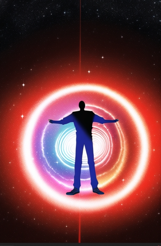
Still, I had a laugh at this Penny Arcade comic, in particular because I like Alastair Reynolds so much:
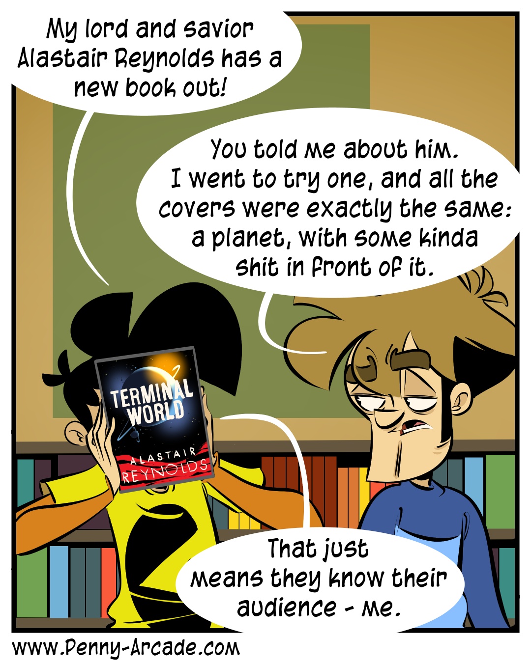
The only thing it gets wrong is that it’s not “some kinda shit”; it’s a spaceship, or maybe a station. And not one that’s actually described in the book.
Looking at the SF/fantasy books near the tops of my bookpiles currently, excluding ones I haven’t read yet:
The Traveler, 2019: A man in a tunic handing a round rainbow-y object to a boy in a tunic. The scene appears in the book.
Neuromancer, 1984: A weird person with a glowy hand. Nothing to do with the book.
Phule’s Company, 1990: A bunch of folks (including three aliens) in black military uniforms being instructed by a dandy fellow with a butler at his side. No particular scene, but it’s clearly an illustration of the specific characters from the book.
Klara and the Sun, 2021: A simple drawing of a hand, with a drawing of the Sun in the middle of it. Vaguely related, I suppose, but there’s nothing in the book resembling Klara holding the Sun in her hand, or anything else that would be depicted in that way.
The Science Fiction Hall of Fame, 1982: A bunch of planets, with a spaceship in the foreground. Generically science-fictiony, but not really related to any of the stories in the book.
Brief Cases, 2017: A man wearing a T-shirt, trenchcoat, hat, and pentagram necklace, and holding a wizard staff. A reasonable depiction of Harry Dresden, aside from the hat (except all of the pictures of him show a hat, for some reason).
Artemis, 2018: A picture of the Moon. Relevant, given that the book takes place on the Moon, but not at all specific.
A Logic Named Joe, and Other Stories, 2005: A kangaroo smoking a cigarette wreaking havoc, while pursued by a bunch of identical women. Not a scene from the titular story, but it is a scene from one of the other stories in the book.
So, that’s two with no connection at between art and book, both from the 80s, two recent books where the cover art has some connection, but not very specific, and five from 1990 or later where the cover art was clearly created specifically for the book.
With the weather getting cold on the longest night of the year, it is the perfect time to go on a fake vacation to somewhere warm and sunny.

On the other hand, my copy of “Have Space Suit - Will Travel” has cover art that very specifically depicts a scene from the book - the ‘Mother Thing’ in a space suit collapsed on the ground. My copy of “The Moon is a Harsh Mistress” depicts the ejection end of a catapult on thr Moon. James P. Hogan’s “Inherit the Stars” has an illustration depicting finding an ancient astronaut on the Moon. David Brin’s ‘Startide Rising’ has a cover depicting people interacting with sentient dolphins.
I’d say that most of my paperback SF novels have cover art specifically related to the story.
Trying for an image including a hawk, an eggplant, and Fuji. Ran some pure text prompts then attempted to evolve a fairly decent image. 32 times the output image was blurred because it tripped the dim little AI obsenity filter.
I tried doing a set of duplications of this image (“yurei” using the Night Cafe color portrait settings on SD 2.1)

And got this

All of them are what I consider failures, not creating anything like the mix of facial art in the original. But as they used to say on Sesame Street, one of these things is not like the others. I wonder how the heck that happened?
My email was suddenly flooded with 18 follow requests so I was wondering what the heck was going on. Apparently my dessert challenge entry came in at #7.
Honestly though, the challenges are so random. Realistic desserts were easy to pop out of the algorithm, I didn’t try hard on this one. I think I evolved a couple of times. And honestly a lot of the entries look just as good to me.