The main advantage of the ampersand is, once you know how to write one, you’re two-thirds of the way to being able to draw a treble clef on the musical staff.
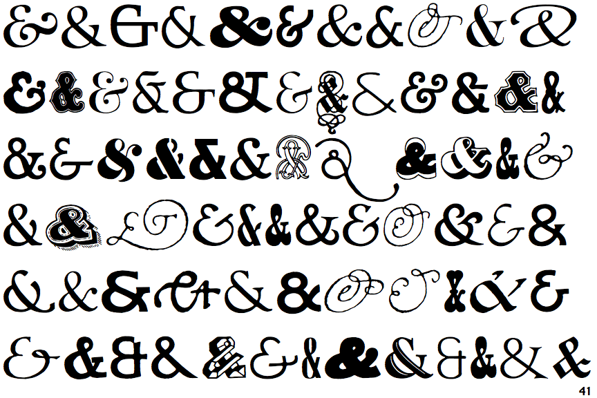
I’ve seen it, and always assumed it was just a plus sign written quickly, with one stroke rather than two. As Peter_Morris mentioned above, an ampersand is a stylized ligature of the Latin word “Et” (meaning “and”). Some fonts use an ampersand symbol closer to its original form, like the first and third examples in the top row here, and the first, third and fifth in the second row:
The Wikipedia article about the ampersand also mentions the symbol that the OP is talking about (or one close to it), and describes it as “A handwritten plus sign used, like the ampersand, to mean ‘and’”:
That’s how I always write the symbol for “and.” I’ve never been able to do the fancy &.
Mine’s more like the upside-down 4. Square not round. But that’s basically how I would write a note to myself - not fancy with an ampersand, and not engaged enough to pick up my pen to write a real +.
Thanks for that; my first thought on reading the OP was that there are like a hundred different methods/substitutions for the ampersand…
I still use it. It’s just a cursive + sign as far as I’m concerned.
I switch between it and an ampersand. Sort of depends on how recently I’ve seen an ampersand, because I’ll often write it backwards.
It is called a “Tironian et”
Not only that; take a look at this lexicon:
https://kuscholarworks.ku.edu/server/api/core/bitstreams/91924fe7-aa19-4490-b17e-5443587bfa87/content
They all are. Can’t you see the “e” and the “t” there?
Oh, well done! I just added it to my public Wish List! Fingers crossed for Father’s Day…
Sorry, I’ve never seen it or even heard of it.
Yeah, or a sloppy plus sign? It never occurred to me that it was another character – I’m just quickly making a plus without lifting my pen.
Mine is second from the right on the top line in @pulykamell’s picture, or fifth from the left on the second line.
This calls to mind a question.
Is there a word for the history or evolution of a glyph or letter symbol the way that “etymology” is the history of the development of a word?
Palaeography?
Diachronic graphology?
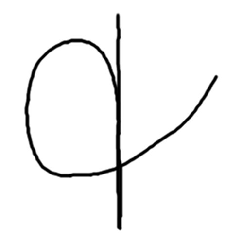
Yeah, I would have thought it was the more common way of the shorthand “and” symbol. I don’t really think I’ve generally seen an actual handwritten ampersand in people’s writing. A “plus,” a “cursive plus,” or that curly “E” sign with a line vertically through it are the ones I mainly encounter.
Aren’t those all ampersands? Anyway, it’s not some made-up fiction:

I actually don’t know if they all are grouped under the same name or not. They’re (at least) three different glyphs. The backward “3” with the line and “&” I definitely identify as an ampersand, but I wasn’t sure whether the “+” version was called the same in typography. It’s functionally an ampersand, but not sure if it had a different name technically, or not.
I can prove they are the same glyph: consider, for visual reference, Alexander Hamilton’s ampersand on the second line:
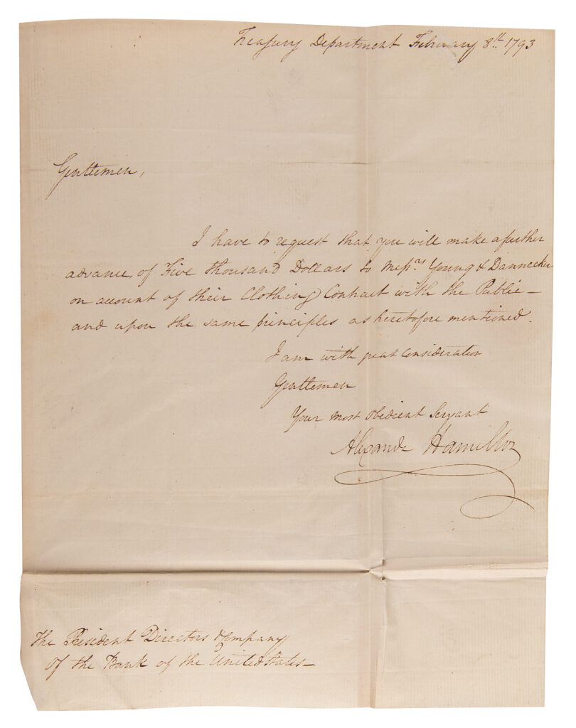
As the loop on the top left degenerates and disappears, you are left with a kind of “alpha” shape:
https://iconicauctions.com/ItemImages/000135/135963a_med.jpeg
IOW, you can, essentially, continuously vary between the “&” and the “+”.
I’m not exactly sure what you mean, but they seem like two distinct glyphs to me. When I make my “ampersand” I think of a cursive + letterform, not a &. To me, it seems to obviously stem from a stylzed “+” sign, and “+” on its own can mean “and.” But it doesn’t really matter.
All I mean is, at least on my default settings, an “&” has an obvious loop at the top. Imagine shrinking it until it degenerates into just a cusp, then disappearing altogether. That makes your [cursive] “+”. So “&” and “+” sure look different, with different topologies, on a computer screen, but they are actually variations of each other if you consider their handwritten origins.
You can see those variations in the different images I posted.