I see your point as to topology. Stretch this, shrink that, and you can smoothly transform one result into the other.
But if you approach your analysis more vector style, like where does the pen path start and end, there’s little in common between starting at top center going down, and starting at lower right going up & left.
Using @pulykamell’s cited examples, my cursive plus is third row 6th from left. With the pen path starting at the top center going down and ending at middle right going right.
I definitely never considered it a plus sign. I would not write a plus sign without lifting the pen or pencil, any more than I would the letter t. I’m probably using it around multi-digit numbers, which also require lifting the pen(cil).
I decided to think about how I could write “joined-up” numbers, and I don’t think I can. They all start on top and move down. It would look like a mess. Cursive letters tend to start from the baseline, or have an altered version that start from the midline after certain letters. (Capitals are an exception, but they tend to starts words.)
That was mine exactly and I used it all the time. Now I use an ampersand which is just as easy to write. It is just an upside down mirror 8 and I make it the same way.
I remember seeing my Mom use this when she was making lists. She knew
how to write shorthand and probably that’s where she learned it. I used it
once or twice a very long time ago but went back to using the “&”.
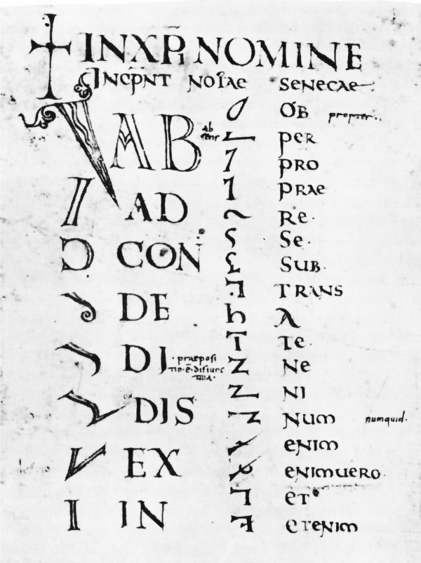
There are five pictures on that page showing a Tironian et, and the symbol looks like a “7”, not a cursive sort of “+”. My wife went to school and college in Ireland, and she uses that sign all the time.
If a Tironian et consists of a single bend stroke, horizontal changing direction to vertical:
then I have to admit it does not, at first glance, seem to be intended to be the same as a et-ligature/ampersand/+, despite an arguable superficial resemblance. Thanks for the correction.
The elements of the Tironian shorthand are at least inspired by the standard letter forms, so it is not that there is no connection at all, but the history of the ampersand is that it arose from normal cursive rather than specifically from shorthand:
It’s the joining up part I was talking about. Arabic numbers were increasingly integrated into written text (I’m not talking about math or bookkeeping where spacing is important) around the same time modern cursive writing was developed. Did anyone even attempt it?