I’ve always been puzzled by the blue cross part. It’s supposed to represent the two rivers Columbia and Willamette. But they don’t “cross”. A “T” (or even better a “T” with a tilted top) would be a better fit.
I remember when it came out that people objected to it since it looked like the flag of Scandinavian countries and everyone “knew” those were a bunch of commies. :rolleyes:
And how many flags have a truncated hypocycloid on them?
My city of ~10k has a flag, or at least I think it does, because there’s a flag at the city building that I don’t recognize as anything else. I’ve never seen it close up, though, and it’s not mentioned on the city website. (It uses the same colors as the local high school sports teams, so it could also just be a generic rah-rah spirit banner or something.)
I’ve always quite liked our city flag. Simple, identifiable from a distance, no text, good symbolism and colors. It’s everything a flag should be, in my opinion. Makes up for the horrendous (to my tastes) state of Illinois flag.
It’s basically the Israeli flag with the seal replacing the star, which is common in Israeli municipalities. The seal itself, IMHO, is a bit of a mess, with a (metaphorical) lighthouse, Herzl’s seven stars placed in the least symmetrical manner possible, and a quote from the Book of Jeremiah - “I will build you up again and you will be rebuilt”, which in Hebrew is just two words.
Jerusalemand my hometown of Haifa have much better flags, IMHO.
Gold on the bottom for wheat fields; blue on top for the sky. Straight boundary between them because well, that’s what our horizon looks like. (Baker, I’m sure you’ll get that, living in Kansas. )
And a St Edwards Crown, because Regina is the “Queen city” taking its name from Her late Majesty, Victoria.
Interestingly, the flag of Ukraine uses similar blue-gold symbolism. Another flat prairie country with grain agriculture, which is why the Canadian government encouraged Ukrainian immigrants to come to the Prairies.
I really like the new one. Flag with seals on them are not good. Just not.
New one is dtynamic and visually interesting, and the symbology stands out. I got the sunflower thing as soon as I looked at it. (Again, common prairie roots. )
Pamplona: green, with the escutcheon of the city in the middle.
Tudela: just like the flag of Finland, except for the escutcheon of the city in the middle.
Barcelona: y’all know the escutcheon for Barça? Its top half is taken from the city’s symbols. “Quartered, with the bars of Aragon on second and third and the Cross of Saint George on first and fourth” describes both the escutcheon and the flag of Barcelona (the escutcheon bears a Count’s crown).
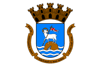
MUCH more interesting and vexillologically pleasant than my longtime place of residence and work, San Juan PR.
Many towns in PR, to be fair, did not really have officially sanctioned flags until the 1970s when the Institute of Puerto Rican Culture encouraged research into what had been their heraldry in Spanish times and the island legislature authorized the regulation of their use.
My other longest-lived-and-worked location was Baltimore, MD.
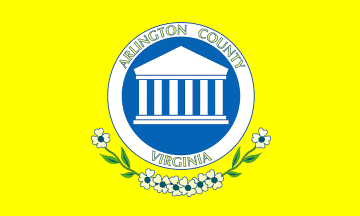
Currently I am residing until at least 2021 in Arlington County, VA, which is pretty meh flagwise. At least it’s not blue or white.
i can see why you’d say the San Juan flag isn’t a stand-out, but the symbolism is clear: the Lamb of God, a phrase from the Gispel of St John, on an island.
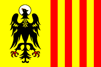
I suppose they could have chosen an eagle instead, but that’s not as distinctive, because it’s used in a lot of hreraldry, as the flag for Morovis shows. That’s certainly a striking flag!
My current city of residence, Cleveland, Ohio, has a flag, and it sucks - looks like France’s, but with the city seal on it. Borrrrrring: Flag of Cleveland - Wikipedia
Ohio has a great state flag (and I’d say that even if I didn’t live here). But the city flags I’ve seen here all suck.
It helps that the Arms of the city date to back when they would be actually issued by the Spanish Crown and people involved knew their stuff.
It is one of the towns who got seals/pseudo-arms and flags in the 70s – flag turned out Aragonese-influenced ISTM, and this eagle is also from John, only this one being specifically the sigil of the Evangelist himself, after the name (Juan Evangelista) of the town founder (a terribly distant ancestor of mine on my maternal grandfather’s side).