Since we’re talking about the worst of comic book art in another thread, we might as well have a more positive thread to balance things out. I searched for a thread similar to this and couldn’t find one, so here we go.
Does it get any more perfect than that? It’s simple, with great Ty Templeton art, and it absolutely begs you to look inside (and the story inside is grea, too).
After that, I don’t really have a list, but I did remember a few more that I like a lot:
Comes up a lot when discussing favorite covers… and for good reason. It’s beautiful. My dad gave me his old copy when I was a kid, and I must’ve read it about a thousand times.
Sleepwalker was a pretty mediocre book with a good concept. However, the cover to the first issue is great. In the Superman-smashing-a-car tradition, the hero of the book looks like an out-of-control monster. Which I like.
Do I even need to explain why I love this one? I mean, come on. Gorilla in a beret with heavy weaponry, pushing a baby carriage. What more could you want?
More for the story behind it than the actual art. (Going from memory) The artist was told way back when that the comics that sold the most were the ones that had…
Tengu, I’m glad you brought up the Courtney Crumrin covers. I would have, but couldn’t decide which one! I have an unholy love for that series. I was such a Courtney as a kid, it’s not even funny.
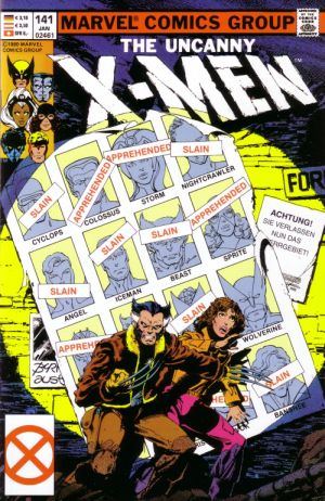
I love this Astro City cover. Simple but dramatic and it reminds me of this Uncanny X-Men classic. I love great underdog stories and these covers capture that aspect of those stories perfectly.
And while I’m linking to John Byrne X-Men covers, can someone explain to me Cyclops’ pectoral anatomy in this cover?
Actually, almost all the MAD covers from when it was a comic were great, but I think they were surpassed by its short-lived sister-mag (and only authorized MAD rip-off) PANIC:

