Given any sort of allowance, a serif font is a must. From the usual limited-choice menus of font selection, Times New Roman.
Given my druthers, for “everyday” text at pica or larger that simply needs to be readable, Georgia. For formal or fancy use, I’m with RealityChuck: Souvenir cannot be beat.
For readability in fine print – 8 pt. and smaller, e.g. text in a newsletter – Bauer Bodoni or a related font style is my preference.
And if someone insists on sans serif, I’ll bite my tongue and go with Helvetica.
I don’t know if I should admit this in a public forum, but Gill Sans turns me on. Aesthetically and possibly sexually. The symmetry of the capital W makes me giddy, and the roundedness of the curved capitals (D, C, O, G) makes me deeply content. It’s just…right and good, you know? It’s clean and yet warm, unlike Arial. Or worse, Univers shudder.
I want my tombstone inscribed in Gill Sans.
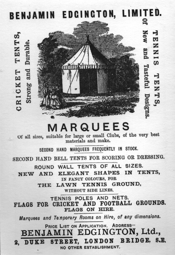
I also get turned on by 19th century sans serif commercial fonts, like a couple of the fonts in this ad.
Trade Gothic. You cannot go wrong.
[QUOTE=Polycarp]
…For readability in fine print – 8 pt. and smaller, e.g. text in a newsletter – Bauer Bodoni or a related font style is my preference…
[/QUOTE]
Erm, I don’t mean to go all art director on you, but Modern Serifs like Bodoni are designed to have very thin strokes and serifs. At small sizes, you risk those falling away, and if you’re printing in a CMYK build, you can guarantee it. At small sizes, san serifs or an Old Style / Garalde serif face will be most readable.
[QUOTE=miamouse]
I was stuck in the Helvetica Neue family for a while. Lots of different weights, extendeds were nice too.
[/QUOTE]
Helvetica is where I live, font-wise. It’s everywhere, it’s easy to read no matter the size and most of all, it’s clean. I used to love impact for stuff like newsletters and whatnot, but we’ve parted ways.
[QUOTE=Brad Serum]
Trade Gothic. You cannot go wrong.
[/QUOTE]
Oh that’s nice.
I am loyal to my own family font.
Not a fan of Myriad, huh? Might I suggest Frutiger?

The company I was with for 6 years had Frutiger as its company font. Maybe that is why I keep going back to humanist sans, they just look right.
Ooh, that Trade Gothic is schweet.
I don’t get to do sans serif much, since I mostly design book interiors. And most of our books are dry, academic monographs, so I don’t get to do much fun design, either. Often the earlier Renaissance-era faces with the small x-height are a little too dramatic for my stuff.
Thanks for the compliment, The Weird One. Though most of my font geekery was lifted wholesale from Robert Bringhurst (Amazon link) – he is one intense dude when it comes to typography. I did get a pure geek frisson one time when I realized that the face I chose for a book was created the exact same year as a peace treaty the book was discussing. Schwing!
Georgia’s nice for screens/blogs, but I’m not a huge fan of it in print, for some reason. For smaller text in a newsletter-type use, I’ve been using Officina Serif.
We use Nimrod for the body copy at our newspaper, following a redesign a decade ago. At first I didn’t like it, but have grown very comfortable with it over the years. It’s decently readable at small sizes, with its large x-height.
We use Optima for headlines, and Goudy Old Style for subheads, all recommended by a hired designer.
Optima lacks a little heft for my taste, but it ain’t my call.
All my personal stuff is done in Copperplate Gothic Light.
But I’m also fond of the fonts of Human Kindness and Human Wisdom.
Gotham is the current darling of many newspapers, including mine. We use Poynter Old Style Display for body copy and Miller Headline for our non-lede headlines. These are new fonts here as of a 2006 redesign.
Curse all of you.
I loves me some fonts, yet I have never bought anything other than what the system came with.
I hate you all.
Comic Sans. You can’t really go wrong with Comic Sans in any situation, no matter how formal.
OK, not really.
I don’t have much use for formal-looking fonts. I use Mister Earl for titling most of my video work, because it’s good and solid and stands out against a messy background.
And I sometimes use fonts in the Bolton family for signwriting.
My all-time unassailable favorite is something called Snipple, but I don’t think it’s the kind of thing you’re looking for.
Awfully cool, though.
For a whimsical font, I use Pricedown , which is what they use for The Price is Right logo.