Fonts - why the hate, why the love, when did we decide that there should be taste in fonts

Sometimes, learning these things is no blessing. I brushed up against typography while earning my bachelor’s degree, so I can point out things that I find ugly in Comic Sans.

For instance:

m

Look at that letter. Look at that fucking hunchbacked obscenity of a letter. There’s no balance, no grace, and what the fuck is the middle stem doing?

And this:

s

You call that a terminal? EW.

Comic Sans flips a middle finger at all the conventions of typographic design - readability, legibility, symmetry, balance, consistency, elegance. There is no sense to whether a letter lands on the baseline or overshoots it. There’s no consistency in the axis of rotation. It really does look like someone hacked out the font in twenty minutes and never looked back. Typographers hate it because of these reasons, and because people still think it’s sweet and bouncy and fun. The only way it could be considered sweet and bouncy and fun is if you think rabid animals are also sweet and bouncy and fun.

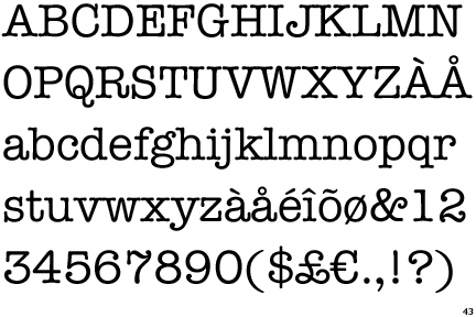
And then there’s this thing called kerning. Kerning is the space between letters. Monospace fonts (the kind that typewriters require, like Courier have lousy kerning, but they have to, because the point is that every letter occupies the same amount of horizontal space. If you’re using anything higher level than a typewriter, there’s no excuse for using a monospace font.

For instance (and I can’t put it here, because it isn’t offered as a font option), Cracked.com’s font article has Papyrus listed as the first font in its table.

Go look at the space between the initial P and the apyrus. You’ll never unsee that enormous, big enough to drown a small child, washtub of a kerning space. Kerning is why it’s a bad idea to write “FLICK” or “CLINT” in an all caps, script font. The L and I are kerned too closely together without enough letter characteristics. The reading eye perceives them as something completely different.

So why did this become a thing instead of continuing on as an esoteric craft for typesetters and design afficianados? You can blame Steve Jobs. Apparently, he took a typography course in college before he dropped out, and he was the one who decided that the Apple computer should offer more than one typefact. He was the one that pushed computer typography away from monospace fonts. He was the one who insisted that word processors be able to change a typefact from regular to bold or italicized or even both.

I also happen to speak as a former 8th grade English teacher who had to threaten her students with flunking if they turned in a paper printed in something other than a standard serif font or used more than three fonts in a PowerPoint presentation.

Awesome post, and I wholeheartedly agree with everything you said. However, I just want to not that yes, Jobs brought high quality fonts into the hands of the unwashed massed… but also the professional set, and revolutionized the graphic arts and printing industry with desktop publishing.

Despite the abuse, and proliferation of poorly designed, bush-league fonts, and the abuse by Keith in accounting, I’d rather the computer revolution with Comic Sans, Hobo and Papyrus, than having to do what I do using rubylith, camera stats, and key-lining.

The right fontcan save your life . . . or at least, your exit strategy.

Do yourself a favor and google change word default font.

Are computers higher in level than a typewriter? Because there are loads of computing applications for monospace fonts.

Not sure what you mean.

Typewriters, being mechanical and stuck with one font (computer typeface equivalent: American Typewriter) were largely monospaced due to mechanical limitations.

Kerning, coming from the laborious process of the manual adjustment of the spacing between the letters themselves to mitigate huge, unbalanced gaps by carefully shaving off the metal sides but keeping the raised letter dangling over the side, so the bowl of a lowercase “a” would now tuck nicely underneath the bar of a cap “T” in the word “Tacky”.

The computer has largely automated this process of balancing out proportional typefaces (even using an optical algorithm when or if kerning pairs are not available by design), either by having the fond designer create “kerning pairs” of popular problematic letter combos, or even ligatures which is combining letter pairs into one glyph when elements of a letter, depending on the design, might overlap or butt together against others.

A very well designed font will usually take care to design at least the most popular ligatures and include them in the set, and most modern graphic design / layout applications like, Adobe Indesign, will “smartly” swap in a font’s ligature when you type such a combo, like the ffi in “sufficient” if it’s included, ligature replacement activated in the app, etc.

Monospaced fonts are still around because they still serve pragmatic applications, such as OCR (optical character recognition), or other uses where a monospaced font is desired when you need to be sure that no matter what will be typed, is certain to fit a fix space constraint, making the sure the letters and words fit a specific format in a predictable way, such as in using Courier:

(same character count)

I like to visit Chicago, Illinois.

I hate my area Detroit, Michigan.

I like to visit Chicago, Illinois.

I hate the area Detroit, Michigan.

I think you need a mono-spaced font for that pr0n stuff or it just ends up looking distorted.

[Freud]

In the Courier example, you say “the” area; you no longer admit that you live in Detroit, or perhaps you no admit to ‘ownership’ of Detroit. This is very interesting. Does the literal meaning of Courier, as someone who travels and carries documents perhaps bring to the surface your buried desire to leave Detroit? Hm?

[/Freud]

What I mean is that in the field of computing, there are plenty of [del]excuses[/del] perfectly valid reasons to use monospaced fonts. Program coding, for example, working with fixed width formatted data files, working with any kind of textual configuration method, the command-line, etc.

Or in other words, I think I disagree with the statement:

Comic Sans - World’s Most Hated Font

In my case, love for a typeface usually comes for aesthetic reasons. I simply like the look of it.

My hate for a typeface is usually based in practicality, and that usually means readability. A great font for printed material at 12pt might be an absolutely horrible font for tiny print on a computer screen where the letters are only ten pixels high.

The perfect font for a long passage of text is the font you won’t even notice.

I came into this thread to point out that there is a whole book that answers it. In my opinion, it answers it quite well. I definitely enjoyed the book and learned from it.