Another font peeve of mine is when someone uses a gothic or script font in all caps. It’s an affront to God himself.
Arrrgh! A practical font. I kick (Apple) Sand upon your efforts!
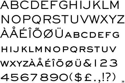
Fair enough.
How much coverage does Melior have? I get curious because I have 3 or 4 default Chinese fonts, and somehow the system decides which one it should use WRT to a given other font. How does that work?
I have noticed lately (maybe as my eyes age) that, when reading a document on the computer, I find Times New Roman gives me a headache. Actually, most fonts with a serif make me feel like squinting. (Including the sample Century Schoolbook a few posts back.) So even though it sort of offends my intellectual sense, I find myself switching documents to Arial.
I wonder why serifs seem harder on my eyes these days.
Somehow, I’ve never noticed this font before. I’m not entirely sure how. But that may give Comic Sans a run for its money for the bottom of the barrel.
It literally took me a few hours to figure out what you meant by this. When I saw “gothic” I was thinking sans serif typefaces like, well, Century Gothic. I couldn’t figure out what was wrong with them in all caps. It only just dawned on me that you must mean “Gothic” to mean blackletter/medieval typefaces, which makes a whole hell of a lot more sense.
I think it was a typical standard font pre-OS X but has kind of dropped out of sight since then. Classic Mac OS had around a dozen or so default fonts, OS X north of three score, so the Baskervilles and the Impacts and the Chalkboards (comic sans minus the stupid) get lost in the immensity of it.
See?! SEE?! Dull is good.
I’m not following you here, sorry. In any case, when I say I found a full run of Melior, I mean a full set of the matrices to cast Melior in the range of text size. Hot lead and all that.
It’s “jumps.” Your way, there’s no “s.”
Oh, I see, actual casting forms. Awesome!
Papyrus was over-used by everyone who wanted to appear earthy, crunchy, or exotic. It got old fast.
As for Comic Sans:
I’m just glad the hate hasn’t spread to my old friend, Bank Gothic, quite yet.
Though even I can see it becoming over-used nowadays…so it’s probably only a matter of time. ![]()
Bank Gothic is a display font, as cmyk adverted to above. Fonts that only have upper-case characters (even if there is a “lower case” of small caps) are unquestionably display fonts.
Display fonts should be used for logos or short headers. It needs to be at a relatively large point-size and must never be used for body text.
Sackers Gothic looks a lot less cheezy than Bank Gothic.
There’s nothing wrong with Arial. Or Helvetica. Or, for that matter, Garamond, or Optima, or Franklin, or Times New Roman. They are all very readable typefaces.
Heck, I remember my final exam in hand-lettering class: render this sentence in … (and the examiners chose ) Garamond! No Letraset books, no other aids. We had to know Garamond by heart, and render it with dip pens and ink.
I passed, with an A. 
I personally like Garamond – it’s what I write all my song lyrics in.
I worked in the type industry for several decades. For several years my job was to identify typefaces from samples a client had sent us, like a scrap torn out of a magazine. Normally this meant looking for unique characteristics from certain letters, like: G, J, Q, R, f, g and y. And of course, the shape of the serifs, if any. I’d look for these characters, and usually had no trouble identifying the font. But sometimes there’d be a serif font with absolutely no characteristics whatsoever. Nothing stood out as the “personality” of the font. Whenever this happened, 90% of the time, it was Times Roman. It’s like the anti-font, no characteristics and no personality. I realize that this is precisely why some people use it, but I suspect people use it because it’s the default in the software they’re using.
And don’t get me started on kerning.
It’s a good time. Until you get molten lead sprayed all over you, at least.
I think that the worst thing that happened was that MS put all these fonts in Word and Powerpoint, and untrained people thought they had to use each and every one of them.
With all due respect to our friends who never studied design, there is a lot more to design than you may think.
As has been said, you need to look to the “personality” of a font. What do you want it to do?
I use Times New Roman because it’s the only font allowed at my university for any and all academic papers. How I wish it was the default in Word, PP etc., instead of Calibri, which I have to switch to TNR every fucking time I start working, sometimes even mid-text when the program decides it’s default time for some inexplicable reason. Yeah, I’m computer-savvy like that.
Ha, yes, I meant the medieval/old english style fonts.
While most text and display fonts are usually fine in using all caps, the caps for most gothic and script fonts just aren’t designed to work together for all uppercase typography.
The gothic caps were designed for being even more decorative than their lowercase counterparts because using extremely large initial caps at the beginning of chapters, or what have you, was the common practice. In fact, I believe there was a time where only the ornate capital letters were used, and without spaces, so reading and parsing sentences made their eyes explode. Over time, they held onto the highly ornate initial cap and developed more legible cases for the bodies of text. Oh, and spaces were a welcome advent, I’m sure. Helps keep the eyes intact and in the skull. Always a good thing.
As for script fonts, again, the uppercase (see here) is designed to work with a lowercase cursive script (see here), just like cursive handwriting. When I see heavily flourished script fonts in all caps in the wild, and wonder how they managed typing it out without having a seizure.